Thisispaper Community
Join today.
Enter your email address to receive the latest news on emerging art, design, lifestyle and tech from Thisispaper, delivered straight to your inbox.
Oops! Something went wrong while submitting the form.
Instant access to new channels
The top stories curated daily
Weekly roundups of what's important
Original features and deep dives
Exclusive community features
@zaxarovcom
Dec 16, 2019

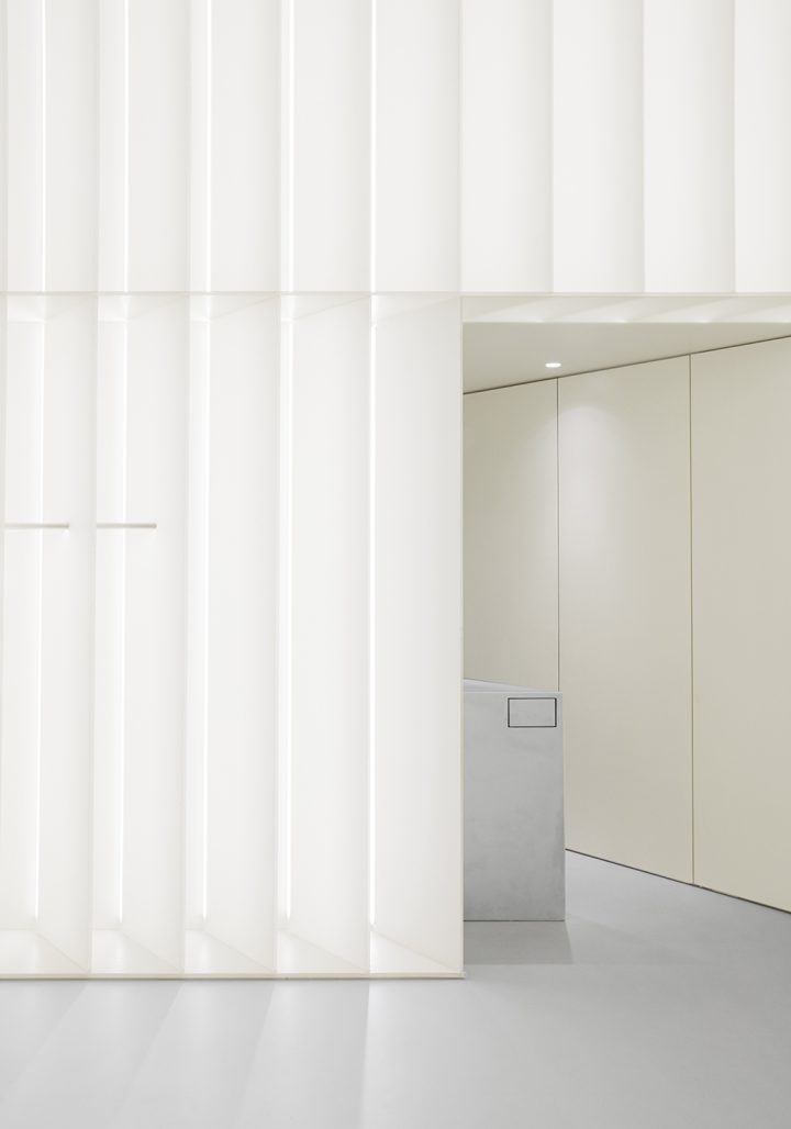
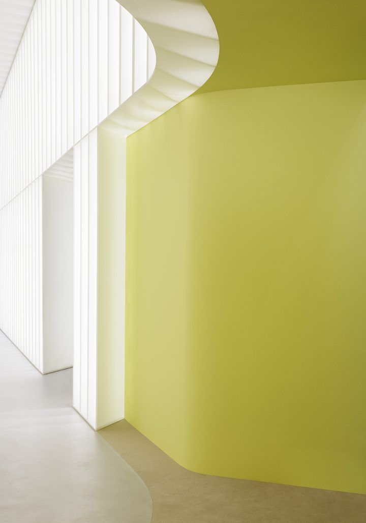
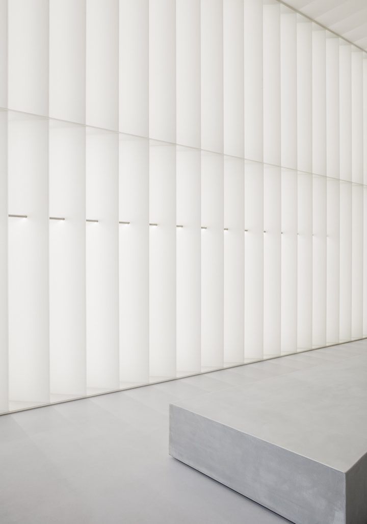
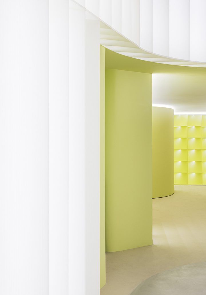
1970s design inspires David Thulstrup’s retail vision for J.Lindeberg.

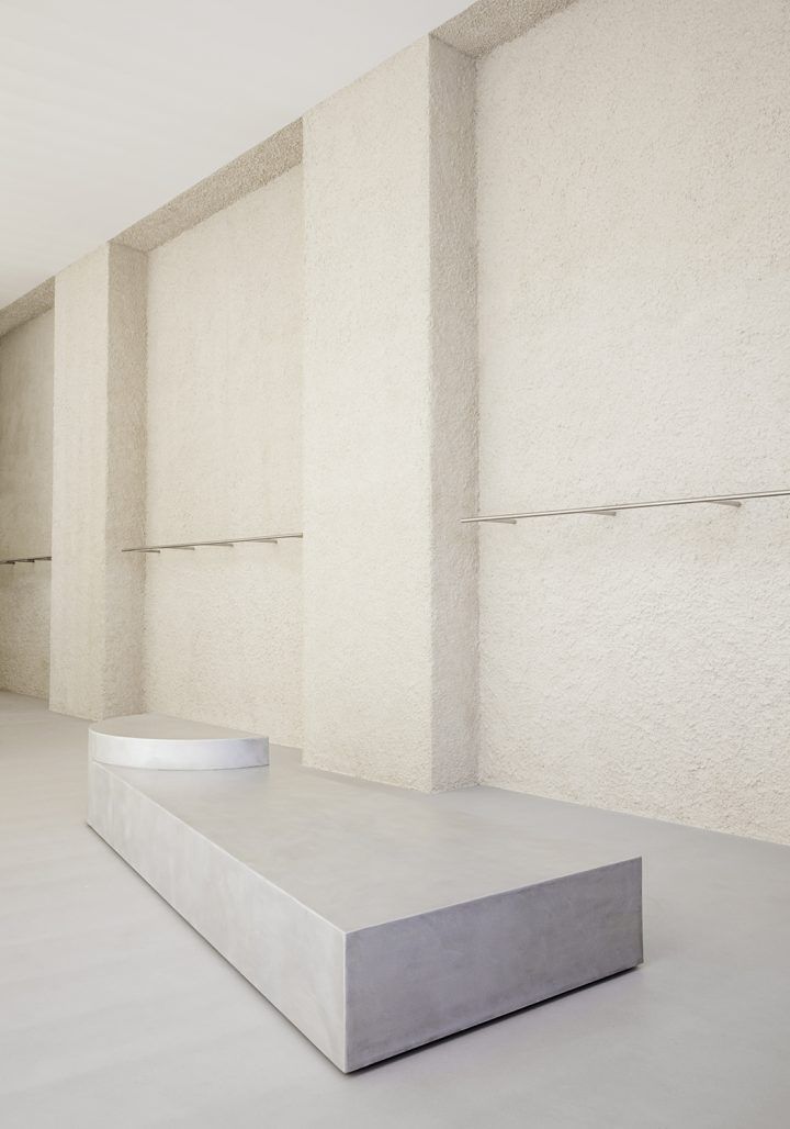
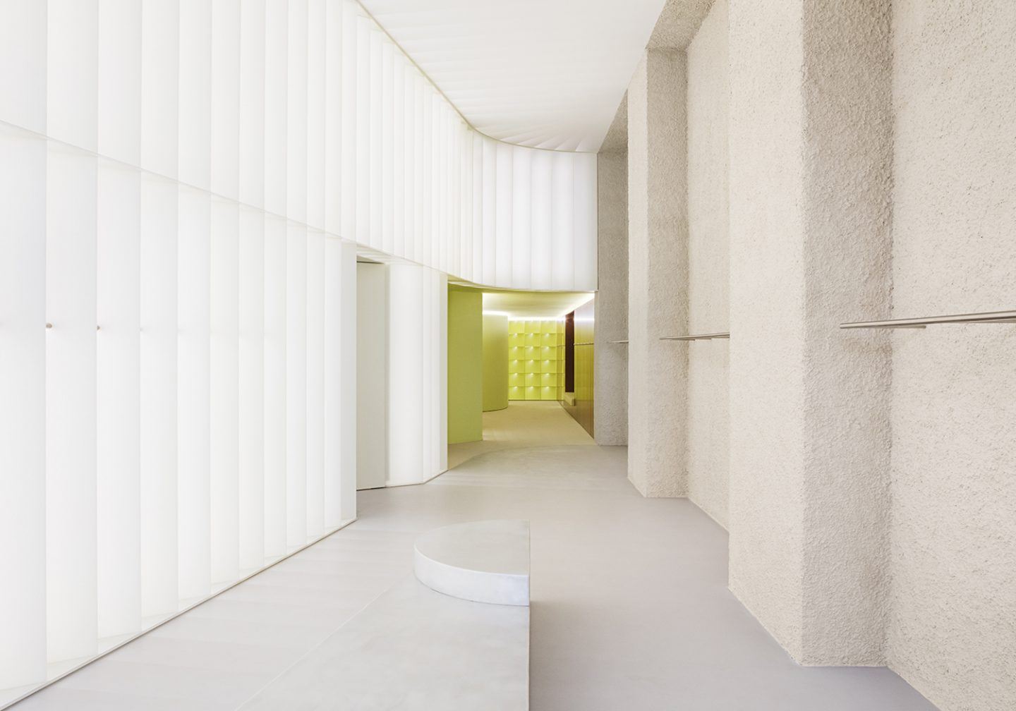
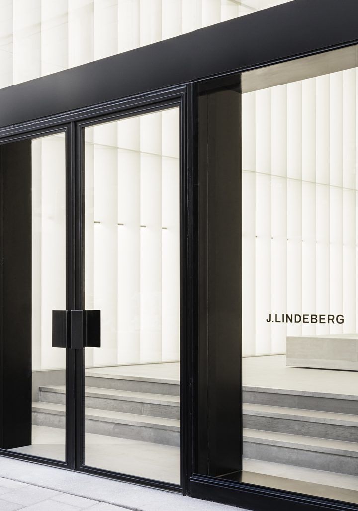
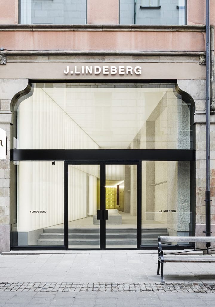
For J.Lindeberg, Thulstrup’s starting point was to look into the brand’s past. ‘The project took time – more than a year – but I had some clear features in my mind,’ he says. ‘I wanted it to be futuristic but with strong references to the 1970s and techy and warm at the same time. These ideas, along with their logo, called the Bridge, were the starting point of the project.’

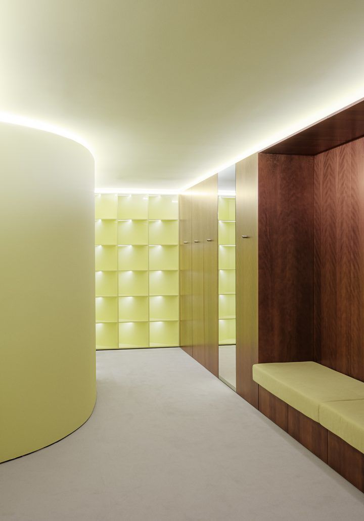
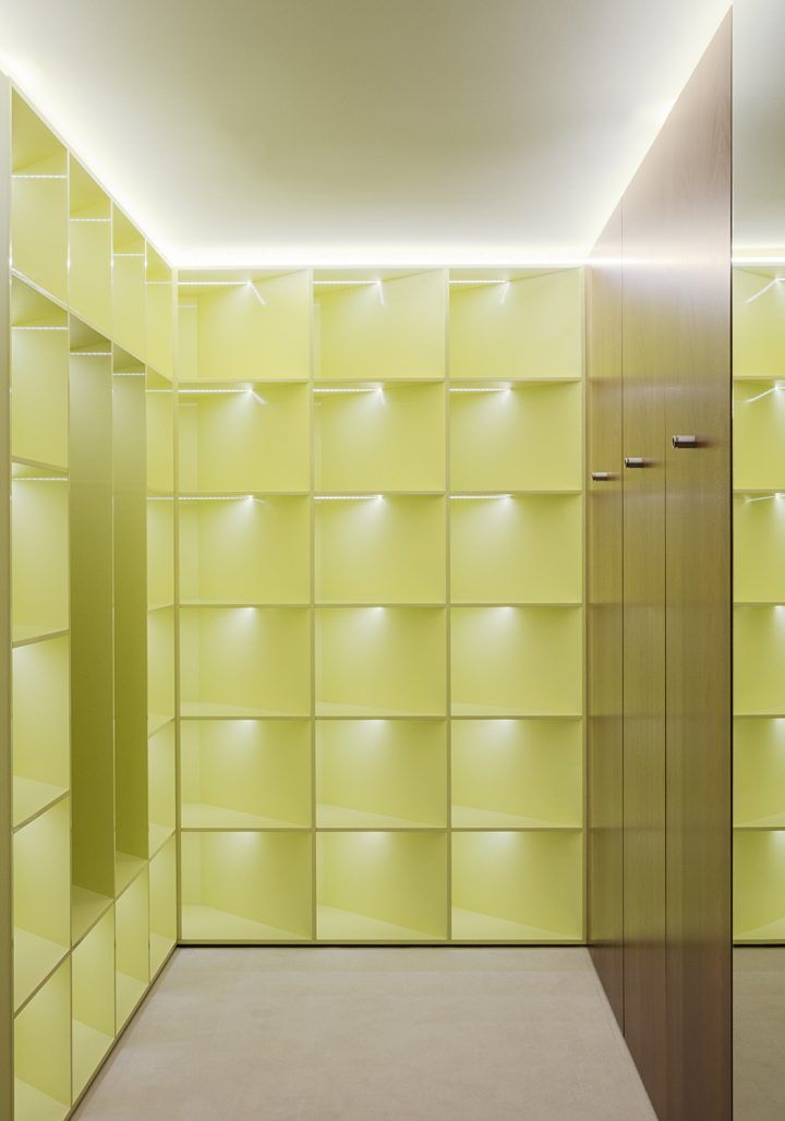
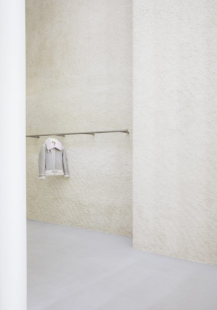
A neutral palette of materials such as concrete and platane wood was drawn together to conjure a luxurious yet sporty ambience, while a splash of pale yellow on flocked panels at the rear of the store picks up J.Lindeberg’s signature colour.

Interested in Showcasing Your Work?

If you would like to feature your works on Thisispaper, please visit our Submission page and sign up to Thisispaper+ to submit your work. Once your submission is approved, your work will be showcased to our global audience of 2 million art, architecture, and design professionals and enthusiasts.
No items found.
We love less
but there is more.
Become a Thisispaper+ member today to unlock full access to our magazine, advanced tools, and support our work.
Join Thisispaper+
No items found.
@zaxarovcom
Dec 16, 2019

1970s design inspires David Thulstrup’s retail vision for J.Lindeberg.

For J.Lindeberg, Thulstrup’s starting point was to look into the brand’s past. ‘The project took time – more than a year – but I had some clear features in my mind,’ he says. ‘I wanted it to be futuristic but with strong references to the 1970s and techy and warm at the same time. These ideas, along with their logo, called the Bridge, were the starting point of the project.’

A neutral palette of materials such as concrete and platane wood was drawn together to conjure a luxurious yet sporty ambience, while a splash of pale yellow on flocked panels at the rear of the store picks up J.Lindeberg’s signature colour.
Interested in Showcasing Your Work?

If you would like to feature your works on Thisispaper, please visit our Submission page and subscribe to Thisispaper+. Once your submission is approved, your work will be showcased to our global audience of 2 million art, architecture, and design professionals and enthusiasts.
Thisispaper+
minimum
90+ Projects
Web Access
Link to Maps
Timeless over trendy, few over many and plain over fancy - that's probably the most condensed way of putting into words what 'minimum' is about. 'Minimum' embraces the ideas of eliminating all the noise and focusing only on the essential form and function which leads to true freedom, simplicity, and a real sense.
Explore
minimum

Join Thisispaper+
Become a Thisispaper+ member today to unlock full access to our magazine, submit your project and support our work.
Travel Guides
Immerse yourself in timeless destinations, hidden gems, and creative spaces—curated by humans, not algorithms.
Explore All Guides +
Curated Editions
Dive deeper into carefully curated editions, designed to feed your curiosity and foster exploration.
Off-the-Grid
Jutaku
Sacral Journey
minimum
The New Chair
Explore All Editions +
Submission Module
By submitting and publishing your work, you can expose your work to our global 2M audience.
Learn More+
Become a Thisispaper+ member today to unlock full access to our magazine, submit your project and support our work.