Thisispaper Community
Join today.
Enter your email address to receive the latest news on emerging art, design, lifestyle and tech from Thisispaper, delivered straight to your inbox.
Oops! Something went wrong while submitting the form.
Instant access to new channels
The top stories curated daily
Weekly roundups of what's important
Original features and deep dives
Exclusive community features
Zuzanna Gasior
Nov 12, 2021

Ronda House by HANGHAR is an exercise of limited resources, in which the reduction of spatial, material and technological solutions allows the maximum flexibility of use.

In response to the ever-changing uncertainty we currently live in as a society, the project, the renovation of an existing 85m2 apartment, is conceived as an open and undefined system capable of functioning as a backdrop to whoever inhabits it. A propositional system, not a limiting one.

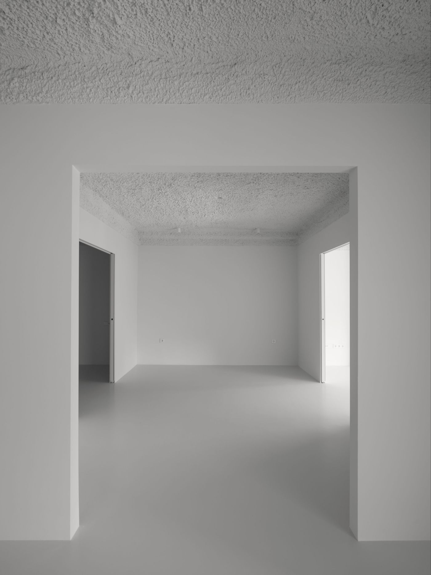
The home distances itself from fixed and conventional distributions through the linkage of a series rooms that are programmatically generic but spatially specific. With this, the home is able to respond to the demands of a contemporary living and not market driven logics. Spatially, the project is resolved through an asymmetric grid that organizes and articulates the given space. Each room, of rectangular proportions, is connected with each other through a series of large, central apertures, creating a spatial enfilade that communicates all spaces and establishes a visual continuity amplifying the space whilst diluting its use limits.

The project’s material palette is direct and bare. The floor, made out of epoxy resin, erases any sense of scale while the ceiling, rough and cavernous, presents itself ornamentally baroque as a result of the splashed plaster’s imprecision. The cooking area, covered in mirrors, simply disappears. Even though the project’s aesthetics could be described as aseptic, recalling Colomina’s analogies between the Modern Movement and 20th century pandemics, the project’s interior architecture is reduced not as a response to newly defined sanitary standards but social ones. An ambiguous system capable of serving the inhabitant it receives, without projecting fixed and immovable living definitions.

Interested in Showcasing Your Work?

If you would like to feature your works on Thisispaper, please visit our Submission page and sign up to Thisispaper+ to submit your work. Once your submission is approved, your work will be showcased to our global audience of 2 million art, architecture, and design professionals and enthusiasts.
No items found.
We love less
but there is more.
Become a Thisispaper+ member today to unlock full access to our magazine, advanced tools, and support our work.
Join Thisispaper+
No items found.
Zuzanna Gasior
Nov 12, 2021

Ronda House by HANGHAR is an exercise of limited resources, in which the reduction of spatial, material and technological solutions allows the maximum flexibility of use.

In response to the ever-changing uncertainty we currently live in as a society, the project, the renovation of an existing 85m2 apartment, is conceived as an open and undefined system capable of functioning as a backdrop to whoever inhabits it. A propositional system, not a limiting one.

The home distances itself from fixed and conventional distributions through the linkage of a series rooms that are programmatically generic but spatially specific. With this, the home is able to respond to the demands of a contemporary living and not market driven logics. Spatially, the project is resolved through an asymmetric grid that organizes and articulates the given space. Each room, of rectangular proportions, is connected with each other through a series of large, central apertures, creating a spatial enfilade that communicates all spaces and establishes a visual continuity amplifying the space whilst diluting its use limits.

The project’s material palette is direct and bare. The floor, made out of epoxy resin, erases any sense of scale while the ceiling, rough and cavernous, presents itself ornamentally baroque as a result of the splashed plaster’s imprecision. The cooking area, covered in mirrors, simply disappears. Even though the project’s aesthetics could be described as aseptic, recalling Colomina’s analogies between the Modern Movement and 20th century pandemics, the project’s interior architecture is reduced not as a response to newly defined sanitary standards but social ones. An ambiguous system capable of serving the inhabitant it receives, without projecting fixed and immovable living definitions.

Interested in Showcasing Your Work?

If you would like to feature your works on Thisispaper, please visit our Submission page and subscribe to Thisispaper+. Once your submission is approved, your work will be showcased to our global audience of 2 million art, architecture, and design professionals and enthusiasts.
Thisispaper+
minimum
90+ Projects
Web Access
Link to Maps
Timeless over trendy, few over many and plain over fancy - that's probably the most condensed way of putting into words what 'minimum' is about. 'Minimum' embraces the ideas of eliminating all the noise and focusing only on the essential form and function which leads to true freedom, simplicity, and a real sense.
Explore
minimum

Join Thisispaper+
Become a Thisispaper+ member today to unlock full access to our magazine, submit your project and support our work.
Travel Guides
Immerse yourself in timeless destinations, hidden gems, and creative spaces—curated by humans, not algorithms.
Explore All Guides +
Curated Editions
Dive deeper into carefully curated editions, designed to feed your curiosity and foster exploration.
Off-the-Grid
Jutaku
Sacral Journey
minimum
The New Chair
Explore All Editions +
Submission Module
By submitting and publishing your work, you can expose your work to our global 2M audience.
Learn More+
Become a Thisispaper+ member today to unlock full access to our magazine, submit your project and support our work.