Thisispaper Community
Join today.
Enter your email address to receive the latest news on emerging art, design, lifestyle and tech from Thisispaper, delivered straight to your inbox.
Oops! Something went wrong while submitting the form.
Instant access to new channels
The top stories curated daily
Weekly roundups of what's important
Original features and deep dives
Exclusive community features
Zuzanna Gasior
Nov 29, 2020

A ground floor in the heart of Kreuzberg, Berlin’s fascinatingly diverse district, was the location chosen for the new home and office for Mark Ask Plus architects.

The sad state of what was once a Schlecker supermarket called for a white canvas intervention. The renovation included new floors, ceilings, walls, partial removal of structural walls, new electrical and water installation. Now, the 180 squared meters ground floor is divided in two; the commercial space looking out the street and the home giving to the courtyard.

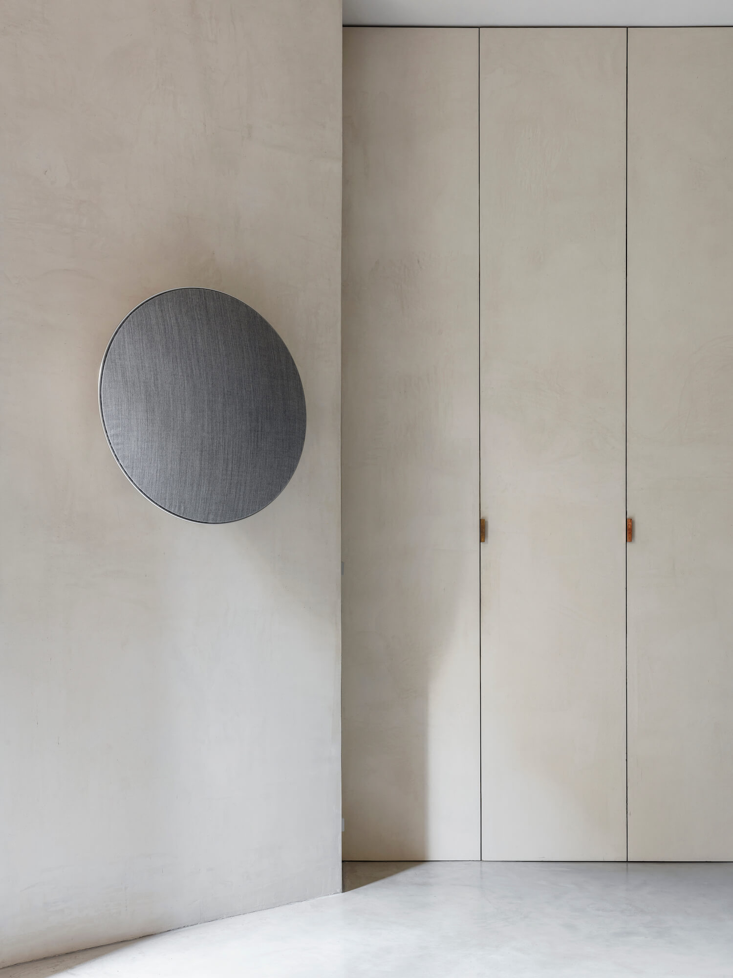
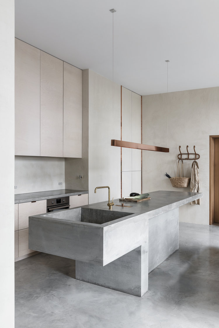
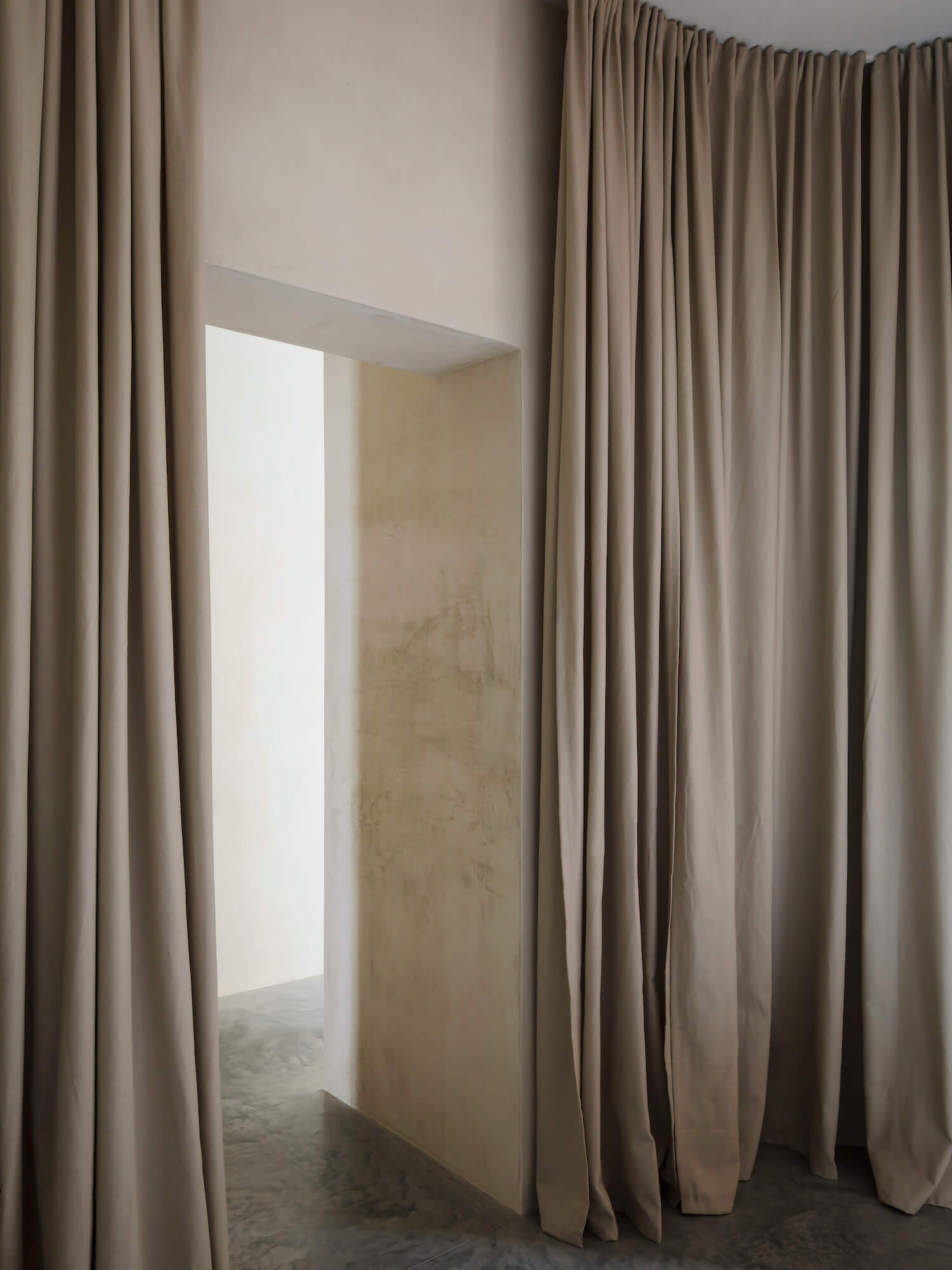
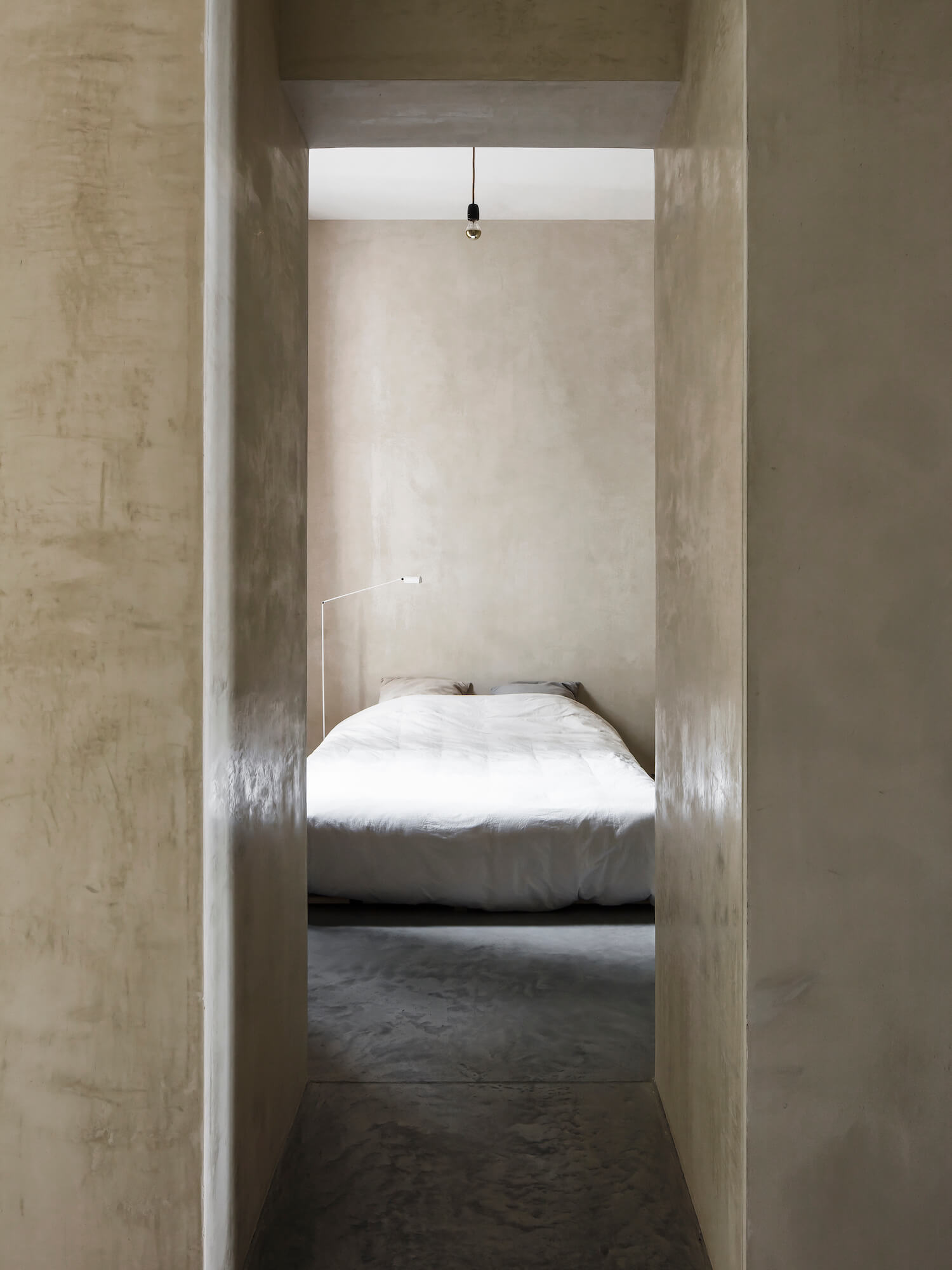
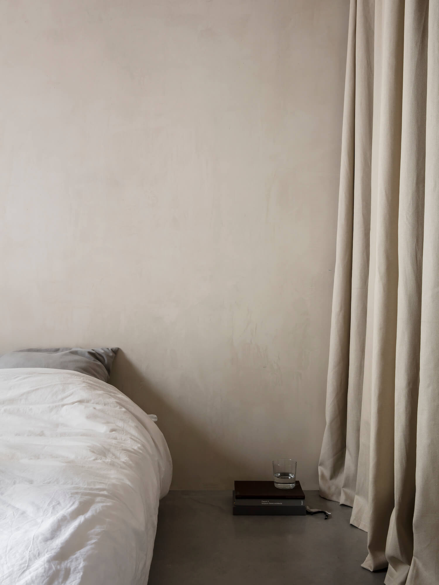
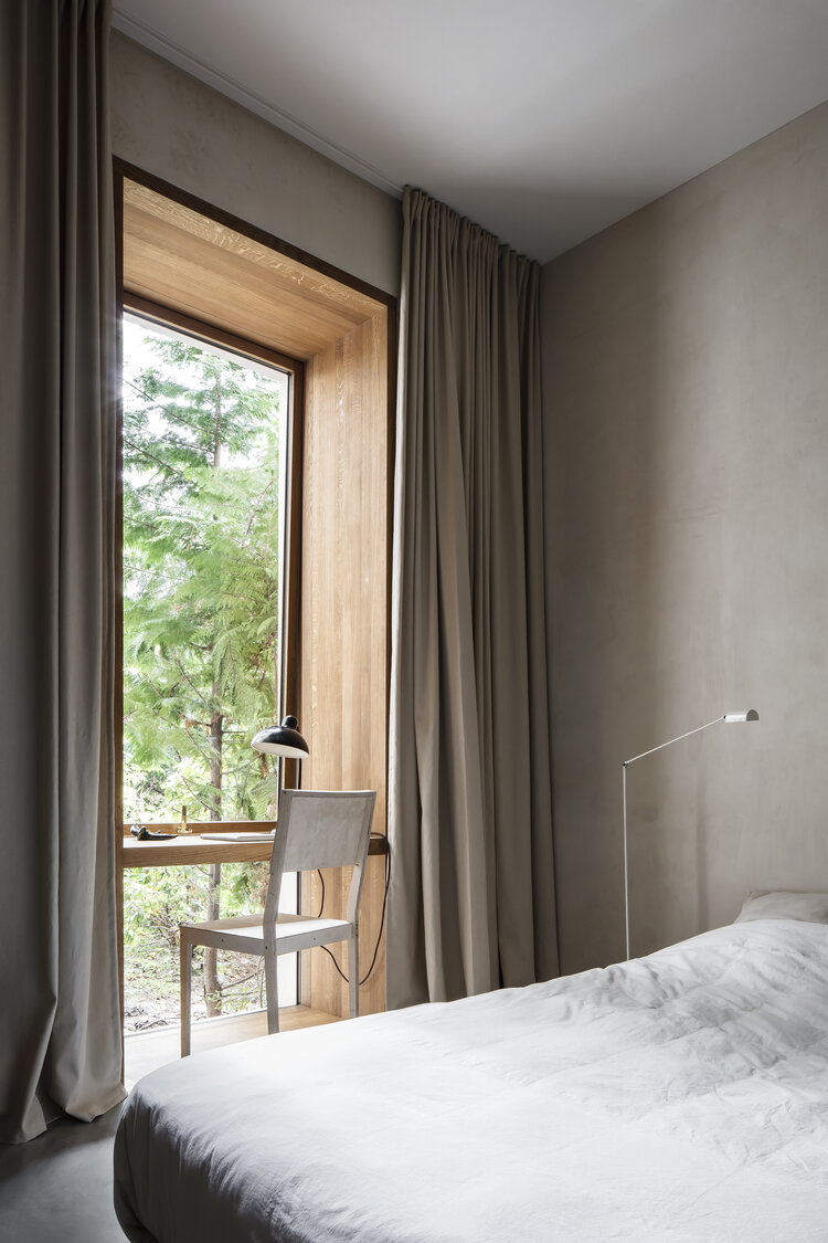
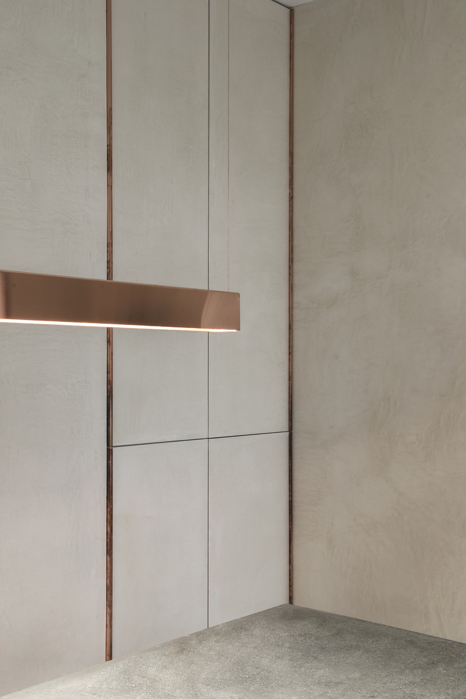
Common to all spaces are the high ceilings, concrete polished floor with floor heating and beautifully stucco-style rendered walls. All the elements needed were carefully designed to be built-in wall to wall. Doors and closet doors are frameless floor to ceiling and are rendered in the same stucco finish as the walls. The geometry is then very potent and the dusty surfaces softens it.

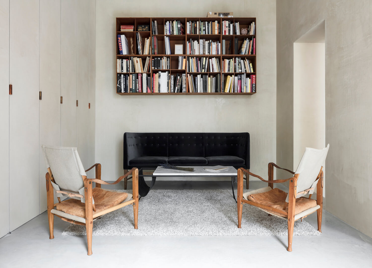
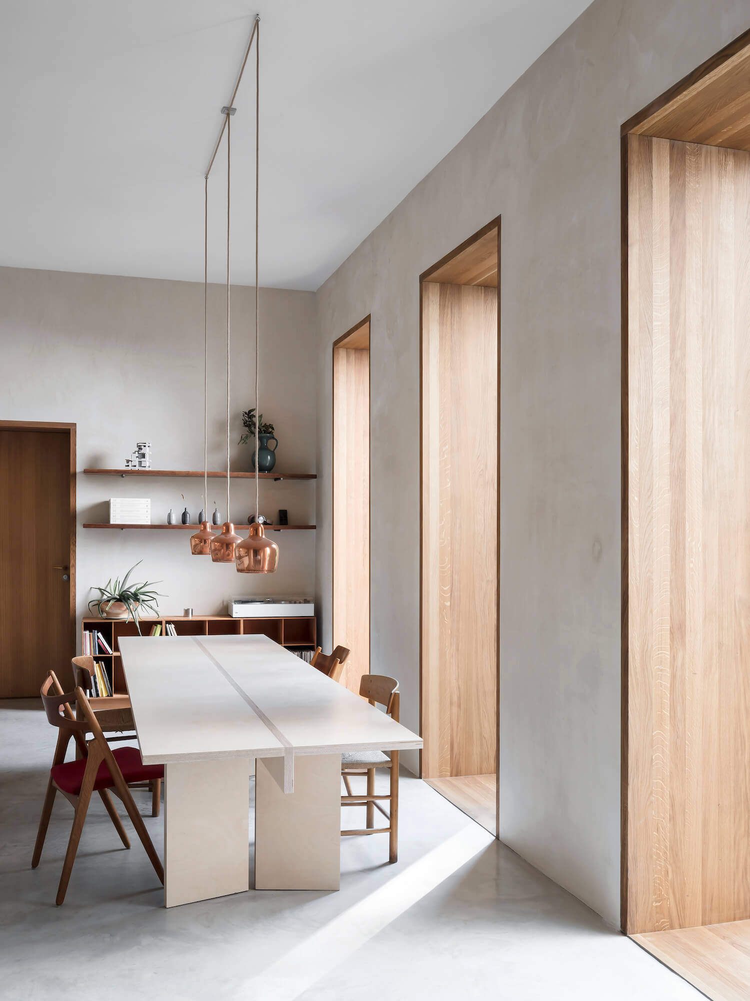
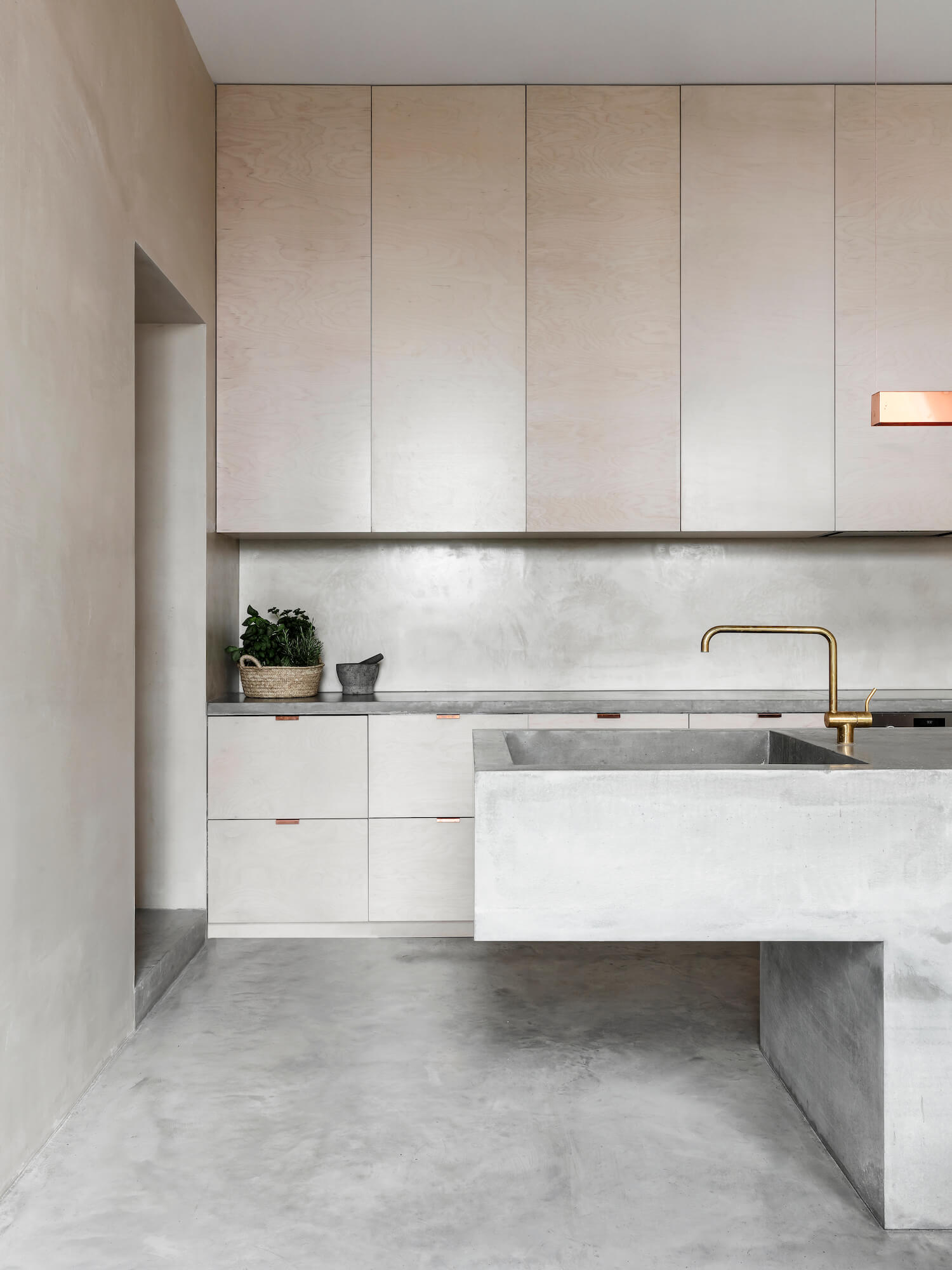
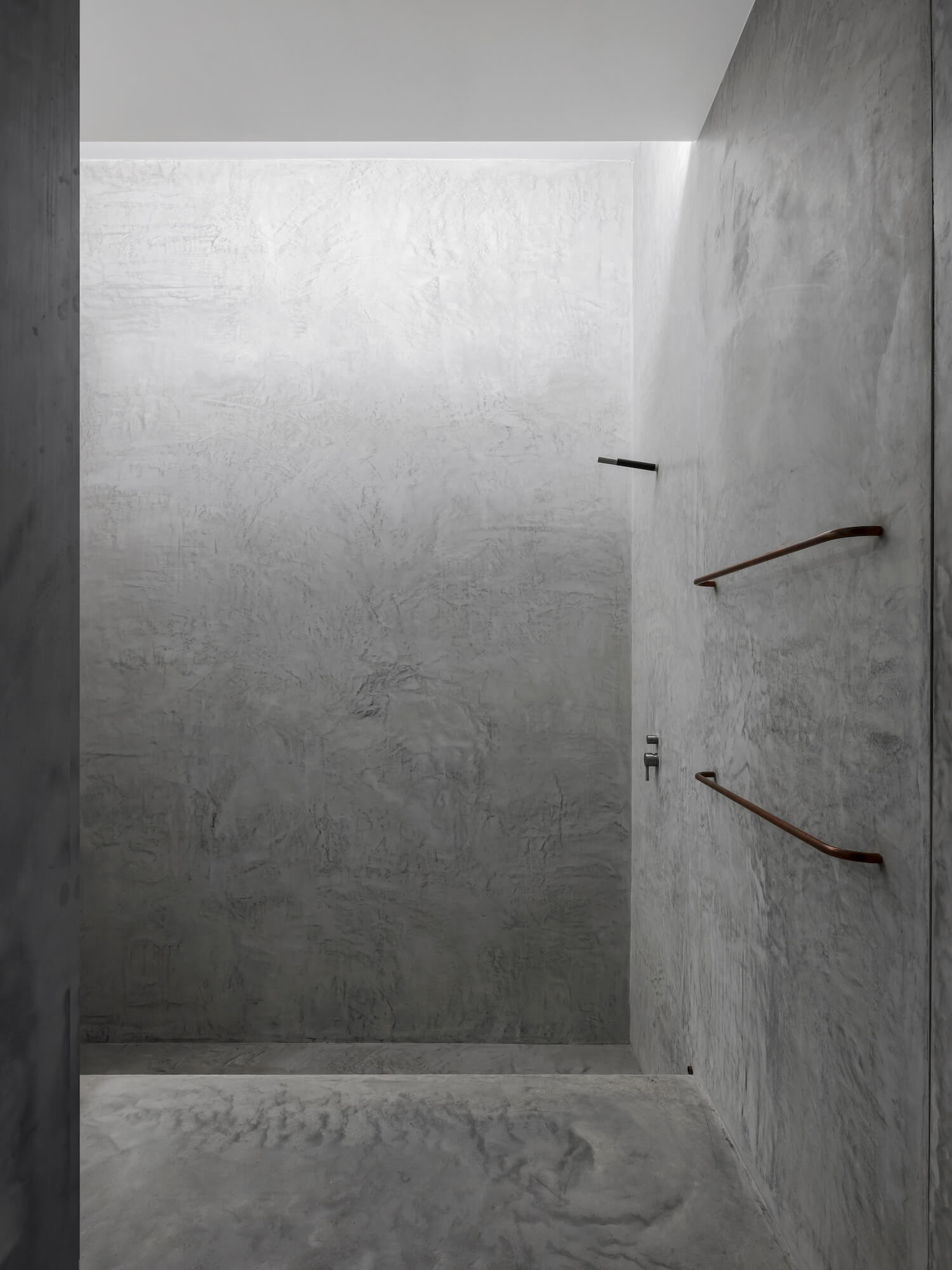
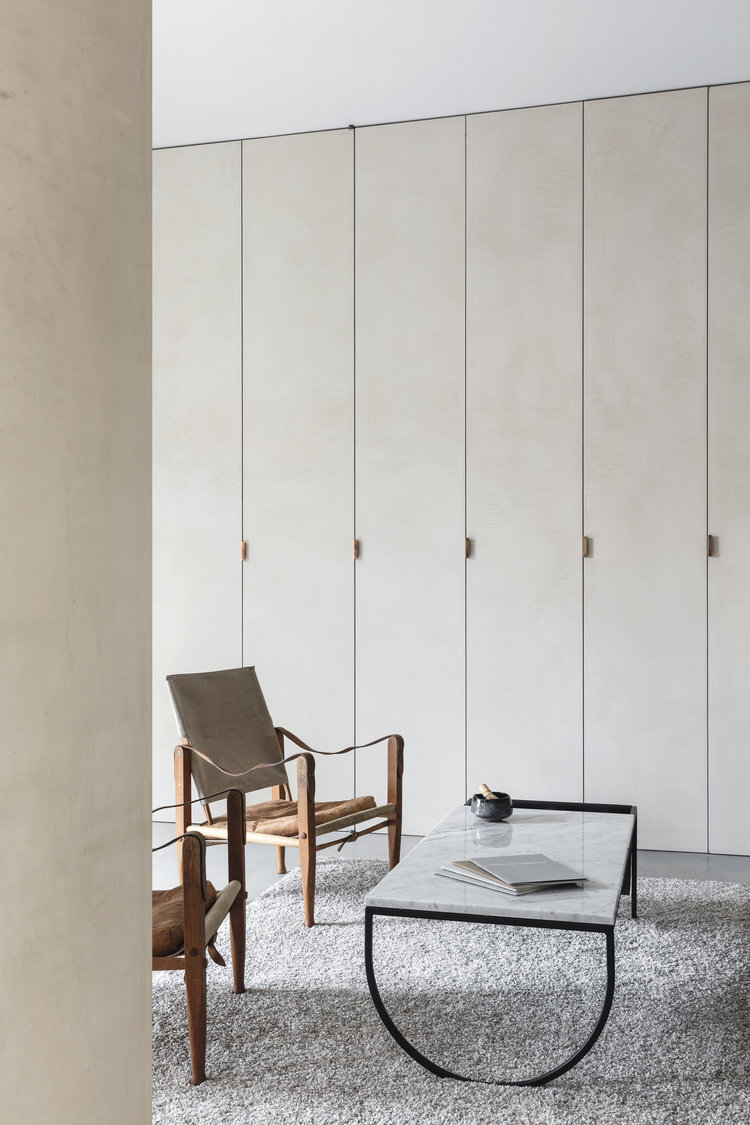
In the living part; the old small windows were replaced by 4 huge 3m high oak windows made in Denmark. They brighten up the home and open it to the small private garden in the courtyard. The central piece of the common spaces is the kitchen, it orchestrates all the main activities of the home. A 3,60m long concrete island was casted directly on site with a gorgeous terrazzo-like texture. A 3m long wood dining table comes by its side, beating at it’s rhythm. Between this big kitchen-dining-meeting area and the living room there’s a change of height that gives the living room it’s own place in an otherwise open plan. The set back for it is a wall of closets. They lead to the bedroom and bathroom. The bathroom is a clean concrete cube, where the elements are hidden and the visible surfaces rendered in microcement. The floor comes down to form a built in bathtub. A fake skylight on top adds up to the dramatic effect.

Interested in Showcasing Your Work?

If you would like to feature your works on Thisispaper, please visit our Submission page and sign up to Thisispaper+ to submit your work. Once your submission is approved, your work will be showcased to our global audience of 2 million art, architecture, and design professionals and enthusiasts.
No items found.
We love less
but there is more.
Become a Thisispaper+ member today to unlock full access to our magazine, advanced tools, and support our work.
Join Thisispaper+
No items found.
Zuzanna Gasior
Nov 29, 2020

A ground floor in the heart of Kreuzberg, Berlin’s fascinatingly diverse district, was the location chosen for the new home and office for Mark Ask Plus architects.

The sad state of what was once a Schlecker supermarket called for a white canvas intervention. The renovation included new floors, ceilings, walls, partial removal of structural walls, new electrical and water installation. Now, the 180 squared meters ground floor is divided in two; the commercial space looking out the street and the home giving to the courtyard.

Common to all spaces are the high ceilings, concrete polished floor with floor heating and beautifully stucco-style rendered walls. All the elements needed were carefully designed to be built-in wall to wall. Doors and closet doors are frameless floor to ceiling and are rendered in the same stucco finish as the walls. The geometry is then very potent and the dusty surfaces softens it.

In the living part; the old small windows were replaced by 4 huge 3m high oak windows made in Denmark. They brighten up the home and open it to the small private garden in the courtyard. The central piece of the common spaces is the kitchen, it orchestrates all the main activities of the home. A 3,60m long concrete island was casted directly on site with a gorgeous terrazzo-like texture. A 3m long wood dining table comes by its side, beating at it’s rhythm. Between this big kitchen-dining-meeting area and the living room there’s a change of height that gives the living room it’s own place in an otherwise open plan. The set back for it is a wall of closets. They lead to the bedroom and bathroom. The bathroom is a clean concrete cube, where the elements are hidden and the visible surfaces rendered in microcement. The floor comes down to form a built in bathtub. A fake skylight on top adds up to the dramatic effect.
Interested in Showcasing Your Work?

If you would like to feature your works on Thisispaper, please visit our Submission page and subscribe to Thisispaper+. Once your submission is approved, your work will be showcased to our global audience of 2 million art, architecture, and design professionals and enthusiasts.
Thisispaper+
DwellWell
100+ Projects
Web Access
Link to Maps
Wellbeing as an outcome of ongoing relations happening in space and time. Things, environments, and experiences that are designed to enhance life and enable us to thrive.
Explore
DwellWell

Join Thisispaper+
Become a Thisispaper+ member today to unlock full access to our magazine, submit your project and support our work.
Travel Guides
Immerse yourself in timeless destinations, hidden gems, and creative spaces—curated by humans, not algorithms.
Explore All Guides +
Curated Editions
Dive deeper into carefully curated editions, designed to feed your curiosity and foster exploration.
Off-the-Grid
Jutaku
Sacral Journey
minimum
The New Chair
Explore All Editions +
Submission Module
By submitting and publishing your work, you can expose your work to our global 2M audience.
Learn More+
Become a Thisispaper+ member today to unlock full access to our magazine, submit your project and support our work.