Thisispaper Community
Join today.
Enter your email address to receive the latest news on emerging art, design, lifestyle and tech from Thisispaper, delivered straight to your inbox.
Oops! Something went wrong while submitting the form.
Instant access to new channels
The top stories curated daily
Weekly roundups of what's important
Original features and deep dives
Exclusive community features
@zaxarovcom
Nov 20, 2020

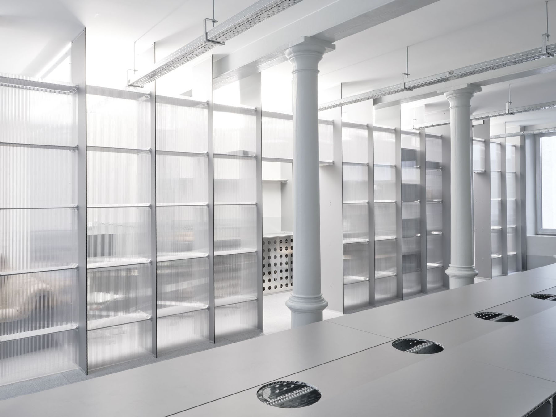
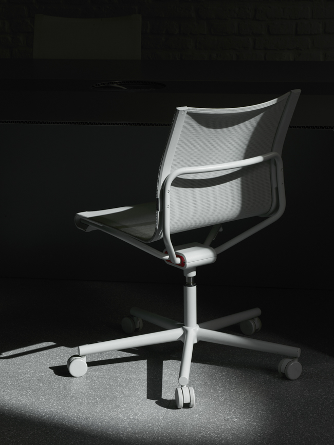
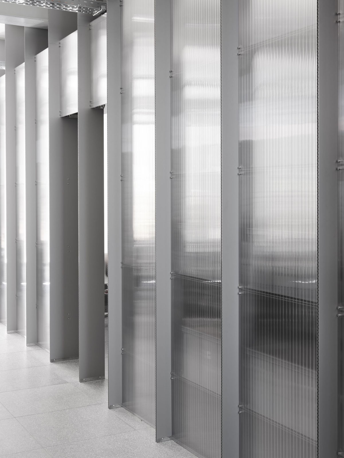
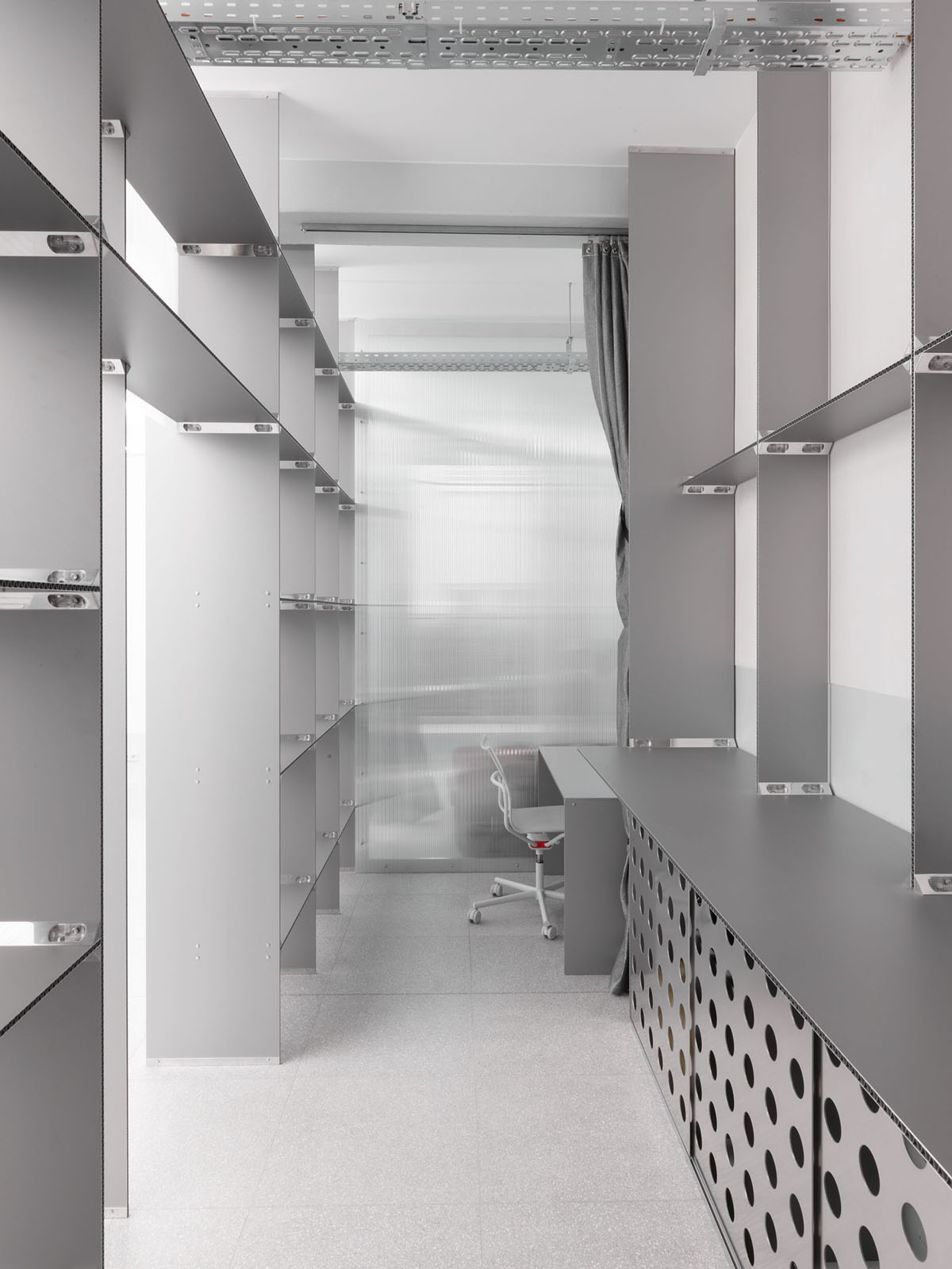
Gonzalez Haase AAS’s minimalistic workspace interior for the graphic design studio Bureau Borsche is being built out into a range of furnishings by Stefan Diez and Wagner Living.

The new Bureau Borsche is located in a quintessential Munich residential building with commercial units on the ground floor. In March 2019, Gonzalez Haase AAS took on the renovation, refurbishment and spatial redesign of the 315 sqm office space. The architects were given no limits in terms of design.

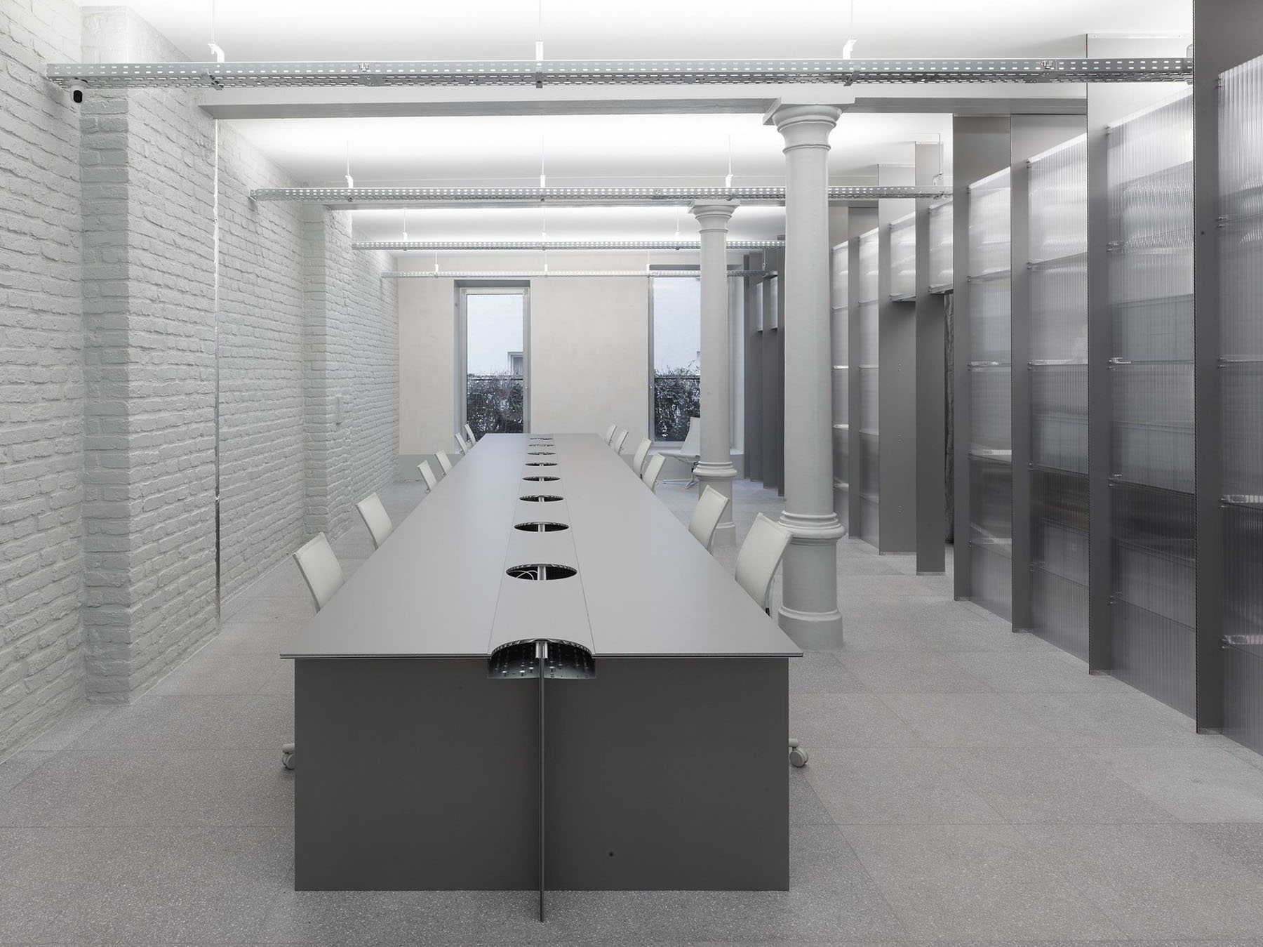
Borsche's primary desire was that he would be able to work together with his team at one common table and have a lounge area to retreat to. To achieve this, three rooms of various functions were created: a showroom in the front-facing building, a workspace in the rear building, and archives in the basement, connecting the showroom and workspace. Through a coherent design language and the application of lightweight materials, Gonzalez Haase was able to give the space new structure, turning the furniture into an integral part of the architecture itself.

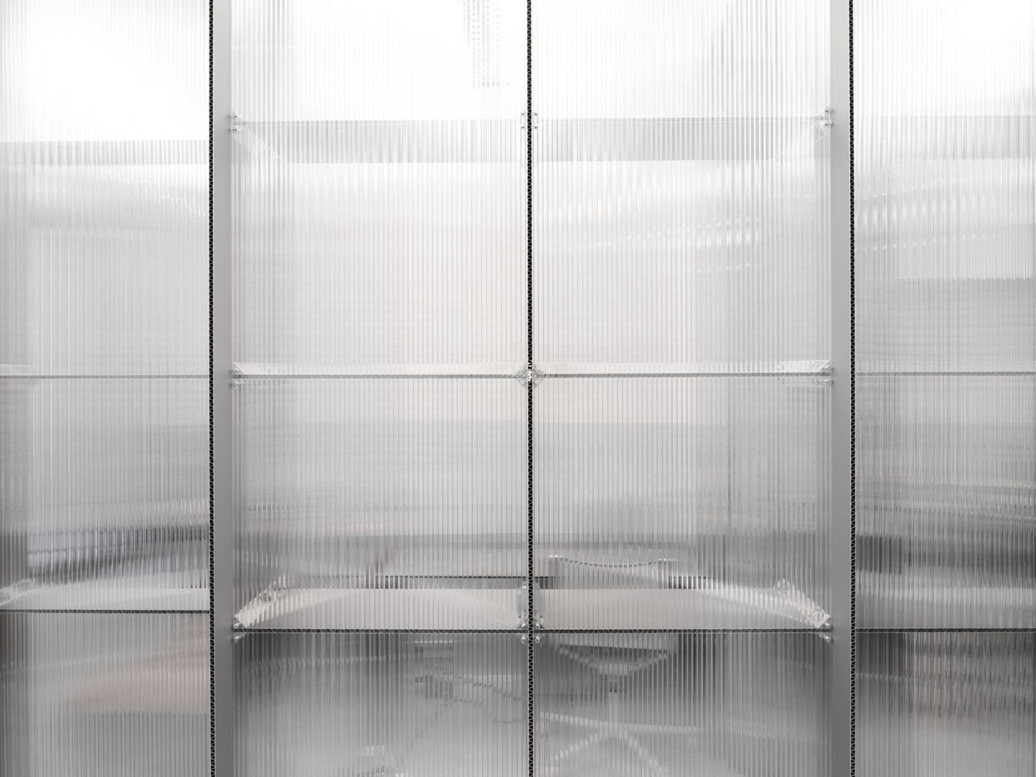
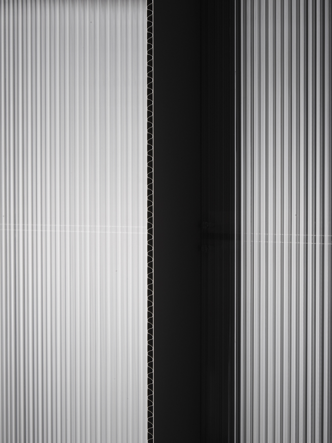
The guiding theme is formed by aluminium honeycomb panels – an industrial material used in aircraft construction – with open edges and junctions made of polished solid aluminium. This way, a room-high shelf made of these panels divides the space into work and functional areas. A metallic strip curtain can be opened and closed as needed to visually separate the lounge from the work area.

The ceiling is covered with fire-resistant foam, creating an unexpectedly soft aura of the beams that contrasts with the hard surfaces of the furniture. Here, the terrazzo floor slabs continue as wall panelling. The new furniture system is characterized by modularity and a maximum of flexibility.

Interested in Showcasing Your Work?

If you would like to feature your works on Thisispaper, please visit our Submission page and sign up to Thisispaper+ to submit your work. Once your submission is approved, your work will be showcased to our global audience of 2 million art, architecture, and design professionals and enthusiasts.
No items found.
We love less
but there is more.
Become a Thisispaper+ member today to unlock full access to our magazine, advanced tools, and support our work.
Join Thisispaper+
No items found.
@zaxarovcom
Nov 20, 2020

Gonzalez Haase AAS’s minimalistic workspace interior for the graphic design studio Bureau Borsche is being built out into a range of furnishings by Stefan Diez and Wagner Living.

The new Bureau Borsche is located in a quintessential Munich residential building with commercial units on the ground floor. In March 2019, Gonzalez Haase AAS took on the renovation, refurbishment and spatial redesign of the 315 sqm office space. The architects were given no limits in terms of design.

Borsche's primary desire was that he would be able to work together with his team at one common table and have a lounge area to retreat to. To achieve this, three rooms of various functions were created: a showroom in the front-facing building, a workspace in the rear building, and archives in the basement, connecting the showroom and workspace. Through a coherent design language and the application of lightweight materials, Gonzalez Haase was able to give the space new structure, turning the furniture into an integral part of the architecture itself.

The guiding theme is formed by aluminium honeycomb panels – an industrial material used in aircraft construction – with open edges and junctions made of polished solid aluminium. This way, a room-high shelf made of these panels divides the space into work and functional areas. A metallic strip curtain can be opened and closed as needed to visually separate the lounge from the work area.

The ceiling is covered with fire-resistant foam, creating an unexpectedly soft aura of the beams that contrasts with the hard surfaces of the furniture. Here, the terrazzo floor slabs continue as wall panelling. The new furniture system is characterized by modularity and a maximum of flexibility.

Interested in Showcasing Your Work?

If you would like to feature your works on Thisispaper, please visit our Submission page and subscribe to Thisispaper+. Once your submission is approved, your work will be showcased to our global audience of 2 million art, architecture, and design professionals and enthusiasts.
Thisispaper+
minimum
90+ Projects
Web Access
Link to Maps
Timeless over trendy, few over many and plain over fancy - that's probably the most condensed way of putting into words what 'minimum' is about. 'Minimum' embraces the ideas of eliminating all the noise and focusing only on the essential form and function which leads to true freedom, simplicity, and a real sense.
Explore
minimum

Join Thisispaper+
Become a Thisispaper+ member today to unlock full access to our magazine, submit your project and support our work.
Travel Guides
Immerse yourself in timeless destinations, hidden gems, and creative spaces—curated by humans, not algorithms.
Explore All Guides +
Curated Editions
Dive deeper into carefully curated editions, designed to feed your curiosity and foster exploration.
Off-the-Grid
Jutaku
Sacral Journey
minimum
The New Chair
Explore All Editions +
Submission Module
By submitting and publishing your work, you can expose your work to our global 2M audience.
Learn More+
Become a Thisispaper+ member today to unlock full access to our magazine, submit your project and support our work.