Thisispaper Community
Join today.
Enter your email address to receive the latest news on emerging art, design, lifestyle and tech from Thisispaper, delivered straight to your inbox.
Oops! Something went wrong while submitting the form.
Instant access to new channels
The top stories curated daily
Weekly roundups of what's important
Original features and deep dives
Exclusive community features
Zuzanna Gasior
Nov 29, 2023

Atelier tao+c's innovative approach in transforming a 1960s textile warehouse into a showroom for ZIIN is a compelling exercise in architectural ingenuity and material storytelling.

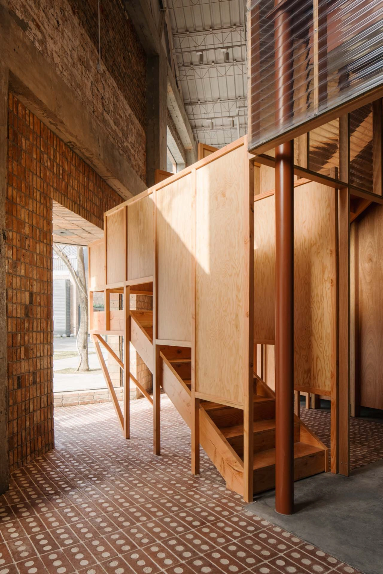
The core of the design features two interlaced frameworks, one transparent and the other solid, creating a crystal-like structure that plays with light and space. The transparent house, clad with corrugated polycarbonate panels, offers a glimpse into the interior, while the back house, wrapped in timber panels, anchors the space. These frameworks are strategically positioned at a 45-degree angle, establishing a new spatial order that enriches the visitor's experience both visually and experientially.

The layout is cleverly organized around two sets of identical columns, creating a sequence of rooms that flow into each other, offering flexible spaces for various events and gatherings. The design also cleverly utilizes the negative space between the existing brick walls and the new frameworks, crafting areas that are both semi-interior and semi-exterior.

A key feature is the mezzanine floor, where unexpected elements like a triangular balcony, pergolas, and a staircase are seamlessly integrated into the design. The staircase, in particular, is placed in a constrained area, creating a glass box in a triangular shape on the facade, highlighting the interplay between architectural boundaries and interior components.

Atelier tao+c's design philosophy is grounded in the authentic craft of construction, making every component of the structure visible and traceable. The layers of the structure, from steel floor decks to I-beams, ducts, piping, and the dropped ceiling, are clearly defined, reminiscent of the earth's layers. This approach not only tells the story of the building's construction but also serves as both the structure and the finish.

The material selection is deliberate, utilizing common industrial materials like steel beams, timber, and bricks, regardless of cost, texture, or grade. This choice aims to eliminate hierarchy within the space, creating a harmonious environment in the Ziin Store. The juxtaposition of these ordinary materials on one elevation narrates the design details and contributes to a warm and inviting atmosphere.

This project is an exemplary model of cost-effective design, utilizing basic formal logic, mundane materials, and construction techniques. It showcases the potential of adaptive reuse, transforming an old warehouse into a vibrant, multi-functional space that respects its historical context while embracing modern design principles.

Interested in Showcasing Your Work?

If you would like to feature your works on Thisispaper, please visit our Submission page and sign up to Thisispaper+ to submit your work. Once your submission is approved, your work will be showcased to our global audience of 2 million art, architecture, and design professionals and enthusiasts.
No items found.
We love less
but there is more.
Become a Thisispaper+ member today to unlock full access to our magazine, advanced tools, and support our work.
Join Thisispaper+
No items found.
Zuzanna Gasior
Nov 29, 2023

Atelier tao+c's innovative approach in transforming a 1960s textile warehouse into a showroom for ZIIN is a compelling exercise in architectural ingenuity and material storytelling.

The core of the design features two interlaced frameworks, one transparent and the other solid, creating a crystal-like structure that plays with light and space. The transparent house, clad with corrugated polycarbonate panels, offers a glimpse into the interior, while the back house, wrapped in timber panels, anchors the space. These frameworks are strategically positioned at a 45-degree angle, establishing a new spatial order that enriches the visitor's experience both visually and experientially.

The layout is cleverly organized around two sets of identical columns, creating a sequence of rooms that flow into each other, offering flexible spaces for various events and gatherings. The design also cleverly utilizes the negative space between the existing brick walls and the new frameworks, crafting areas that are both semi-interior and semi-exterior.

A key feature is the mezzanine floor, where unexpected elements like a triangular balcony, pergolas, and a staircase are seamlessly integrated into the design. The staircase, in particular, is placed in a constrained area, creating a glass box in a triangular shape on the facade, highlighting the interplay between architectural boundaries and interior components.

Atelier tao+c's design philosophy is grounded in the authentic craft of construction, making every component of the structure visible and traceable. The layers of the structure, from steel floor decks to I-beams, ducts, piping, and the dropped ceiling, are clearly defined, reminiscent of the earth's layers. This approach not only tells the story of the building's construction but also serves as both the structure and the finish.

The material selection is deliberate, utilizing common industrial materials like steel beams, timber, and bricks, regardless of cost, texture, or grade. This choice aims to eliminate hierarchy within the space, creating a harmonious environment in the Ziin Store. The juxtaposition of these ordinary materials on one elevation narrates the design details and contributes to a warm and inviting atmosphere.

This project is an exemplary model of cost-effective design, utilizing basic formal logic, mundane materials, and construction techniques. It showcases the potential of adaptive reuse, transforming an old warehouse into a vibrant, multi-functional space that respects its historical context while embracing modern design principles.

Interested in Showcasing Your Work?

If you would like to feature your works on Thisispaper, please visit our Submission page and subscribe to Thisispaper+. Once your submission is approved, your work will be showcased to our global audience of 2 million art, architecture, and design professionals and enthusiasts.
No items found.

Join Thisispaper+
Become a Thisispaper+ member today to unlock full access to our magazine, submit your project and support our work.
Travel Guides
Immerse yourself in timeless destinations, hidden gems, and creative spaces—curated by humans, not algorithms.
Explore All Guides +
Curated Editions
Dive deeper into carefully curated editions, designed to feed your curiosity and foster exploration.
Off-the-Grid
Jutaku
Sacral Journey
minimum
The New Chair
Explore All Editions +
Submission Module
By submitting and publishing your work, you can expose your work to our global 2M audience.
Learn More+
Become a Thisispaper+ member today to unlock full access to our magazine, submit your project and support our work.