Thisispaper Community
Join today.
Enter your email address to receive the latest news on emerging art, design, lifestyle and tech from Thisispaper, delivered straight to your inbox.
Oops! Something went wrong while submitting the form.
Instant access to new channels
The top stories curated daily
Weekly roundups of what's important
Original features and deep dives
Exclusive community features
@zaxarovcom
Dec 16, 2020

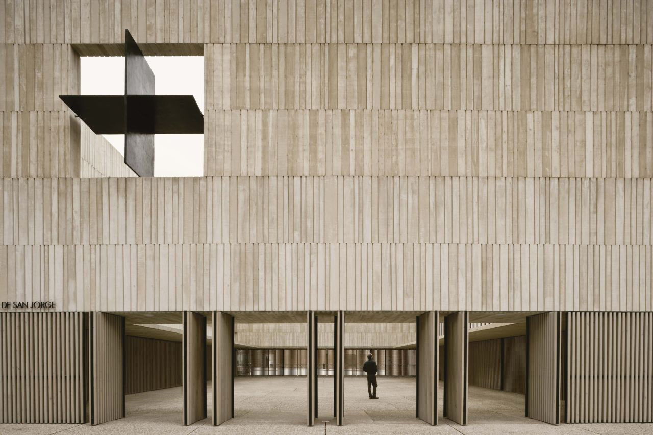
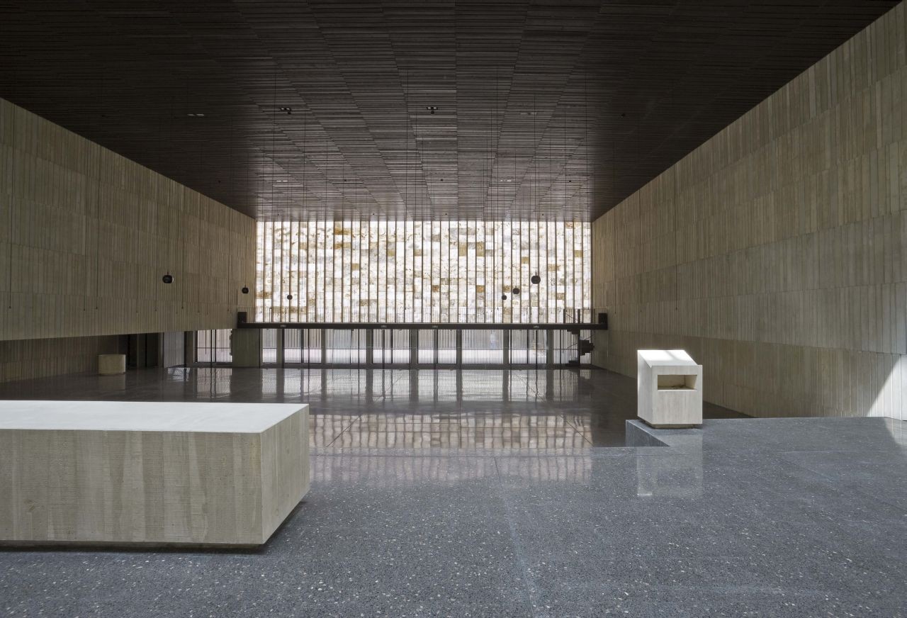
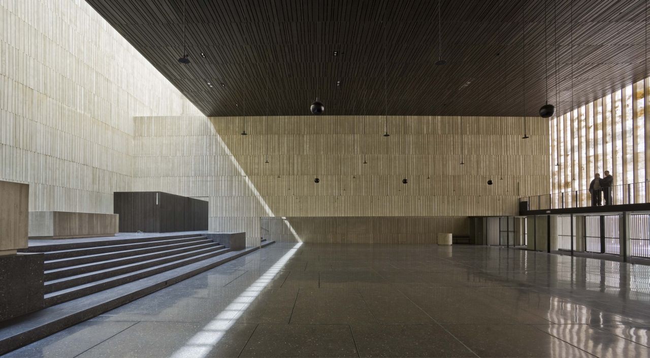
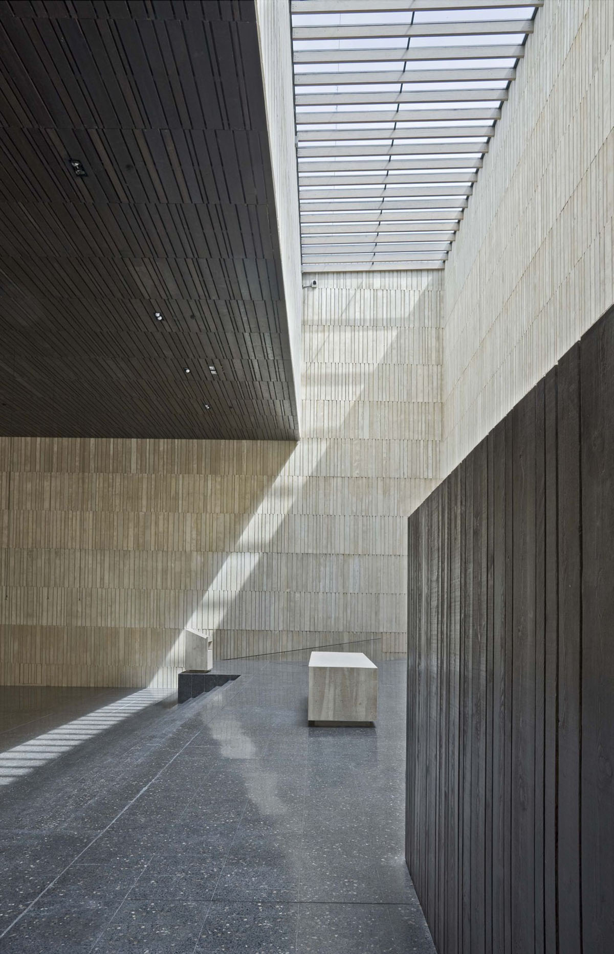
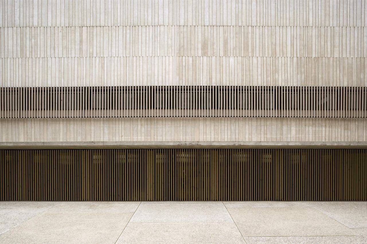
For this project designed by Tabuenca & Leache, a church-building had to be designed and built for 400 people, including a chapel which would cater for about 100 people to use it on a daily basis.

An urban planning study placed the building in the center of a space which was surrounded by buildings as high as eight storeys: A difficult and somewhat bland situation to deal with. In addition, the site spilled out onto 2 squares on 2 of its sides. When architects designed the building, they realised that the relationship between these 2 squares and how they interconnect, would become the pivot point for the complex as a whole.

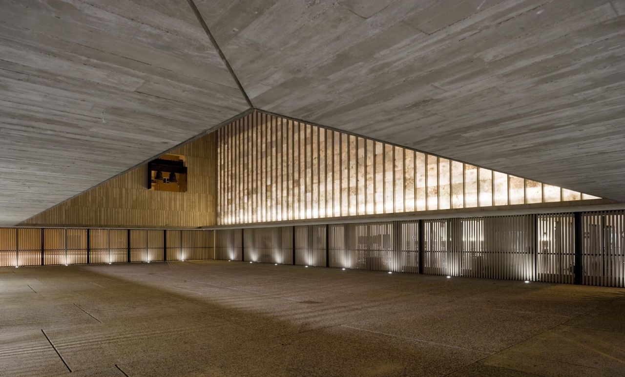
The church stands perpendicular to the neighborhood´s main street. The architects positioned it so that it would conform to the sequence of the existing row of buildings, by having it follow the same line as the others. This helps the building occupy its place in the neighbourhood, seamlessly and with discretion. A large atrium acts as an exterior entrance hall, linking the 2 squares previously mentioned and creating an urban scenario for those people who simply pass through it, while at the same time, it serves as a meeting and gathering point for congregants just before they enter the temple. The atrium also connects the church to the parish centre, which contains the apartments for the priests on the top floor. A raised patio that runs the full length of the facade allows for illumination without disturbing the privacy of others.

This trinity of its main parts (the atrium, temple and parish center) combine under a unified appearance, like that of a church-fortress that protects all that is within and around her, but also serves as a neutral backdrop to the built environment.

Interested in Showcasing Your Work?

If you would like to feature your works on Thisispaper, please visit our Submission page and sign up to Thisispaper+ to submit your work. Once your submission is approved, your work will be showcased to our global audience of 2 million art, architecture, and design professionals and enthusiasts.
No items found.
We love less
but there is more.
Become a Thisispaper+ member today to unlock full access to our magazine, advanced tools, and support our work.
Join Thisispaper+
No items found.
@zaxarovcom
Dec 16, 2020

For this project designed by Tabuenca & Leache, a church-building had to be designed and built for 400 people, including a chapel which would cater for about 100 people to use it on a daily basis.

An urban planning study placed the building in the center of a space which was surrounded by buildings as high as eight storeys: A difficult and somewhat bland situation to deal with. In addition, the site spilled out onto 2 squares on 2 of its sides. When architects designed the building, they realised that the relationship between these 2 squares and how they interconnect, would become the pivot point for the complex as a whole.

The church stands perpendicular to the neighborhood´s main street. The architects positioned it so that it would conform to the sequence of the existing row of buildings, by having it follow the same line as the others. This helps the building occupy its place in the neighbourhood, seamlessly and with discretion. A large atrium acts as an exterior entrance hall, linking the 2 squares previously mentioned and creating an urban scenario for those people who simply pass through it, while at the same time, it serves as a meeting and gathering point for congregants just before they enter the temple. The atrium also connects the church to the parish centre, which contains the apartments for the priests on the top floor. A raised patio that runs the full length of the facade allows for illumination without disturbing the privacy of others.

This trinity of its main parts (the atrium, temple and parish center) combine under a unified appearance, like that of a church-fortress that protects all that is within and around her, but also serves as a neutral backdrop to the built environment.

Interested in Showcasing Your Work?

If you would like to feature your works on Thisispaper, please visit our Submission page and subscribe to Thisispaper+. Once your submission is approved, your work will be showcased to our global audience of 2 million art, architecture, and design professionals and enthusiasts.
Thisispaper+
Sacral Journey
60+ Locations
Web Access
Link to Maps
This channel is a global survey of some of the best sacral spaces of the last few decades. A final step of this research will be creating a digital and print publication of all featured destinations.
Explore
Sacral Journey

Join Thisispaper+
Become a Thisispaper+ member today to unlock full access to our magazine, submit your project and support our work.
Travel Guides
Immerse yourself in timeless destinations, hidden gems, and creative spaces—curated by humans, not algorithms.
Explore All Guides +
Curated Editions
Dive deeper into carefully curated editions, designed to feed your curiosity and foster exploration.
Off-the-Grid
Jutaku
Sacral Journey
minimum
The New Chair
Explore All Editions +
Submission Module
By submitting and publishing your work, you can expose your work to our global 2M audience.
Learn More+
Become a Thisispaper+ member today to unlock full access to our magazine, submit your project and support our work.