Thisispaper Community
Join today.
Enter your email address to receive the latest news on emerging art, design, lifestyle and tech from Thisispaper, delivered straight to your inbox.
Oops! Something went wrong while submitting the form.
Instant access to new channels
The top stories curated daily
Weekly roundups of what's important
Original features and deep dives
Exclusive community features
Zuzanna Gasior
Dec 5, 2021

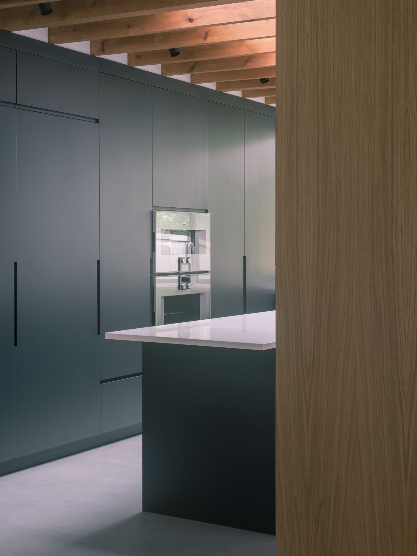
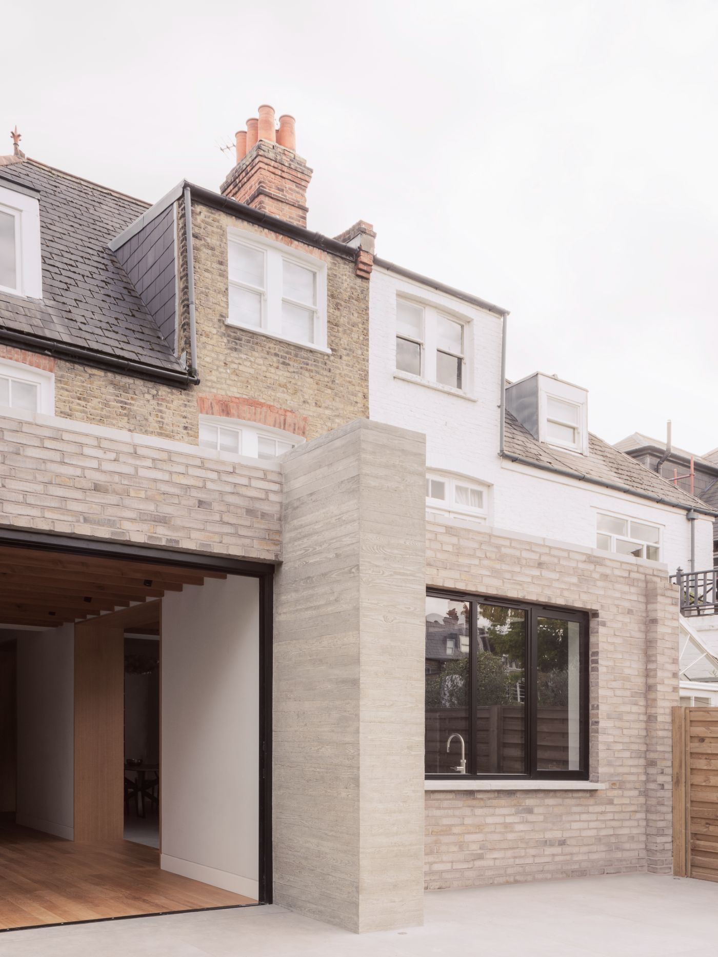
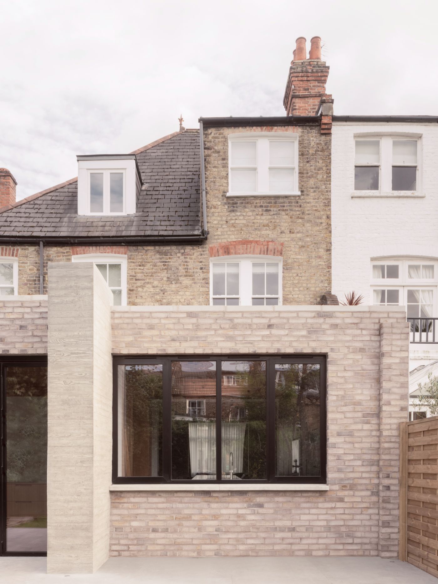
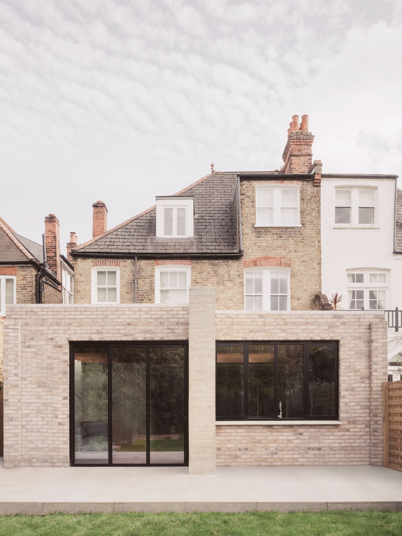
RR Residence is a residential extension and renovation of an Edwardian property in Clapham, London, by architecture practice Studio McW that combines a limited and elemental material palette with unobtrusive layout design to achieve a deceptively simple, minimalistic finish.

A palimpsest of previous renovations, the house was stripped back, extended and internally rebuilt in a sensitive manner, which included new services and better insulation to improve thermal performance. The existing property was a typical Edwardian residential villa; wider and deeper, with fewer rooms and bigger hallways than the preceding Victorian housing type. The client’s loved the proportions of the house, as well as the large front and rear gardens that bookended the house. Their desire to celebrate the proportions as well as encourage views and access onto the rear garden.

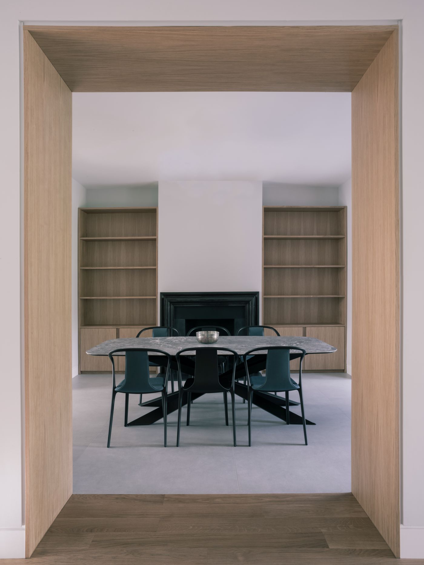
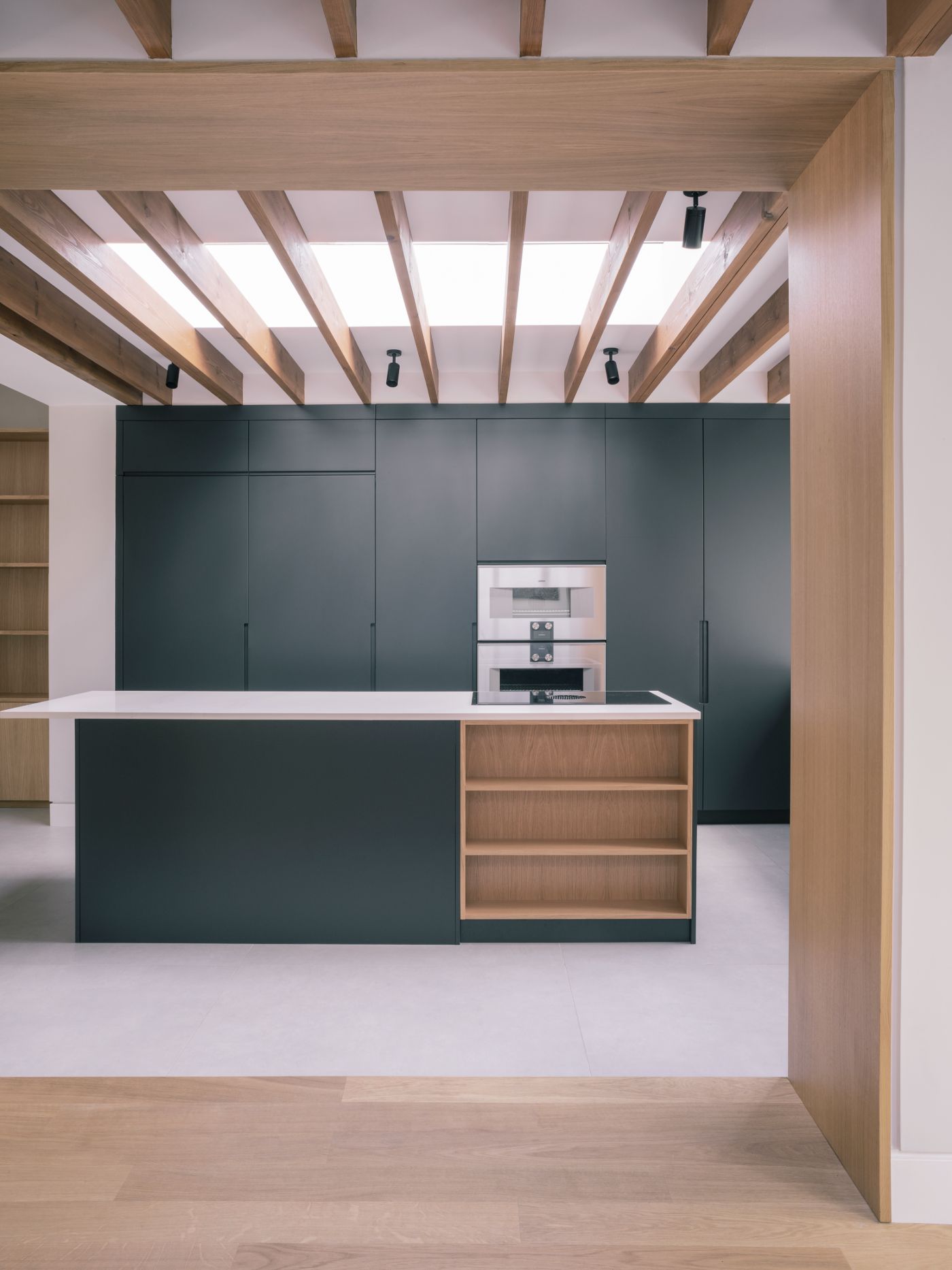
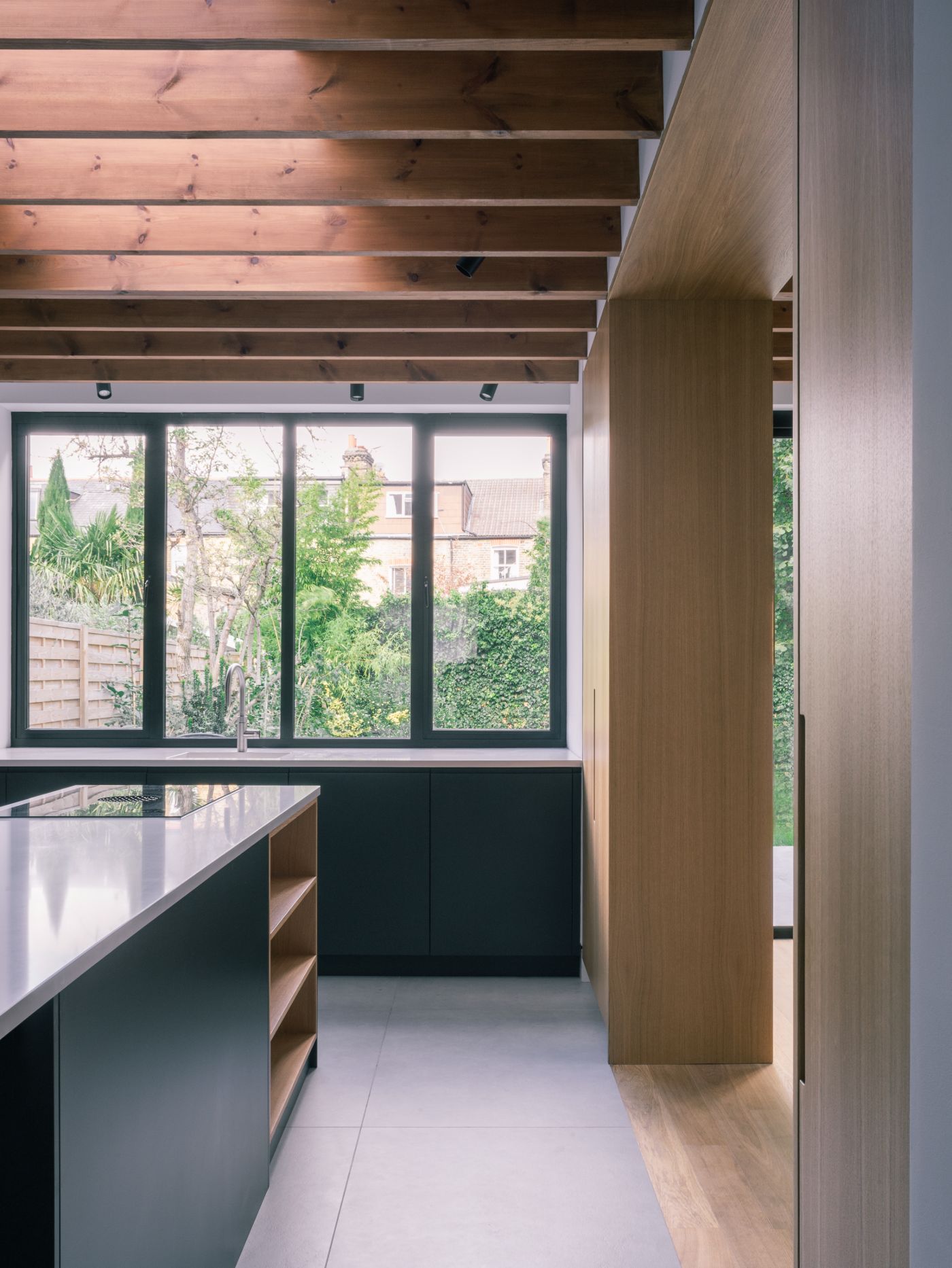
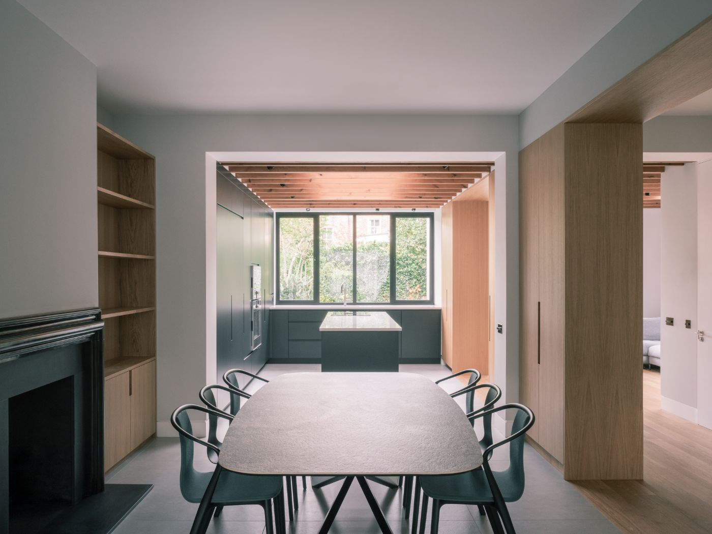
The design created a central axis through the ground floor, improving the visual connection through property. On entering through the front door, the user is drawn physically and visually to the rear garden. The axial hallway through the house is strengthened by being designed as a double-loaded corridor of served and servant spaces. To the right-hand side, there is a washroom, utility, cloakroom, plant room and a generous hallway with bespoke, but discreet staircase. On the left is the formal living room, dining room, kitchen and family room. The proportions of the thresholds and openings of the existing Edwardian terrace off the main corridor were emphasised by being made wider, taller and deeper with joinery lined with oak.

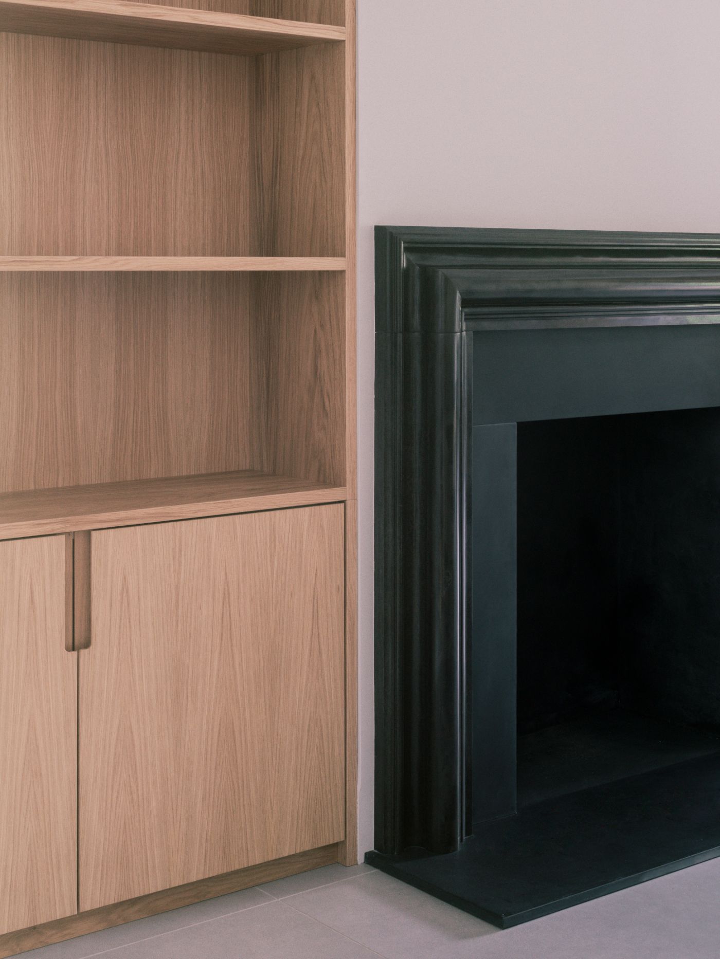
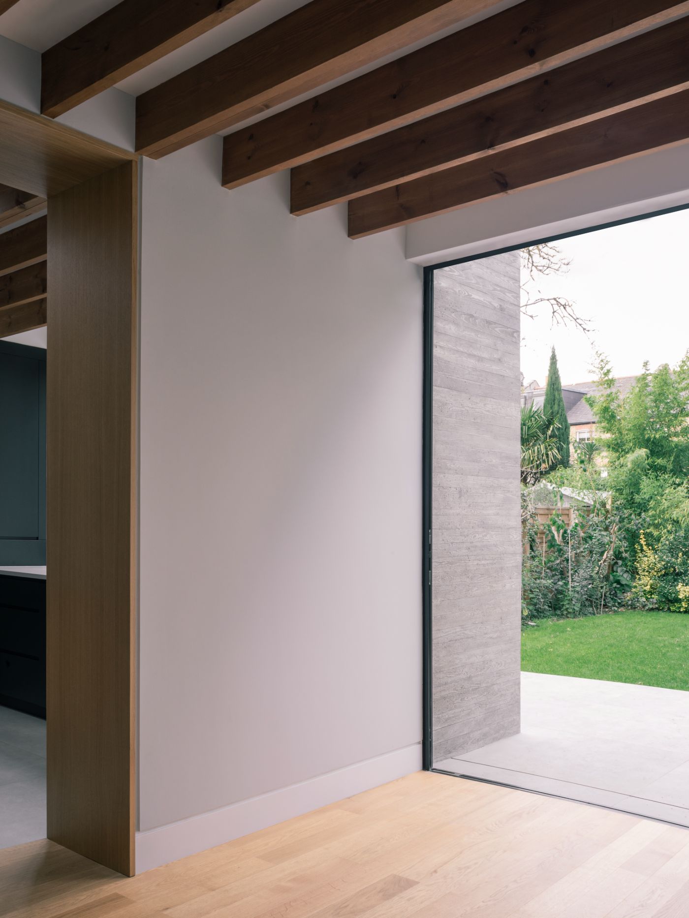
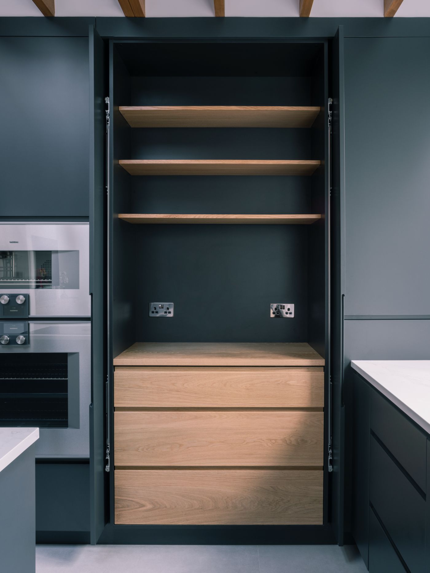
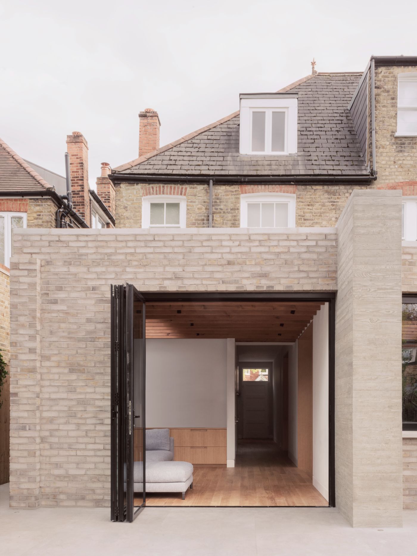
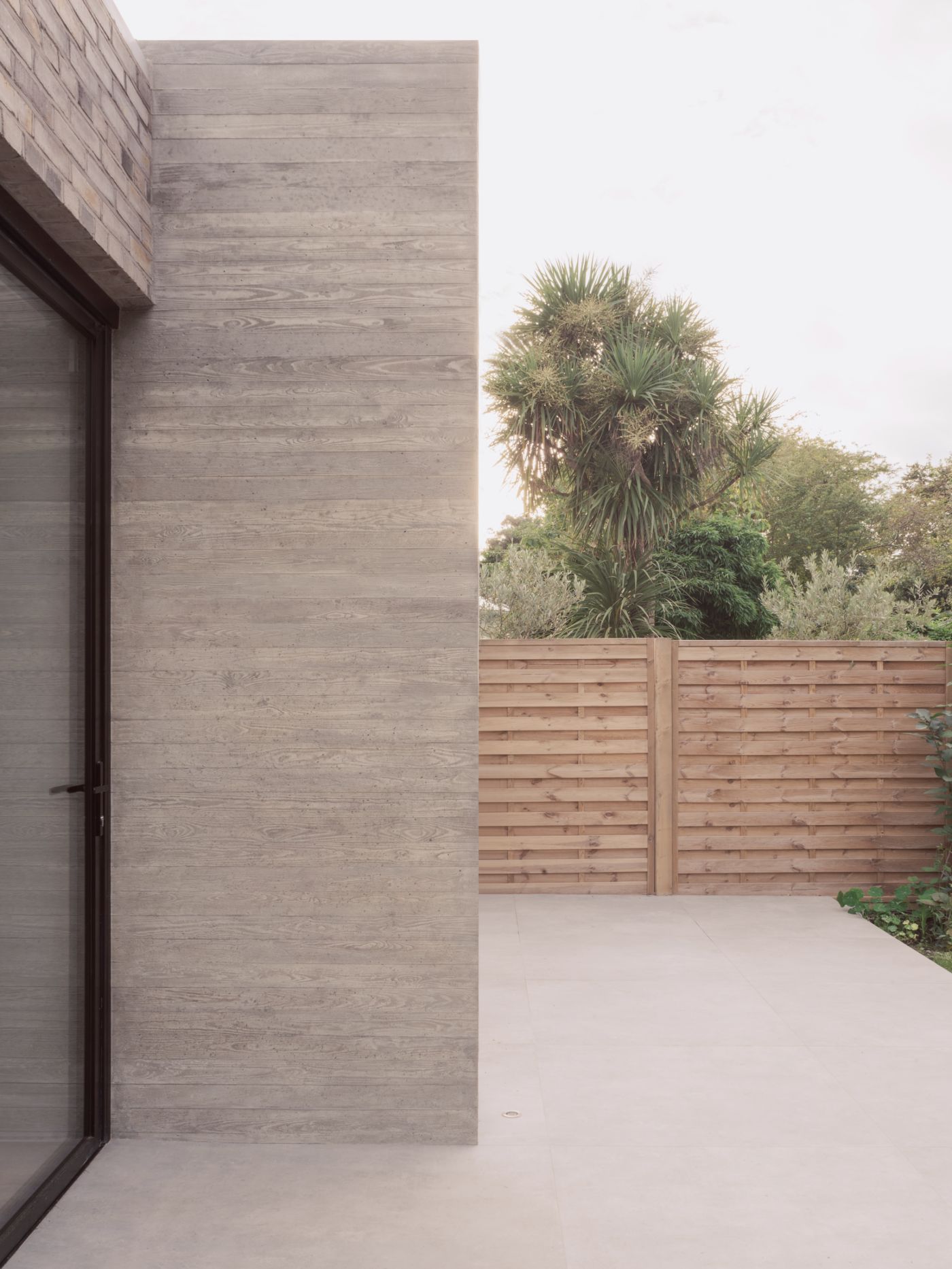
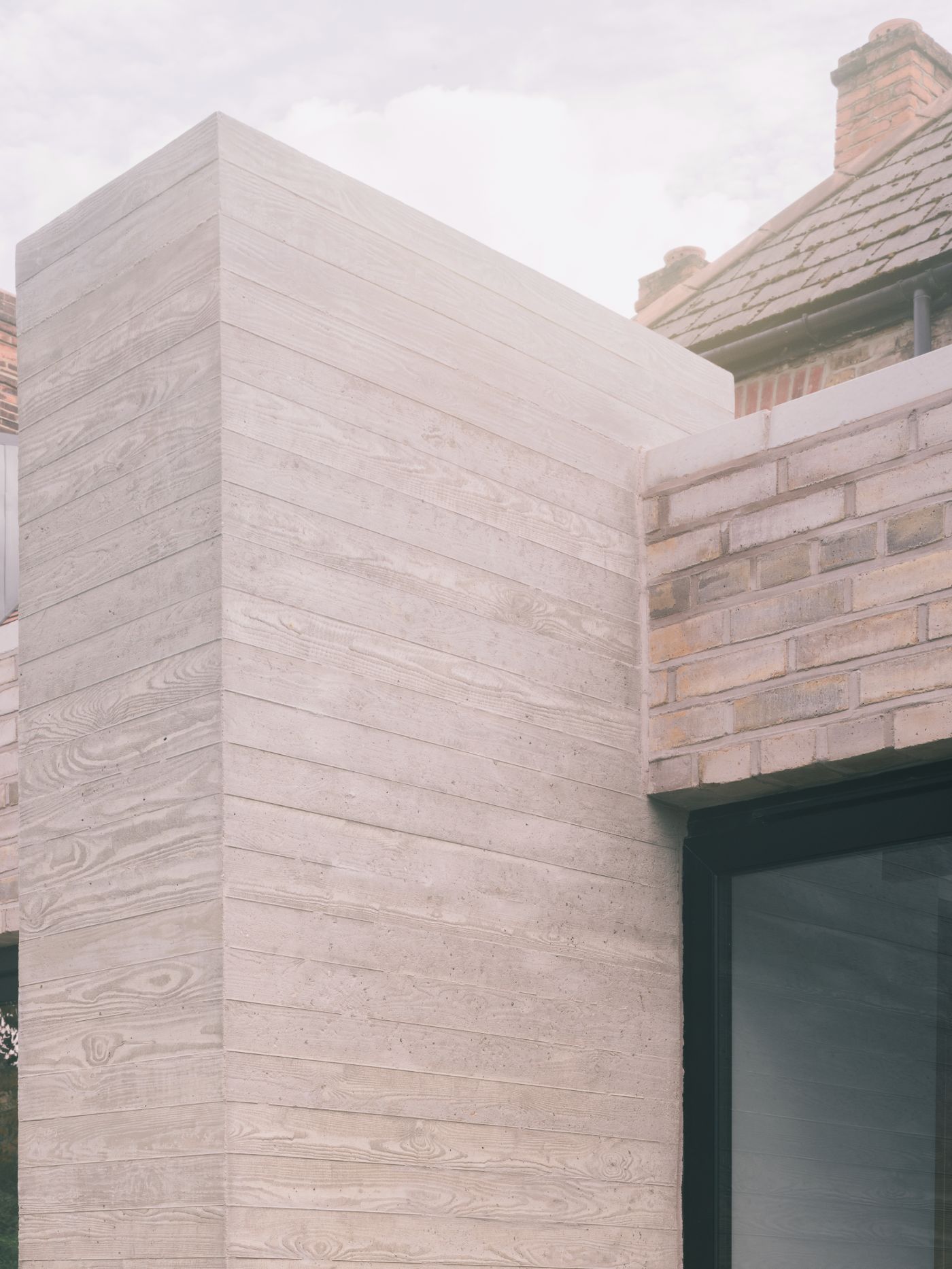
The transitions between spaces was an important aspect of design and a way to celebrate the original Edwardian openings. By embedding the joinery storage into the architecture of the home and lining the transition spaces, it represents an efficiency and integrity that the Edwardian designs became known for. An extreme reduction in the palette of materials heighten the simplicity of the design and celebrate the raw, natural properties were used; oak panelling, board marked concrete and pale grey bricks. Based around the natural, robust materials; the main goal was to create a calming, informal atmosphere. A visually heavy in-situ cast concrete column, acts as an anchor for the axis and the centre of the rear façade. Either side of the column the extension can be read as two volumes, both built in pale grey brick with pale grey mortar to give a monolithic appearance to contrast the existing property.

Subtle detailing, such as turning the brick on edge, references the height of the internal oak exposed ceiling joists. The sawn timber shuttering used to texture the concrete façade matches the height of the pale brick, along with the concrete sills and coping. Carefully considered internal detailing also emphasises the simplicity of design and provides a consistent architectural language through the house. The thresholds between rooms align with the skylights overhead and the exposed joists as well as the joinery below, while the external windows and openings align at either side of the property. This rich detailing alongside functional layouts, simple volumetric composition and rough, tactile poetry of the material selection provide an experience of great calm, comfort and practicality.

Interested in Showcasing Your Work?

If you would like to feature your works on Thisispaper, please visit our Submission page and sign up to Thisispaper+ to submit your work. Once your submission is approved, your work will be showcased to our global audience of 2 million art, architecture, and design professionals and enthusiasts.
No items found.
We love less
but there is more.
Become a Thisispaper+ member today to unlock full access to our magazine, advanced tools, and support our work.
Join Thisispaper+
No items found.
Zuzanna Gasior
Dec 5, 2021

RR Residence is a residential extension and renovation of an Edwardian property in Clapham, London, by architecture practice Studio McW that combines a limited and elemental material palette with unobtrusive layout design to achieve a deceptively simple, minimalistic finish.

A palimpsest of previous renovations, the house was stripped back, extended and internally rebuilt in a sensitive manner, which included new services and better insulation to improve thermal performance. The existing property was a typical Edwardian residential villa; wider and deeper, with fewer rooms and bigger hallways than the preceding Victorian housing type. The client’s loved the proportions of the house, as well as the large front and rear gardens that bookended the house. Their desire to celebrate the proportions as well as encourage views and access onto the rear garden.

The design created a central axis through the ground floor, improving the visual connection through property. On entering through the front door, the user is drawn physically and visually to the rear garden. The axial hallway through the house is strengthened by being designed as a double-loaded corridor of served and servant spaces. To the right-hand side, there is a washroom, utility, cloakroom, plant room and a generous hallway with bespoke, but discreet staircase. On the left is the formal living room, dining room, kitchen and family room. The proportions of the thresholds and openings of the existing Edwardian terrace off the main corridor were emphasised by being made wider, taller and deeper with joinery lined with oak.

The transitions between spaces was an important aspect of design and a way to celebrate the original Edwardian openings. By embedding the joinery storage into the architecture of the home and lining the transition spaces, it represents an efficiency and integrity that the Edwardian designs became known for. An extreme reduction in the palette of materials heighten the simplicity of the design and celebrate the raw, natural properties were used; oak panelling, board marked concrete and pale grey bricks. Based around the natural, robust materials; the main goal was to create a calming, informal atmosphere. A visually heavy in-situ cast concrete column, acts as an anchor for the axis and the centre of the rear façade. Either side of the column the extension can be read as two volumes, both built in pale grey brick with pale grey mortar to give a monolithic appearance to contrast the existing property.

Subtle detailing, such as turning the brick on edge, references the height of the internal oak exposed ceiling joists. The sawn timber shuttering used to texture the concrete façade matches the height of the pale brick, along with the concrete sills and coping. Carefully considered internal detailing also emphasises the simplicity of design and provides a consistent architectural language through the house. The thresholds between rooms align with the skylights overhead and the exposed joists as well as the joinery below, while the external windows and openings align at either side of the property. This rich detailing alongside functional layouts, simple volumetric composition and rough, tactile poetry of the material selection provide an experience of great calm, comfort and practicality.
Interested in Showcasing Your Work?

If you would like to feature your works on Thisispaper, please visit our Submission page and subscribe to Thisispaper+. Once your submission is approved, your work will be showcased to our global audience of 2 million art, architecture, and design professionals and enthusiasts.
Thisispaper+
DwellWell
100+ Projects
Web Access
Link to Maps
Wellbeing as an outcome of ongoing relations happening in space and time. Things, environments, and experiences that are designed to enhance life and enable us to thrive.
Explore
DwellWell

Join Thisispaper+
Become a Thisispaper+ member today to unlock full access to our magazine, submit your project and support our work.
Travel Guides
Immerse yourself in timeless destinations, hidden gems, and creative spaces—curated by humans, not algorithms.
Explore All Guides +
Curated Editions
Dive deeper into carefully curated editions, designed to feed your curiosity and foster exploration.
Off-the-Grid
Jutaku
Sacral Journey
minimum
The New Chair
Explore All Editions +
Submission Module
By submitting and publishing your work, you can expose your work to our global 2M audience.
Learn More+
Become a Thisispaper+ member today to unlock full access to our magazine, submit your project and support our work.