Thisispaper Community
Join today.
Enter your email address to receive the latest news on emerging art, design, lifestyle and tech from Thisispaper, delivered straight to your inbox.
Oops! Something went wrong while submitting the form.
Instant access to new channels
The top stories curated daily
Weekly roundups of what's important
Original features and deep dives
Exclusive community features
Zuzanna Gasior
Apr 22, 2021

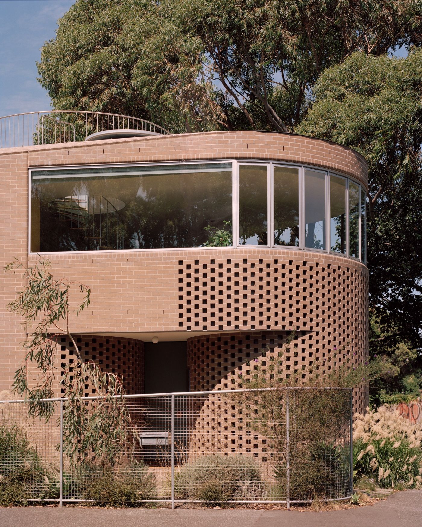
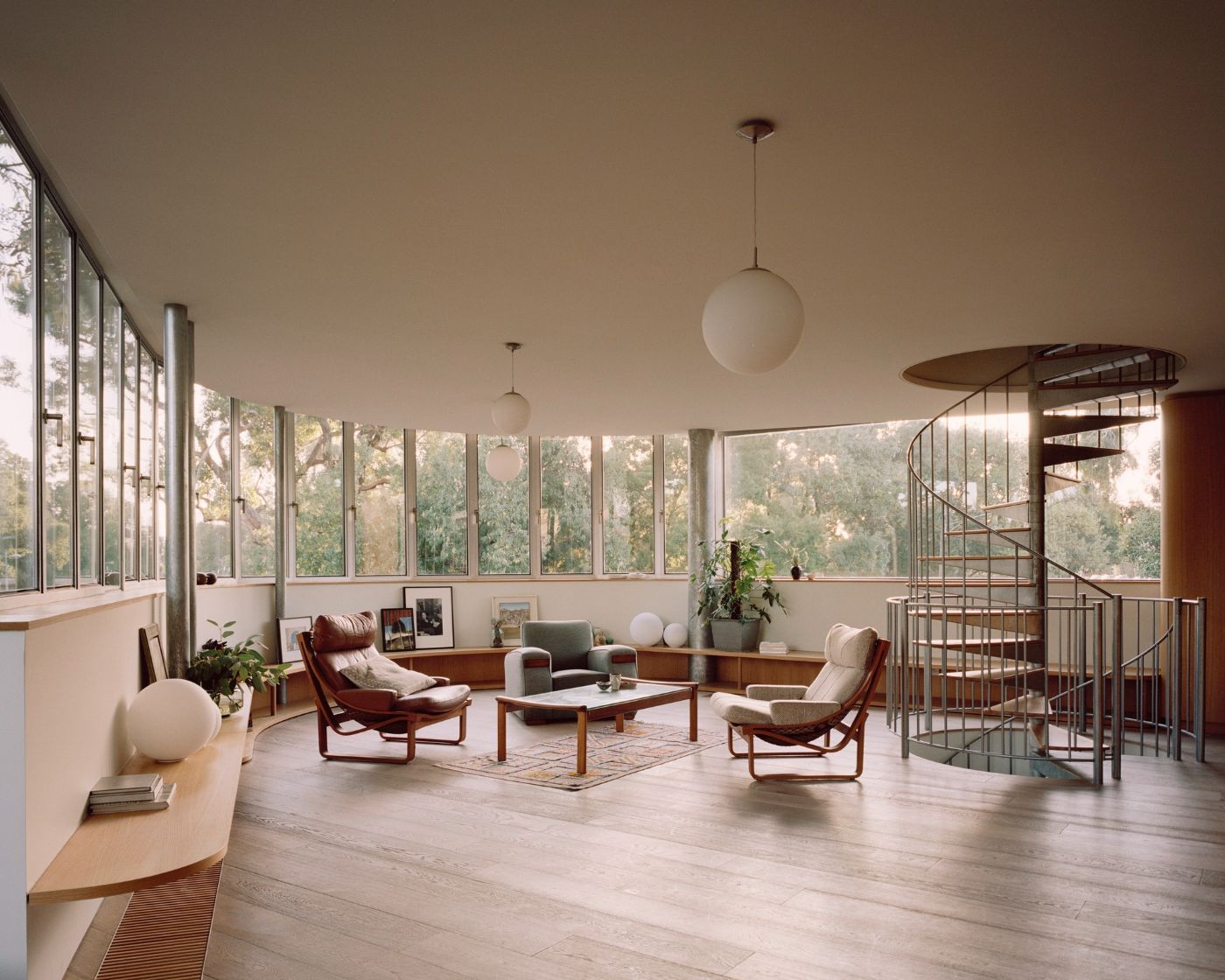
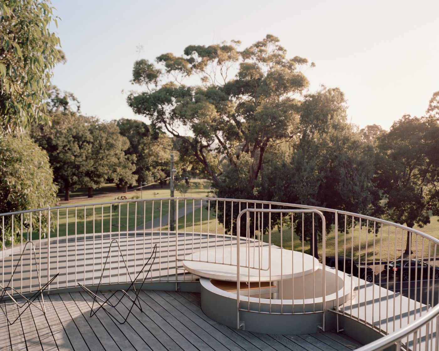
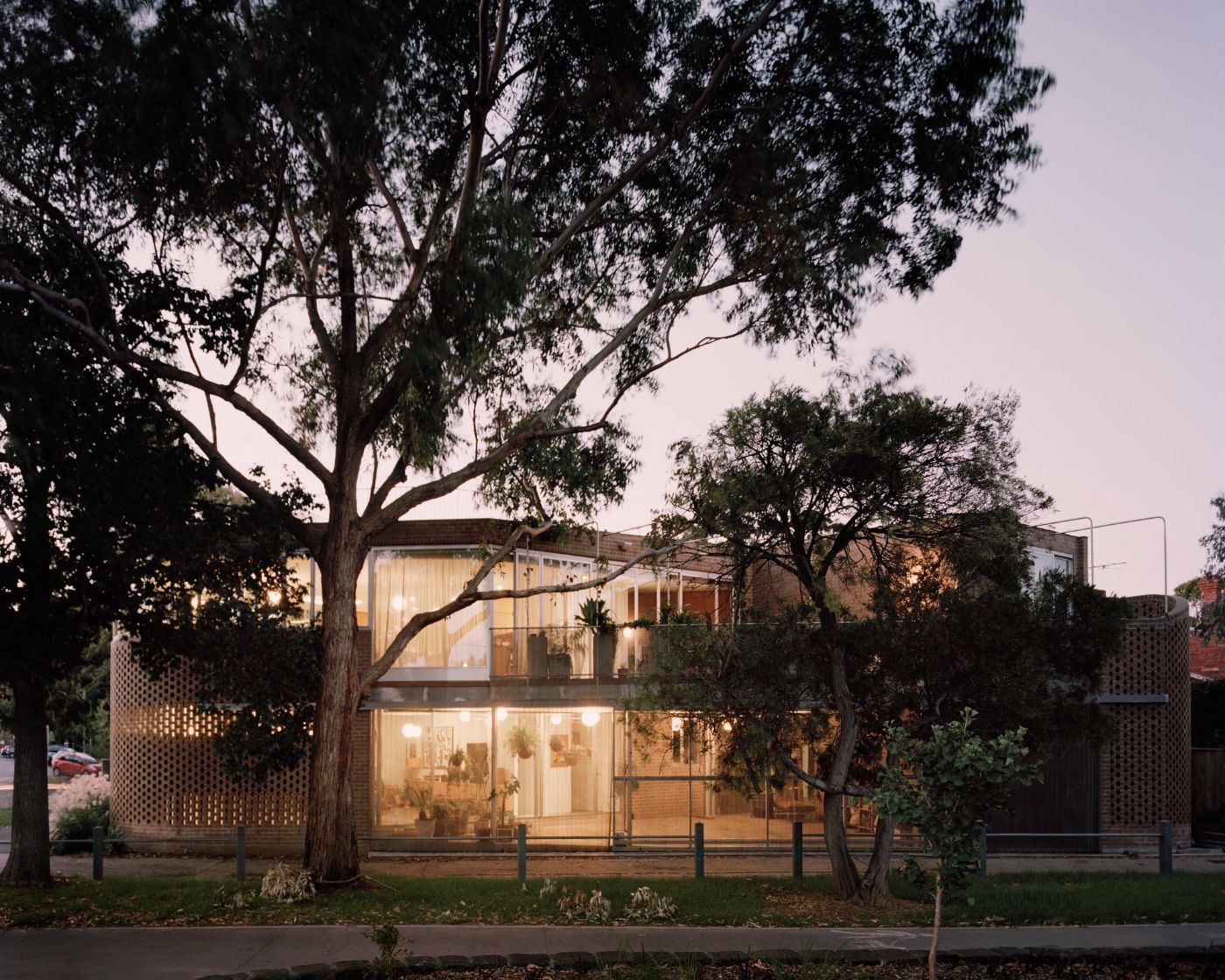
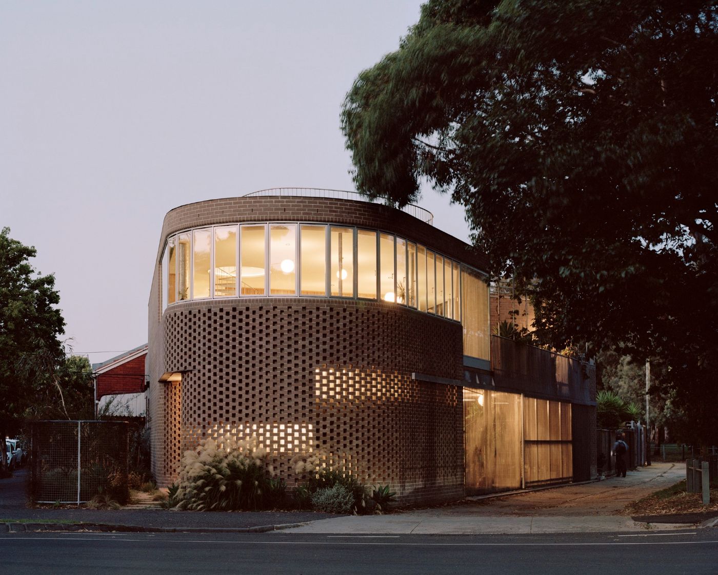
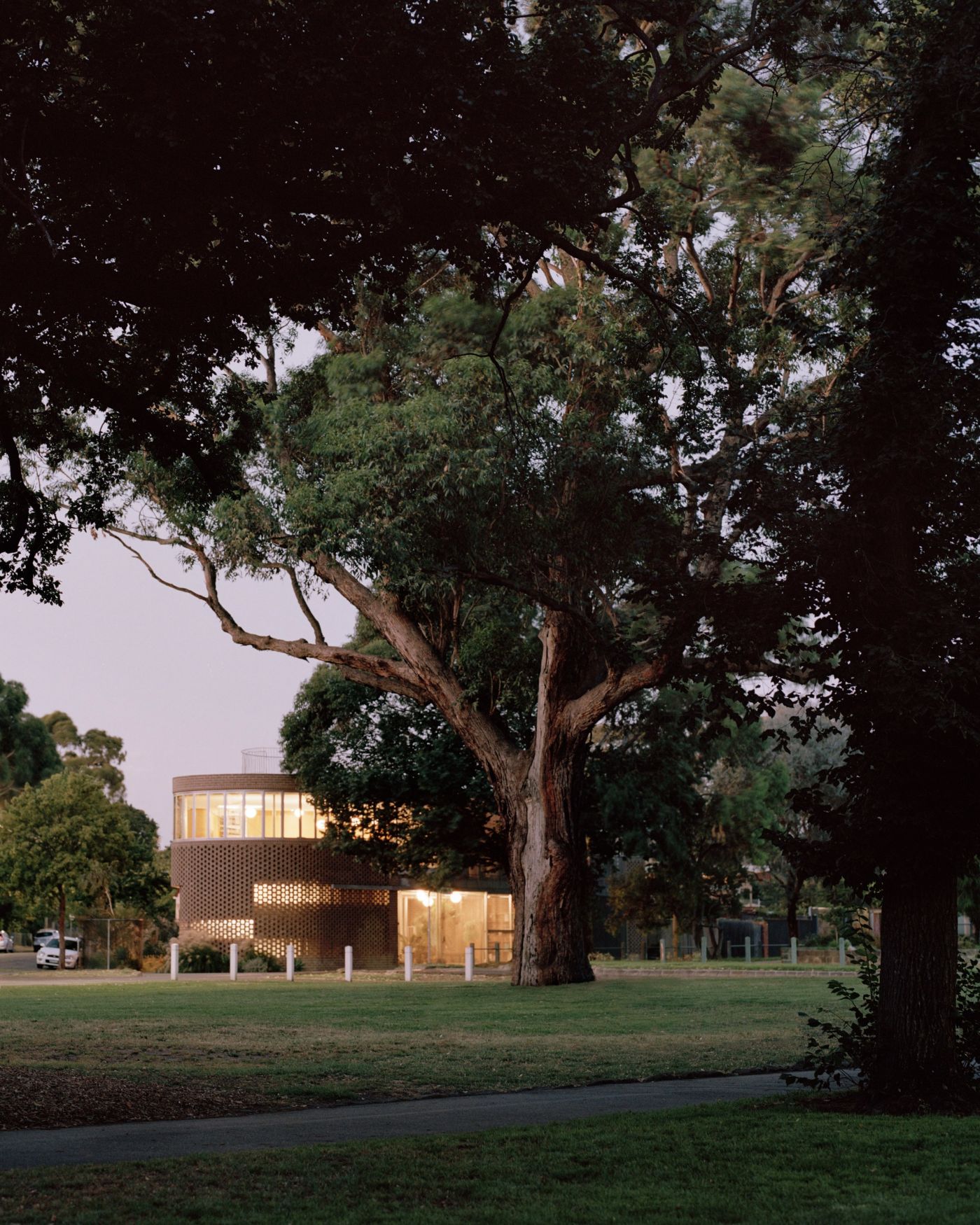
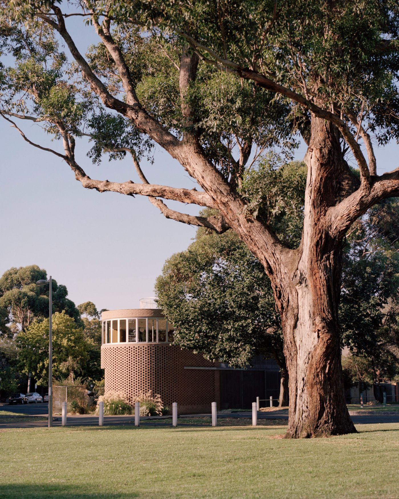
The house designed by Baracco+Wright with its rounded corners fits into the triangular plan in a very delicate and subtle way, accommodating a new living space for the Rose family.

In this family house the Baracco+Wright Architects negotiate the complex site while hoping to create an enduring building with civic presence, extending the urban form of the historic crescent and also contributing to the typology of wedge shaped buildings on similar sites throughout the inner suburbs of Melbourne. This triangular shaped site also allowed the architects to carry on their exploration of simple geometries.

There are two residences in one volume: a 2 bedroom terrace type house for the adult children and a 3 bedroom + study house for the parents. The program consists of a smaller and larger house. The smaller house is designed using the terrace typology – at just over 5 metres wide and 30 metres long – it continues the street pattern of the side street through its entry, setback and house type. The larger house faces the corner and its entry is literally the corner of the site. The two houses are treated as one form.

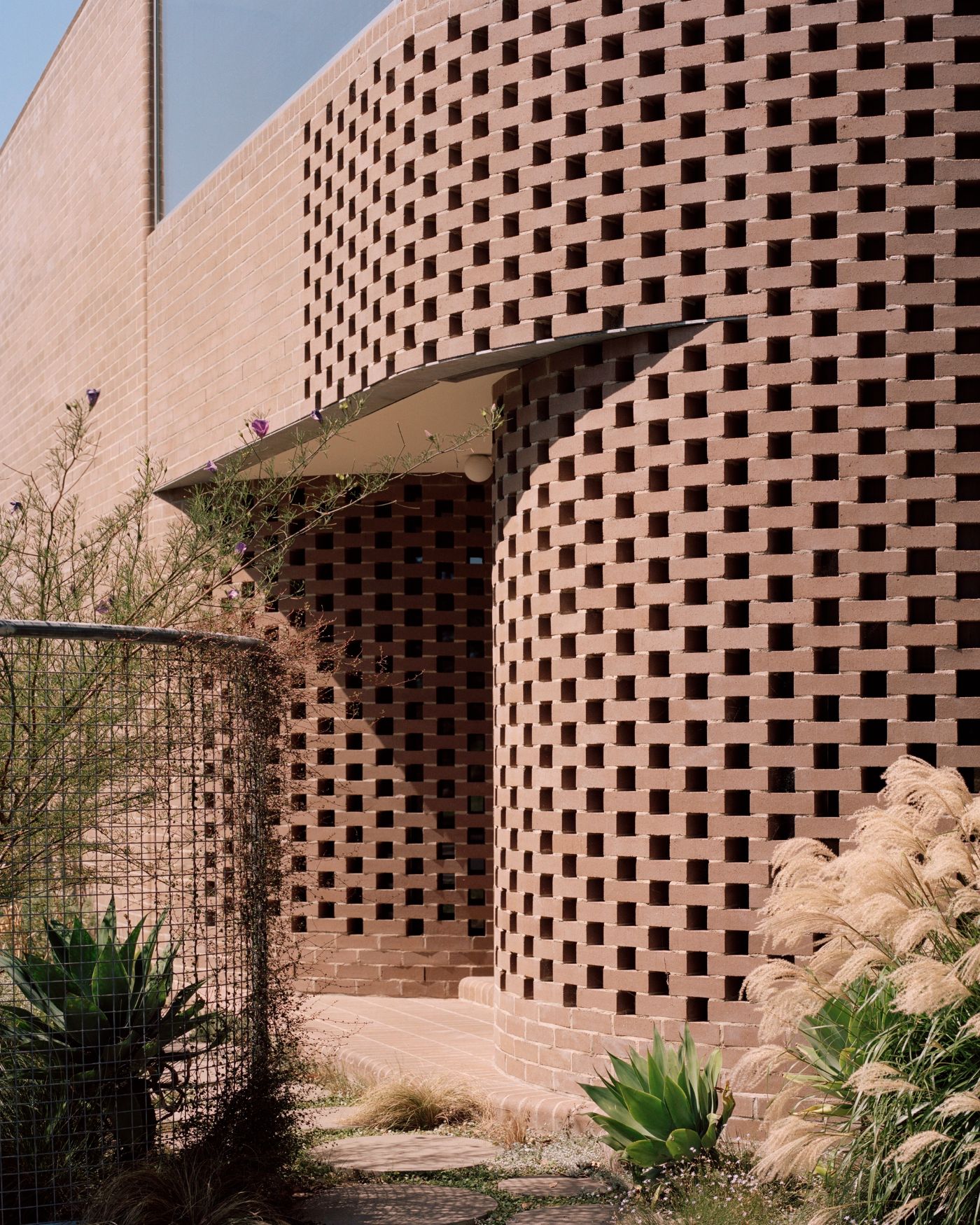
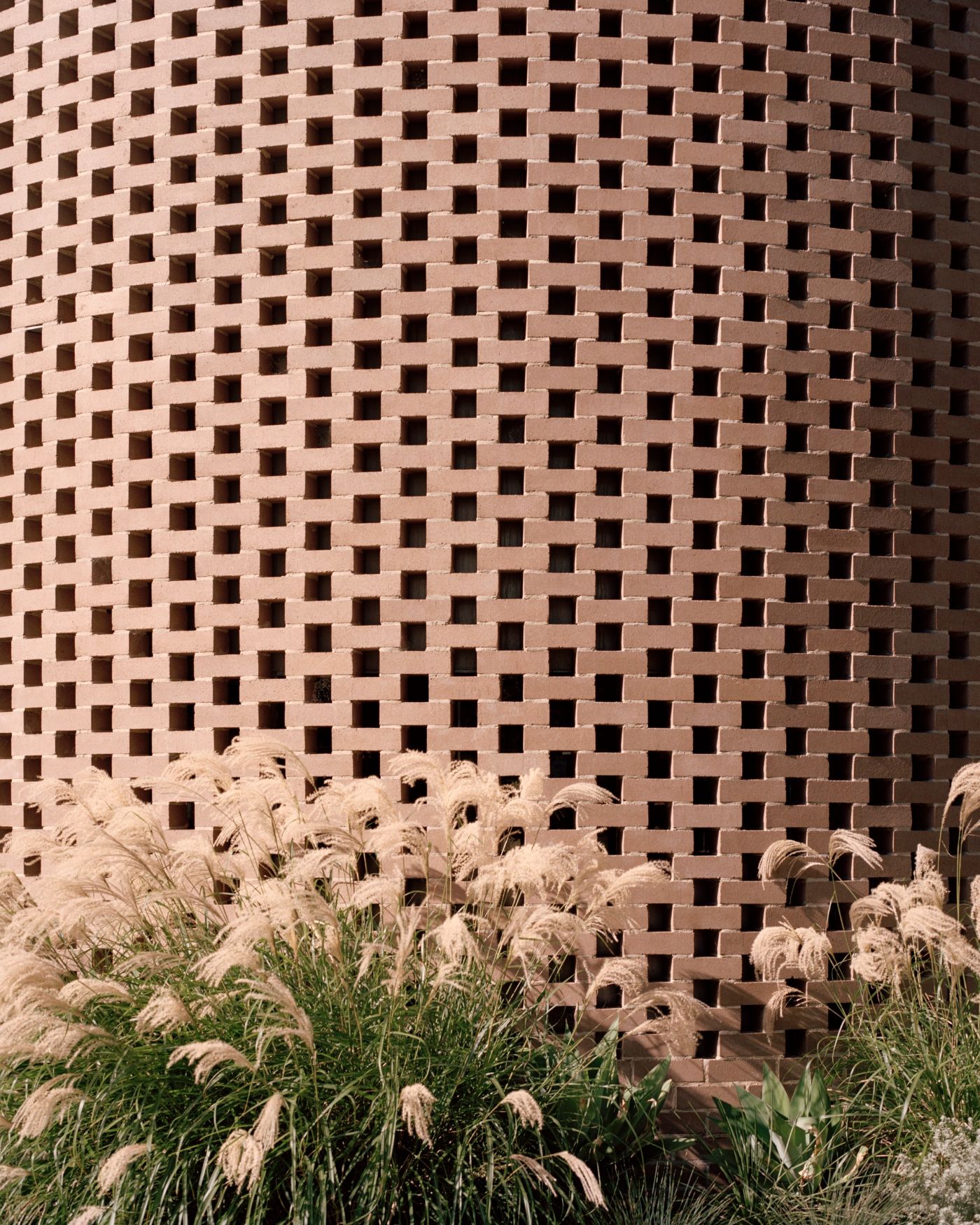
The west facade is ‘solid’, punctuated sharply through a few windows, presenting a 'hard' confident mass to the street. This condition disintegrates as the building moves around to its more intimate relationship with the reserve and busy street level (bike and pedestrian path) on the 'softer' east façade, where the materiality is a play of negative space, transparent mesh, pergola frames, reflection of trees in large windows and planting.

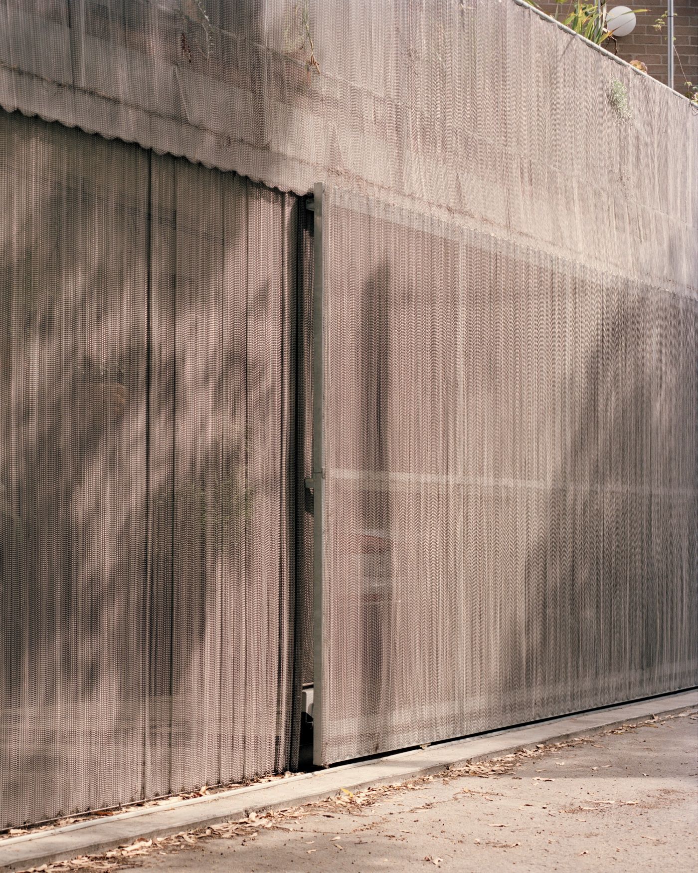
The use of a mesh curtain to enclose this space, which can be opened along its entire length, offers a generous sharing of spatial quality with the adjoining public space rather than a hard wall or garage door. This space is used recreationally but can also accommodate car parking.

The use of a planning technique of spatial displacement rather than division, one is in touch with the perimeter as they move around. This technique has been explored in many of Baracco+Wright Architects’ projects as a key planning strategy.

Interested in Showcasing Your Work?

If you would like to feature your works on Thisispaper, please visit our Submission page and sign up to Thisispaper+ to submit your work. Once your submission is approved, your work will be showcased to our global audience of 2 million art, architecture, and design professionals and enthusiasts.
No items found.
We love less
but there is more.
Become a Thisispaper+ member today to unlock full access to our magazine, advanced tools, and support our work.
Join Thisispaper+
No items found.
Zuzanna Gasior
Apr 22, 2021

The house designed by Baracco+Wright with its rounded corners fits into the triangular plan in a very delicate and subtle way, accommodating a new living space for the Rose family.

In this family house the Baracco+Wright Architects negotiate the complex site while hoping to create an enduring building with civic presence, extending the urban form of the historic crescent and also contributing to the typology of wedge shaped buildings on similar sites throughout the inner suburbs of Melbourne. This triangular shaped site also allowed the architects to carry on their exploration of simple geometries.

There are two residences in one volume: a 2 bedroom terrace type house for the adult children and a 3 bedroom + study house for the parents. The program consists of a smaller and larger house. The smaller house is designed using the terrace typology – at just over 5 metres wide and 30 metres long – it continues the street pattern of the side street through its entry, setback and house type. The larger house faces the corner and its entry is literally the corner of the site. The two houses are treated as one form.

The west facade is ‘solid’, punctuated sharply through a few windows, presenting a 'hard' confident mass to the street. This condition disintegrates as the building moves around to its more intimate relationship with the reserve and busy street level (bike and pedestrian path) on the 'softer' east façade, where the materiality is a play of negative space, transparent mesh, pergola frames, reflection of trees in large windows and planting.

The use of a mesh curtain to enclose this space, which can be opened along its entire length, offers a generous sharing of spatial quality with the adjoining public space rather than a hard wall or garage door. This space is used recreationally but can also accommodate car parking.

The use of a planning technique of spatial displacement rather than division, one is in touch with the perimeter as they move around. This technique has been explored in many of Baracco+Wright Architects’ projects as a key planning strategy.
Interested in Showcasing Your Work?

If you would like to feature your works on Thisispaper, please visit our Submission page and subscribe to Thisispaper+. Once your submission is approved, your work will be showcased to our global audience of 2 million art, architecture, and design professionals and enthusiasts.
No items found.

Join Thisispaper+
Become a Thisispaper+ member today to unlock full access to our magazine, submit your project and support our work.
Travel Guides
Immerse yourself in timeless destinations, hidden gems, and creative spaces—curated by humans, not algorithms.
Explore All Guides +
Curated Editions
Dive deeper into carefully curated editions, designed to feed your curiosity and foster exploration.
Off-the-Grid
Jutaku
Sacral Journey
minimum
The New Chair
Explore All Editions +
Submission Module
By submitting and publishing your work, you can expose your work to our global 2M audience.
Learn More+
Become a Thisispaper+ member today to unlock full access to our magazine, submit your project and support our work.