Thisispaper Community
Join today.
Enter your email address to receive the latest news on emerging art, design, lifestyle and tech from Thisispaper, delivered straight to your inbox.
Oops! Something went wrong while submitting the form.
Instant access to new channels
The top stories curated daily
Weekly roundups of what's important
Original features and deep dives
Exclusive community features
Zuzanna Gasior
Apr 7, 2024

The Petit Gervais duplex by AJAR, nestled in a cozy 50 m2 ground floor space, is a study in making the most out of material contrasts to define and enhance its modest footprint.

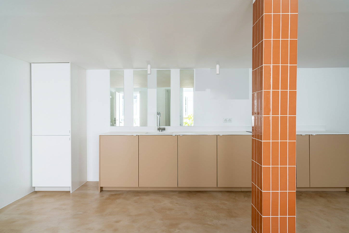
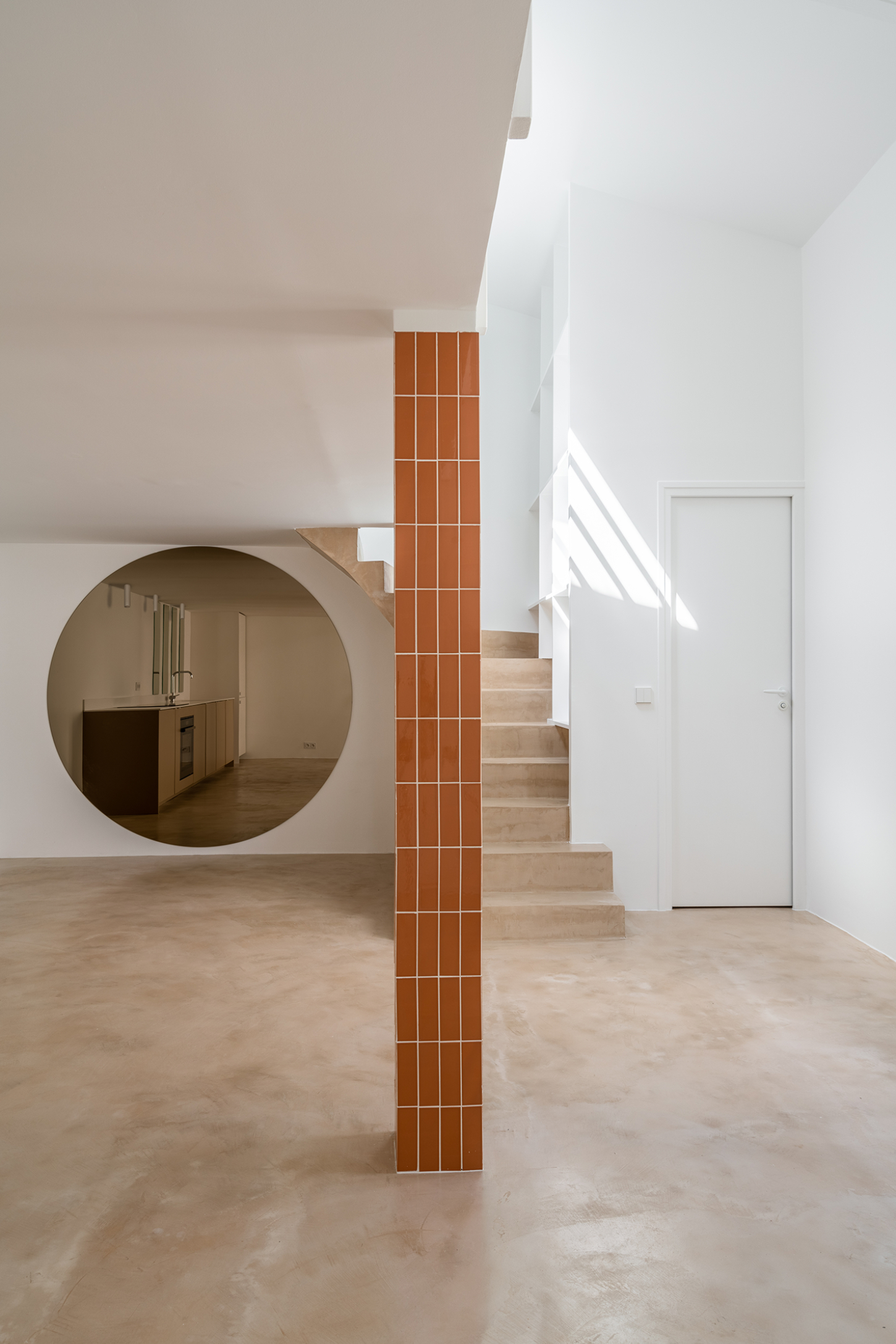
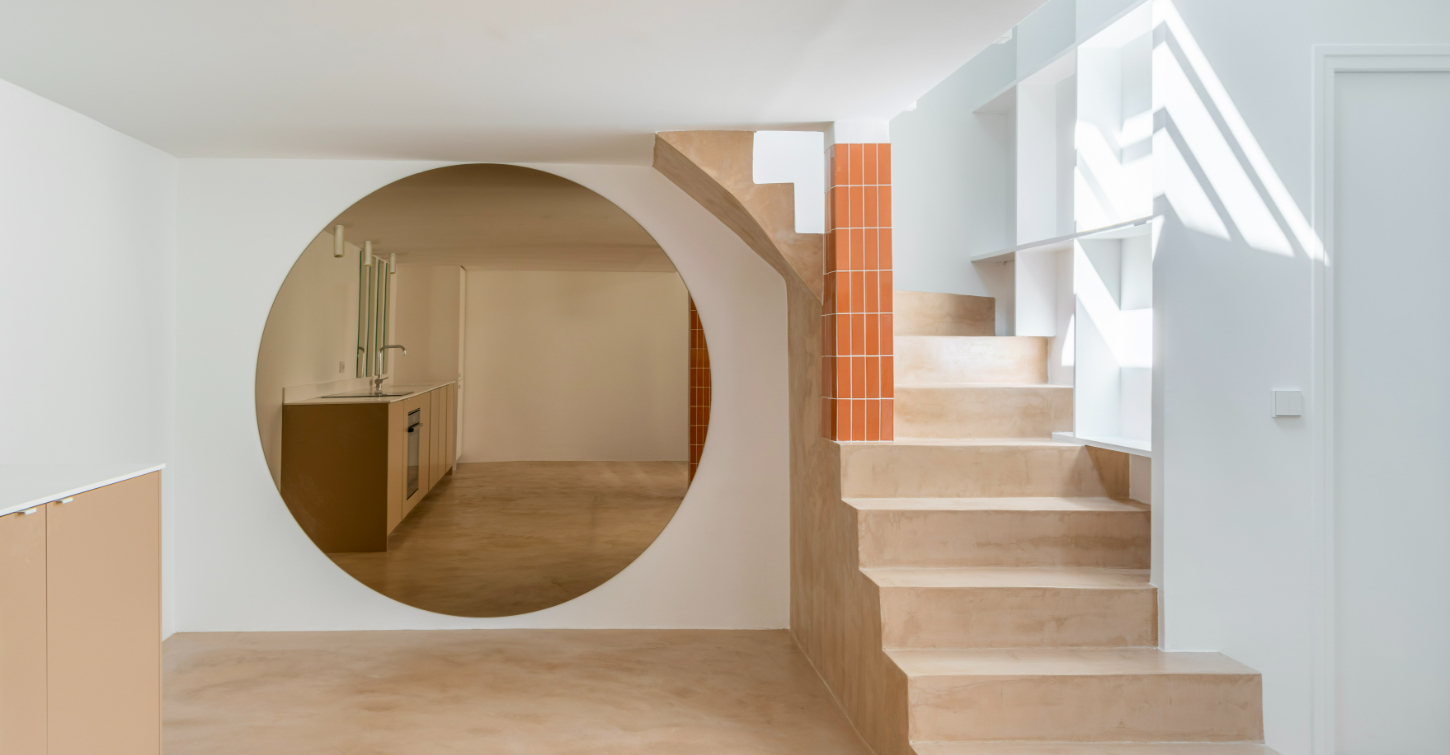
Here, waxed concrete not only covers the floor but elevates the staircase to a sculptural centerpiece, grounding the space with a solid, tactile presence. This material continuity extends into the kitchen, presenting it as a seamless extension of the living area.

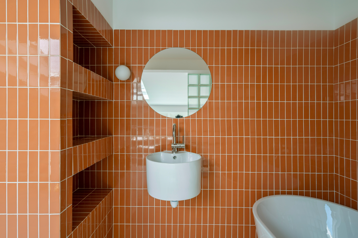
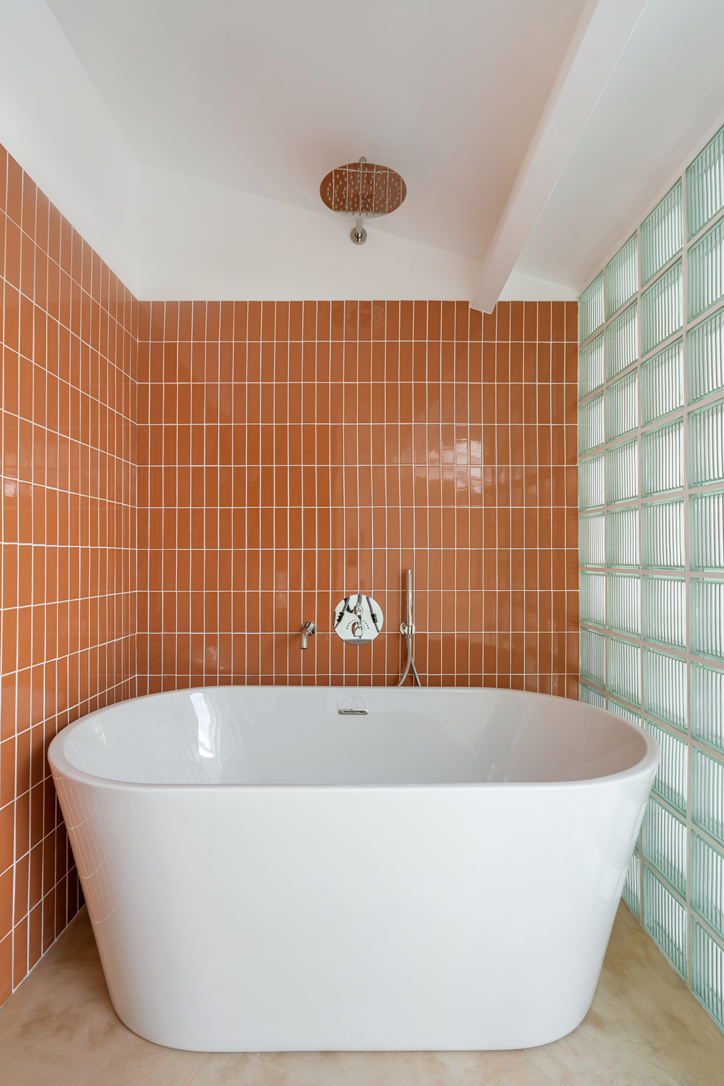
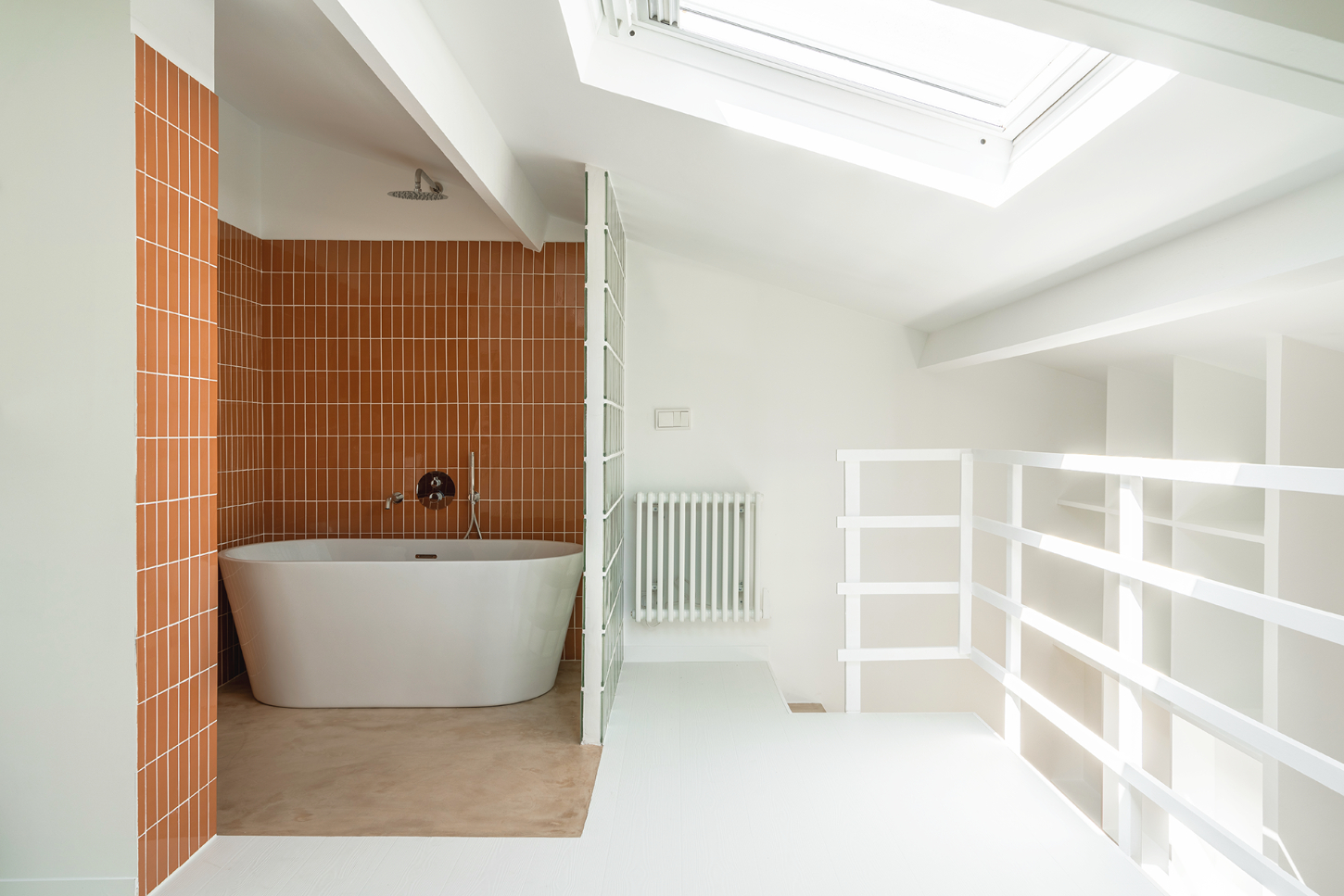
Accents in brick color wrap the ground-floor columns and stretch into the bathroom, adding a rhythmic flow that organizes the loft’s various functions without the need for walls. This strategic application of color and texture brings a structured, yet dynamic vibe to the space.

Reflective surfaces play a crucial role in brightening and enlarging the space. In the kitchen, mirror strips echo the structural columns and catch light from the window, while a large round tinted mirror in the dining area transforms the apartment’s darker corner into a brighter, more expansive zone.

The design cleverly uses contrasts to spotlight active areas, allowing quieter, functional spaces like the toilet to blend into the background. This area is ingeniously incorporated into the overall aesthetic by a full-height bookcase that doubles as staircase support, offering storage that’s as varied as it is practical.

A curtain in rich brick velvet runs along the apartment’s blind wall, concealing a dressing and laundry area. It’s not just functional but also extends the apartment’s visual language, blending storage with style.

Across from the library, a glass block wall surrounds the bathroom, ensuring privacy while still letting light permeate, maintaining an airy feel throughout. Petit Gervais exemplifies how thoughtful material use and clever design strategies can transform a small space into a sophisticated, functional home that feels both open and intimate.

Interested in Showcasing Your Work?

If you would like to feature your works on Thisispaper, please visit our Submission page and sign up to Thisispaper+ to submit your work. Once your submission is approved, your work will be showcased to our global audience of 2 million art, architecture, and design professionals and enthusiasts.
No items found.
We love less
but there is more.
Become a Thisispaper+ member today to unlock full access to our magazine, advanced tools, and support our work.
Join Thisispaper+
No items found.
Zuzanna Gasior
Apr 7, 2024

The Petit Gervais duplex by AJAR, nestled in a cozy 50 m2 ground floor space, is a study in making the most out of material contrasts to define and enhance its modest footprint.

Here, waxed concrete not only covers the floor but elevates the staircase to a sculptural centerpiece, grounding the space with a solid, tactile presence. This material continuity extends into the kitchen, presenting it as a seamless extension of the living area.

Accents in brick color wrap the ground-floor columns and stretch into the bathroom, adding a rhythmic flow that organizes the loft’s various functions without the need for walls. This strategic application of color and texture brings a structured, yet dynamic vibe to the space.

Reflective surfaces play a crucial role in brightening and enlarging the space. In the kitchen, mirror strips echo the structural columns and catch light from the window, while a large round tinted mirror in the dining area transforms the apartment’s darker corner into a brighter, more expansive zone.

The design cleverly uses contrasts to spotlight active areas, allowing quieter, functional spaces like the toilet to blend into the background. This area is ingeniously incorporated into the overall aesthetic by a full-height bookcase that doubles as staircase support, offering storage that’s as varied as it is practical.

A curtain in rich brick velvet runs along the apartment’s blind wall, concealing a dressing and laundry area. It’s not just functional but also extends the apartment’s visual language, blending storage with style.

Across from the library, a glass block wall surrounds the bathroom, ensuring privacy while still letting light permeate, maintaining an airy feel throughout. Petit Gervais exemplifies how thoughtful material use and clever design strategies can transform a small space into a sophisticated, functional home that feels both open and intimate.
Interested in Showcasing Your Work?

If you would like to feature your works on Thisispaper, please visit our Submission page and subscribe to Thisispaper+. Once your submission is approved, your work will be showcased to our global audience of 2 million art, architecture, and design professionals and enthusiasts.
No items found.

Join Thisispaper+
Become a Thisispaper+ member today to unlock full access to our magazine, submit your project and support our work.
Travel Guides
Immerse yourself in timeless destinations, hidden gems, and creative spaces—curated by humans, not algorithms.
Explore All Guides +
Curated Editions
Dive deeper into carefully curated editions, designed to feed your curiosity and foster exploration.
Off-the-Grid
Jutaku
Sacral Journey
minimum
The New Chair
Explore All Editions +
Submission Module
By submitting and publishing your work, you can expose your work to our global 2M audience.
Learn More+
Become a Thisispaper+ member today to unlock full access to our magazine, submit your project and support our work.