Thisispaper Community
Join today.
Enter your email address to receive the latest news on emerging art, design, lifestyle and tech from Thisispaper, delivered straight to your inbox.
Oops! Something went wrong while submitting the form.
Instant access to new channels
The top stories curated daily
Weekly roundups of what's important
Original features and deep dives
Exclusive community features
@zaxarovcom
Oct 10, 2023

In the heart of Venice's Giardini, Sverre Fehn's 'Nordic Pavilion' stands as a quiet masterpiece, redefining Nordic design with ingenious simplicity.

The 'Nordic Pavilion,' as it has come to be known, emerged from the visionary mind of Norwegian architect Sverre Fehn in 1962. At the time, three gifted designers had been invited to shape this emblematic structure, reflecting the artistic essence of the Nordic nations. Fehn's proposal was the one that found favor, and it left an indelible mark on the architectural landscape.

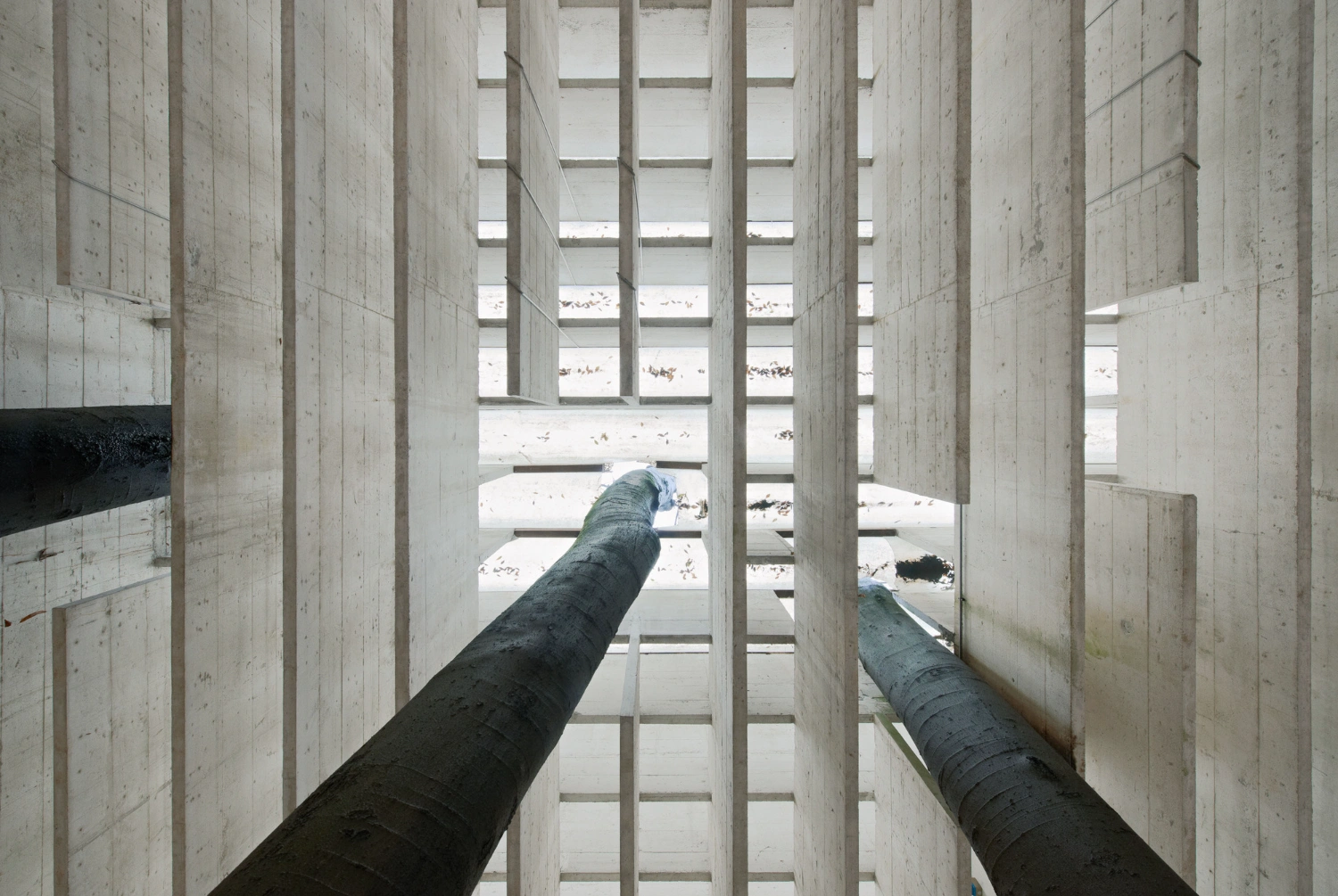
What sets the 'Nordic Pavilion' apart is its unassuming elegance—a feat achieved by Fehn's remarkable departure from the conventional. Instead of heavy timber beams, Fehn opted for slender concrete lamellae, radiant as if kissed by Venetian sunlight on a snowy quilt. Eschewing the usual Nordic practice of sealing off the elements, he removed two of the building's four walls, opening the structure to its surroundings. By crafting an open roof that gracefully embraced the sky, Fehn masterfully controlled the rain's descent into the space. This pavilion harmoniously coexists with its environment while alluding to a world far beyond.

Fehn did not merely mimic Nordic vernacular; he undertook the audacious task of reimagining it. His creation is a translation, not a replication—a meticulous crafting of 'Nordic' architecture tailored for Venice's climate and the unique setting of Giardini. Just as Walter Benjamin contemplated translation as a 'mode,' Fehn recognized that orchestrating space through assemblage differed fundamentally from contextual grafting.

The 'Nordic Pavilion' is not a mere collection of parts; it embodies the culmination of Fehn's spatial vision—a choreography of elements like roof, ground, wall, stair, beam, and their interplay with the topography. Interrupting the seemingly monotonous grid are openings through which three internal plane trees emerge, punctuating the space with vertical grace. Fehn's deep appreciation of light, cultivated during his Italian travels, led him to harness the unique qualities of Nordic illumination upon his return.

To protect the pavilion's intended use as an art gallery from direct sunlight, Fehn ingeniously devised a 'roof' of concrete brise-soleil. These meticulously designed lamellae, a symphony of precision, wove together to create an internal plane drenched in 'Nordic' light—shadeless, uniform, and bright. The result is a world bathed in light, one that Marco Mulazzani aptly describes as "definite, but familiar," a realm devoid of shadows, where art finds its ideal stage.

Interested in Showcasing Your Work?

If you would like to feature your works on Thisispaper, please visit our Submission page and sign up to Thisispaper+ to submit your work. Once your submission is approved, your work will be showcased to our global audience of 2 million art, architecture, and design professionals and enthusiasts.
No items found.
We love less
but there is more.
Become a Thisispaper+ member today to unlock full access to our magazine, advanced tools, and support our work.
Join Thisispaper+
No items found.
@zaxarovcom
Oct 10, 2023

In the heart of Venice's Giardini, Sverre Fehn's 'Nordic Pavilion' stands as a quiet masterpiece, redefining Nordic design with ingenious simplicity.

The 'Nordic Pavilion,' as it has come to be known, emerged from the visionary mind of Norwegian architect Sverre Fehn in 1962. At the time, three gifted designers had been invited to shape this emblematic structure, reflecting the artistic essence of the Nordic nations. Fehn's proposal was the one that found favor, and it left an indelible mark on the architectural landscape.

What sets the 'Nordic Pavilion' apart is its unassuming elegance—a feat achieved by Fehn's remarkable departure from the conventional. Instead of heavy timber beams, Fehn opted for slender concrete lamellae, radiant as if kissed by Venetian sunlight on a snowy quilt. Eschewing the usual Nordic practice of sealing off the elements, he removed two of the building's four walls, opening the structure to its surroundings. By crafting an open roof that gracefully embraced the sky, Fehn masterfully controlled the rain's descent into the space. This pavilion harmoniously coexists with its environment while alluding to a world far beyond.

Fehn did not merely mimic Nordic vernacular; he undertook the audacious task of reimagining it. His creation is a translation, not a replication—a meticulous crafting of 'Nordic' architecture tailored for Venice's climate and the unique setting of Giardini. Just as Walter Benjamin contemplated translation as a 'mode,' Fehn recognized that orchestrating space through assemblage differed fundamentally from contextual grafting.

The 'Nordic Pavilion' is not a mere collection of parts; it embodies the culmination of Fehn's spatial vision—a choreography of elements like roof, ground, wall, stair, beam, and their interplay with the topography. Interrupting the seemingly monotonous grid are openings through which three internal plane trees emerge, punctuating the space with vertical grace. Fehn's deep appreciation of light, cultivated during his Italian travels, led him to harness the unique qualities of Nordic illumination upon his return.

To protect the pavilion's intended use as an art gallery from direct sunlight, Fehn ingeniously devised a 'roof' of concrete brise-soleil. These meticulously designed lamellae, a symphony of precision, wove together to create an internal plane drenched in 'Nordic' light—shadeless, uniform, and bright. The result is a world bathed in light, one that Marco Mulazzani aptly describes as "definite, but familiar," a realm devoid of shadows, where art finds its ideal stage.

Interested in Showcasing Your Work?

If you would like to feature your works on Thisispaper, please visit our Submission page and subscribe to Thisispaper+. Once your submission is approved, your work will be showcased to our global audience of 2 million art, architecture, and design professionals and enthusiasts.
Thisispaper+
Concrete Stories
Web Access
Link to Maps

Join Thisispaper+
Become a Thisispaper+ member today to unlock full access to our magazine, submit your project and support our work.
Travel Guides
Immerse yourself in timeless destinations, hidden gems, and creative spaces—curated by humans, not algorithms.
Explore All Guides +
Curated Editions
Dive deeper into carefully curated editions, designed to feed your curiosity and foster exploration.
Off-the-Grid
Jutaku
Sacral Journey
minimum
The New Chair
Explore All Editions +
Submission Module
By submitting and publishing your work, you can expose your work to our global 2M audience.
Learn More+
Become a Thisispaper+ member today to unlock full access to our magazine, submit your project and support our work.