Thisispaper Community
Join today.
Enter your email address to receive the latest news on emerging art, design, lifestyle and tech from Thisispaper, delivered straight to your inbox.
Oops! Something went wrong while submitting the form.
Instant access to new channels
The top stories curated daily
Weekly roundups of what's important
Original features and deep dives
Exclusive community features
Zuzanna Gasior
Sep 10, 2024

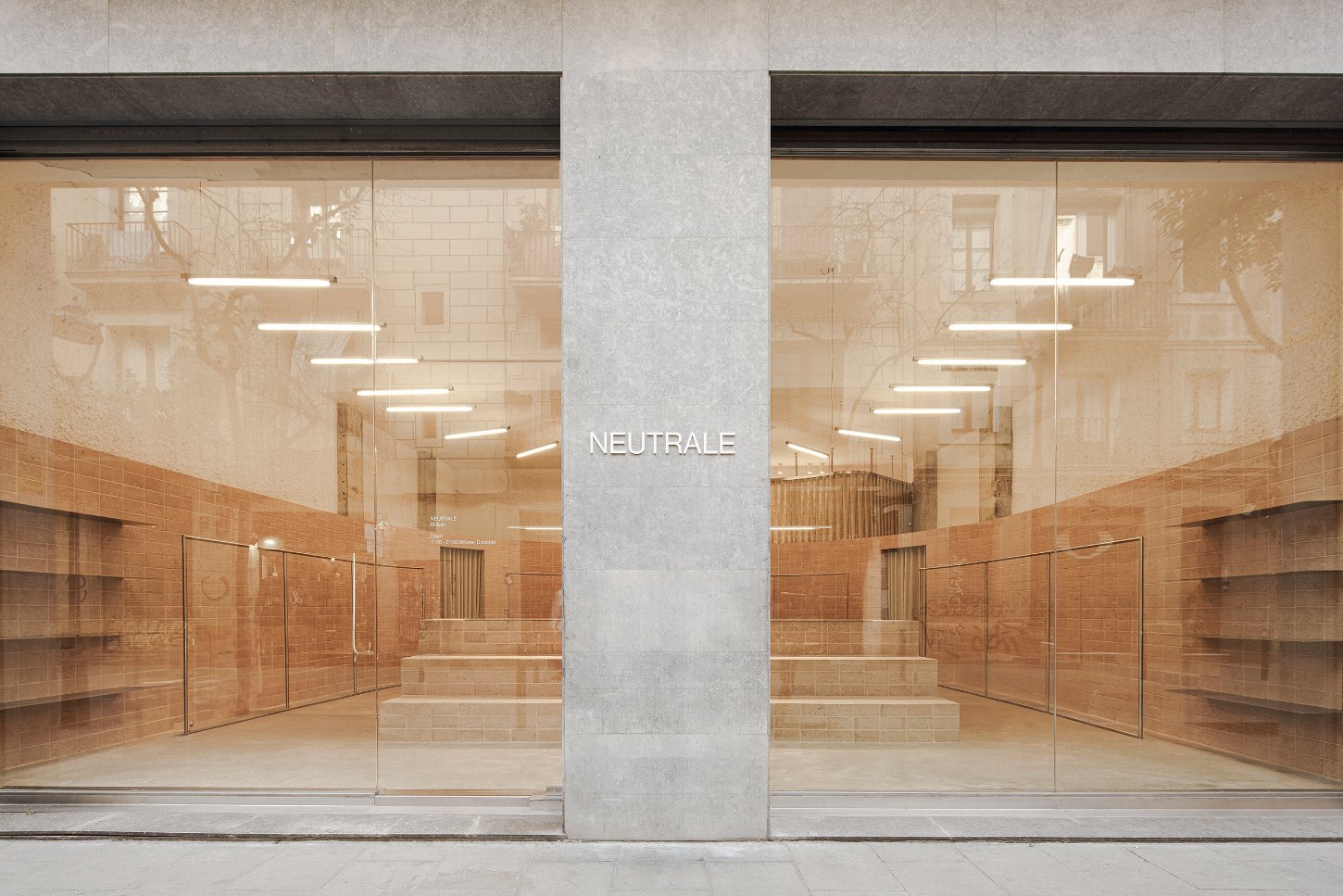
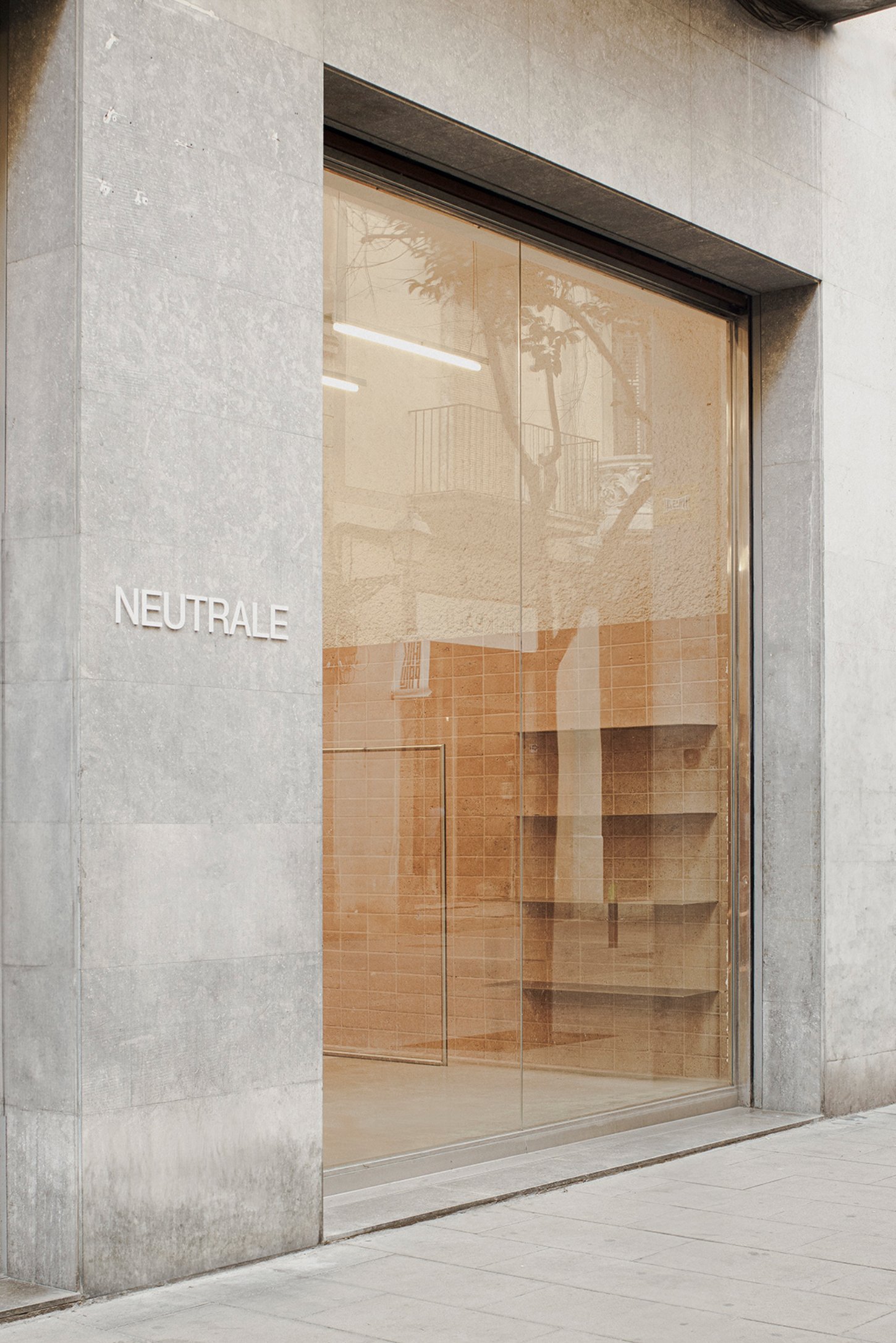
In Barcelona, Neutrale's latest store designed by estudio DIIR represents a continuation of the brand's ongoing exploration of spatial identity, merging the Mediterranean aesthetic with a thoughtful examination of retail environments.

This space, like its predecessors, is not just a venue for commerce but a site where design principles are meticulously tested and applied. Here, the brand identity and customer experience are not afterthoughts but are woven into the very fabric of the store’s architecture.

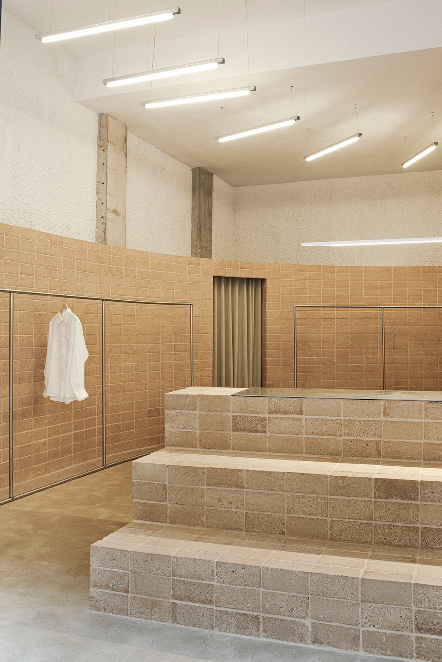
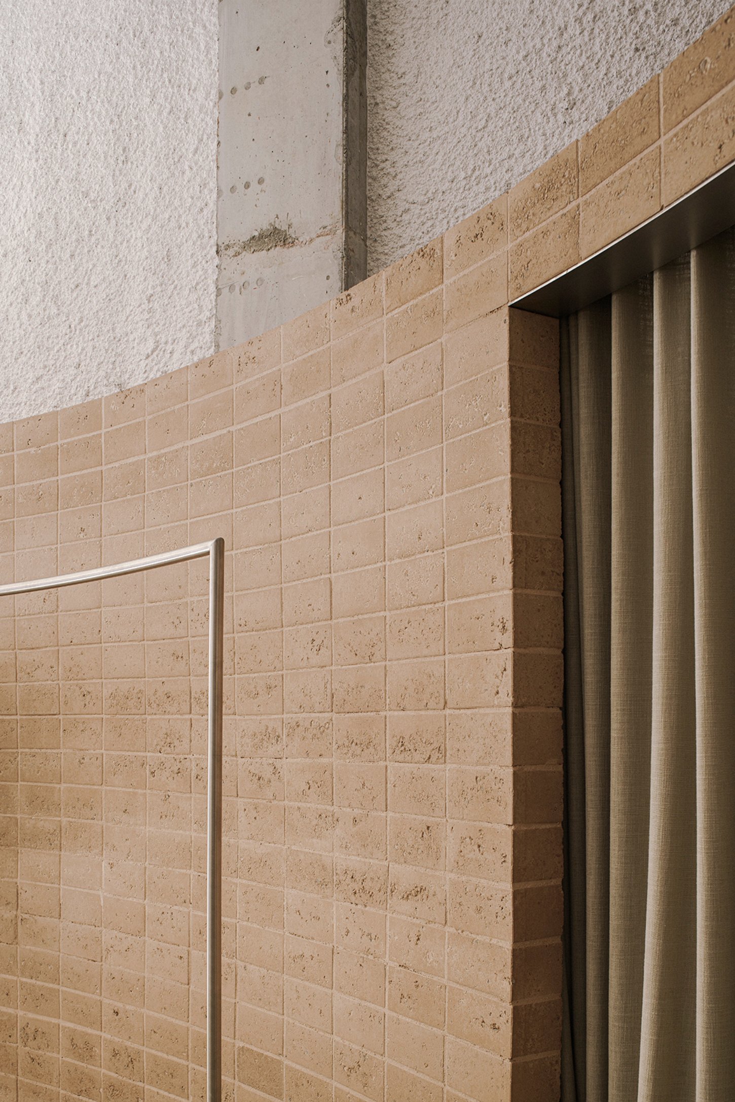
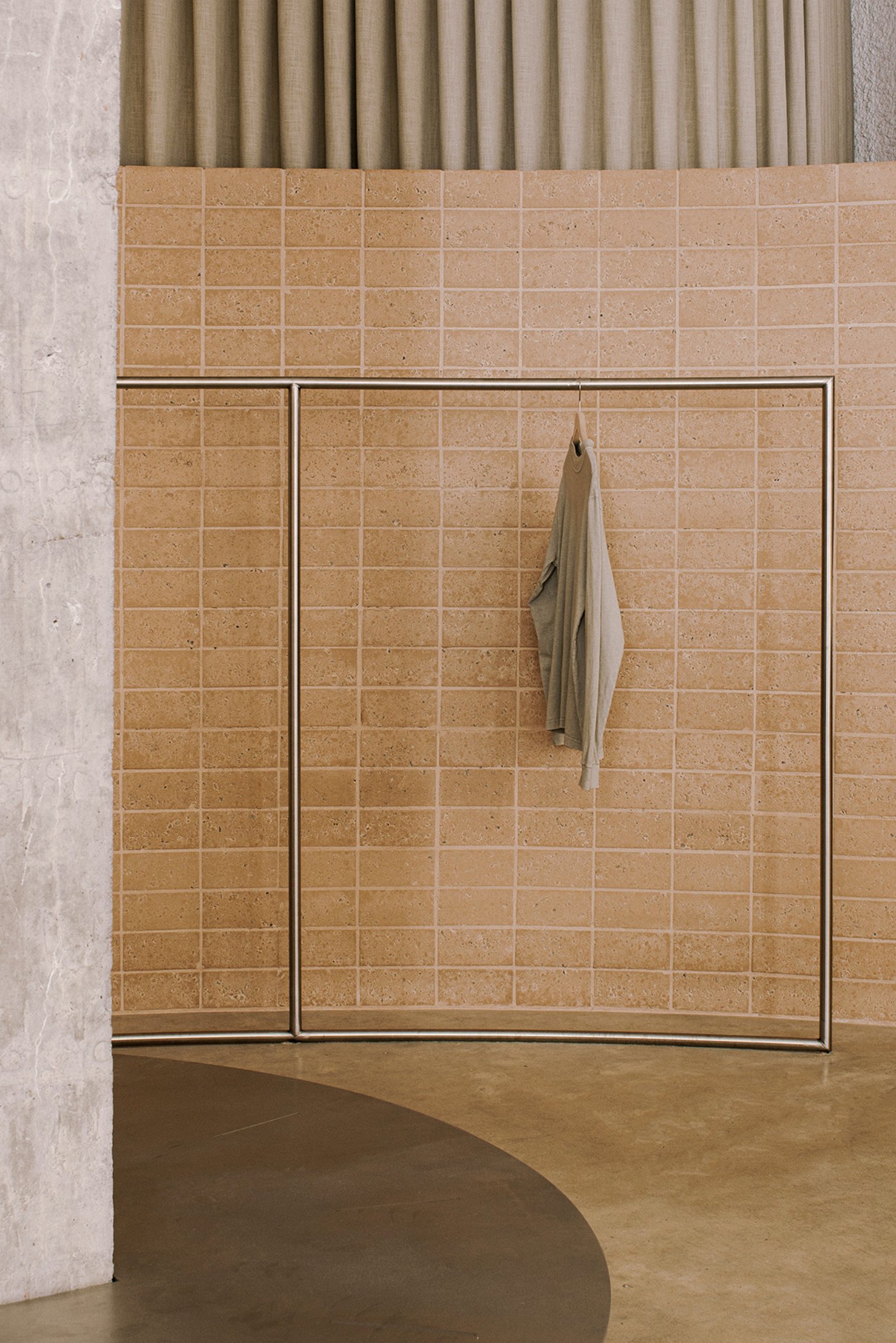
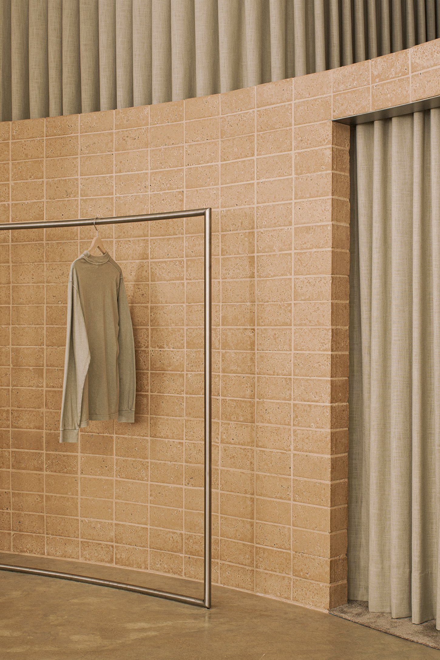
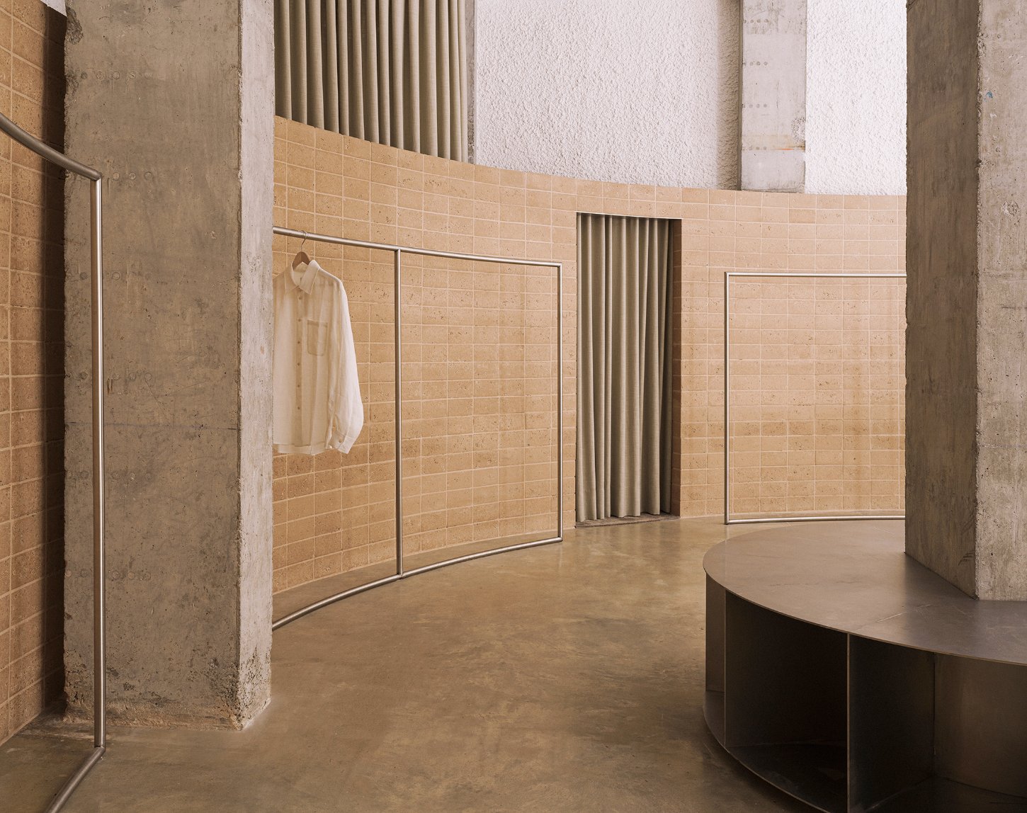
One of the store's most striking features is how it utilizes the original qualities of the premises, stripping away unnecessary barriers to create a more fluid and immersive environment. The design introduces two primary sculptural elements that anchor the space. The first, a curved wall, reshapes the geometry of the room, guiding visitors through a radial path that subtly choreographs the shopping experience. This wall isn’t just a backdrop; it sets the stage for a unique interaction between the customer and the product.

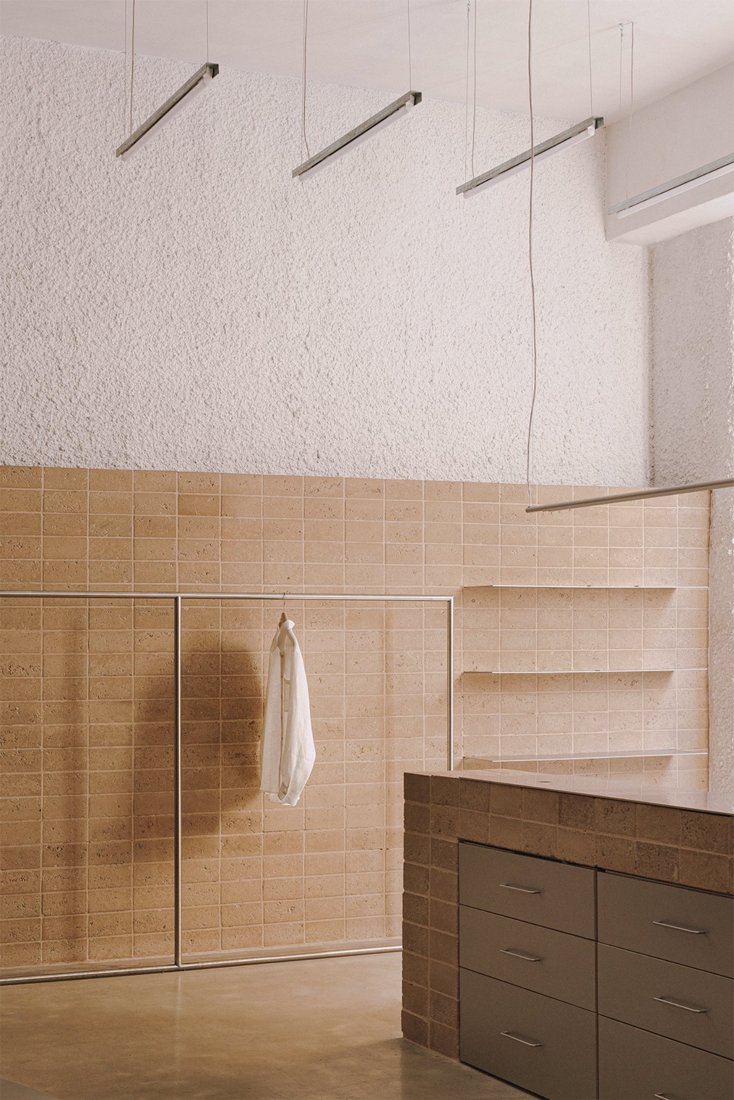
Complementing this is a three-step grandstand, positioned as both a welcoming feature and a functional display unit. It invites customers to engage with the products, while also doubling as a counter. The interplay of these elements creates a seamless connection between the street and the store interior, encouraging a sense of openness and accessibility from the moment one steps inside.

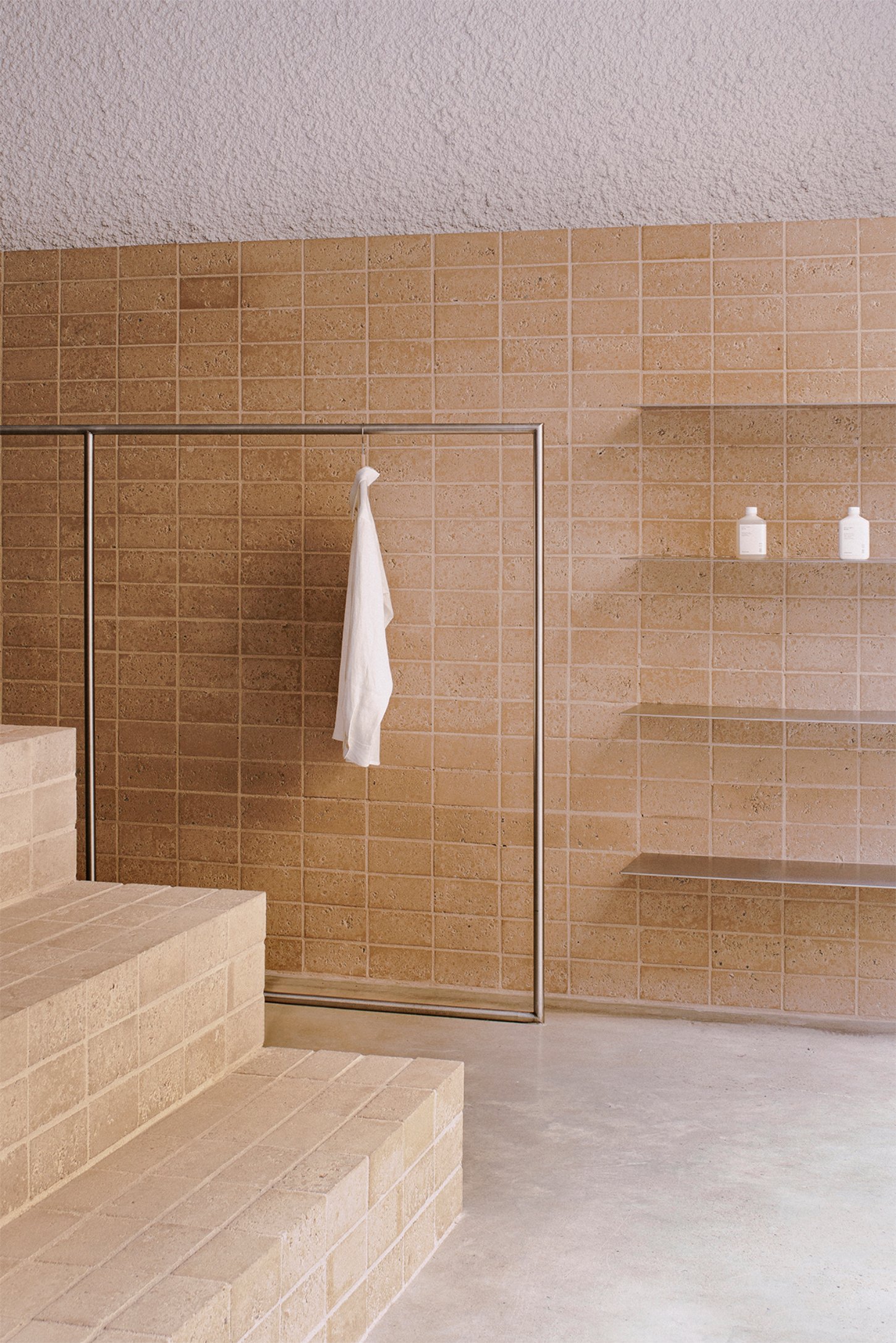
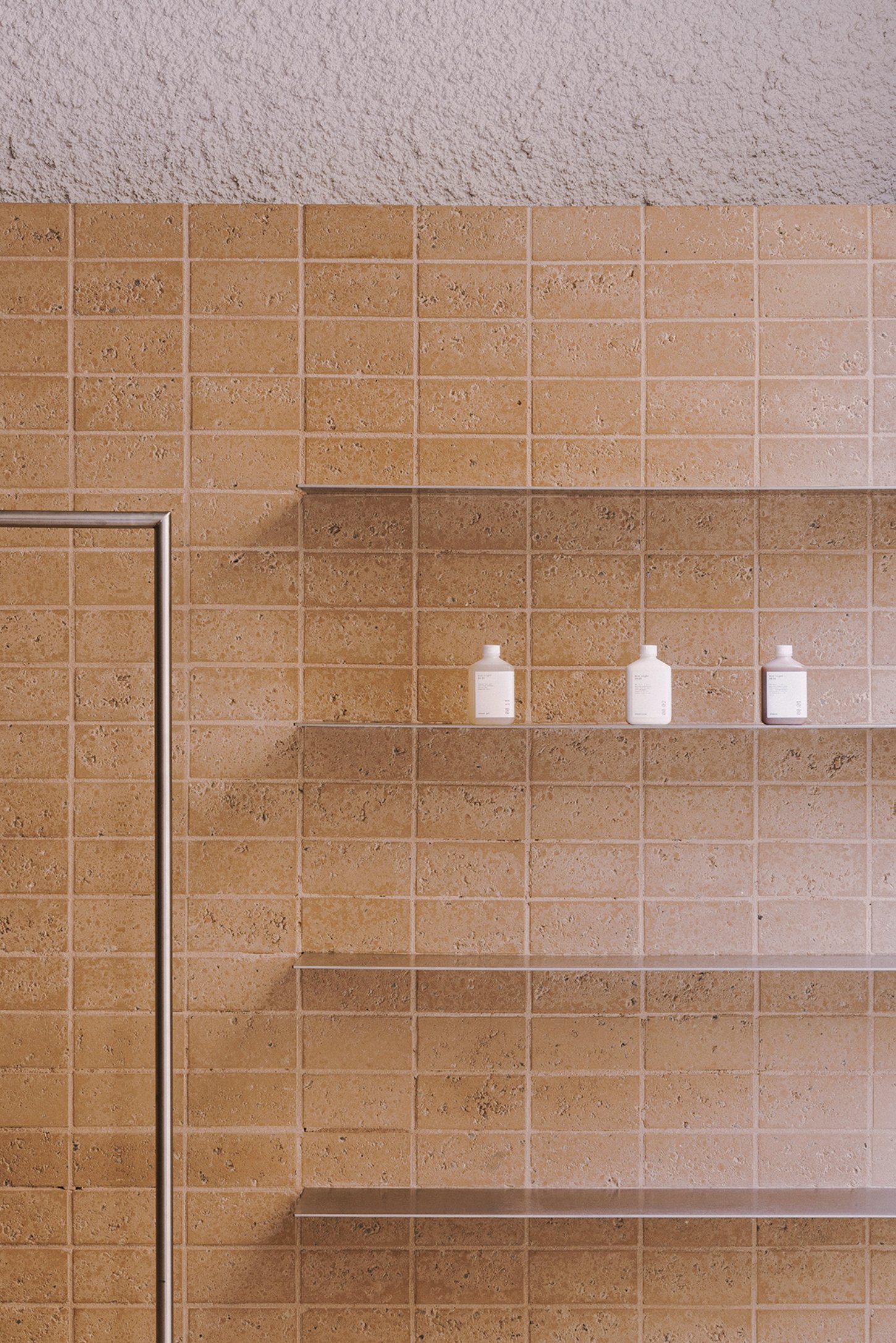
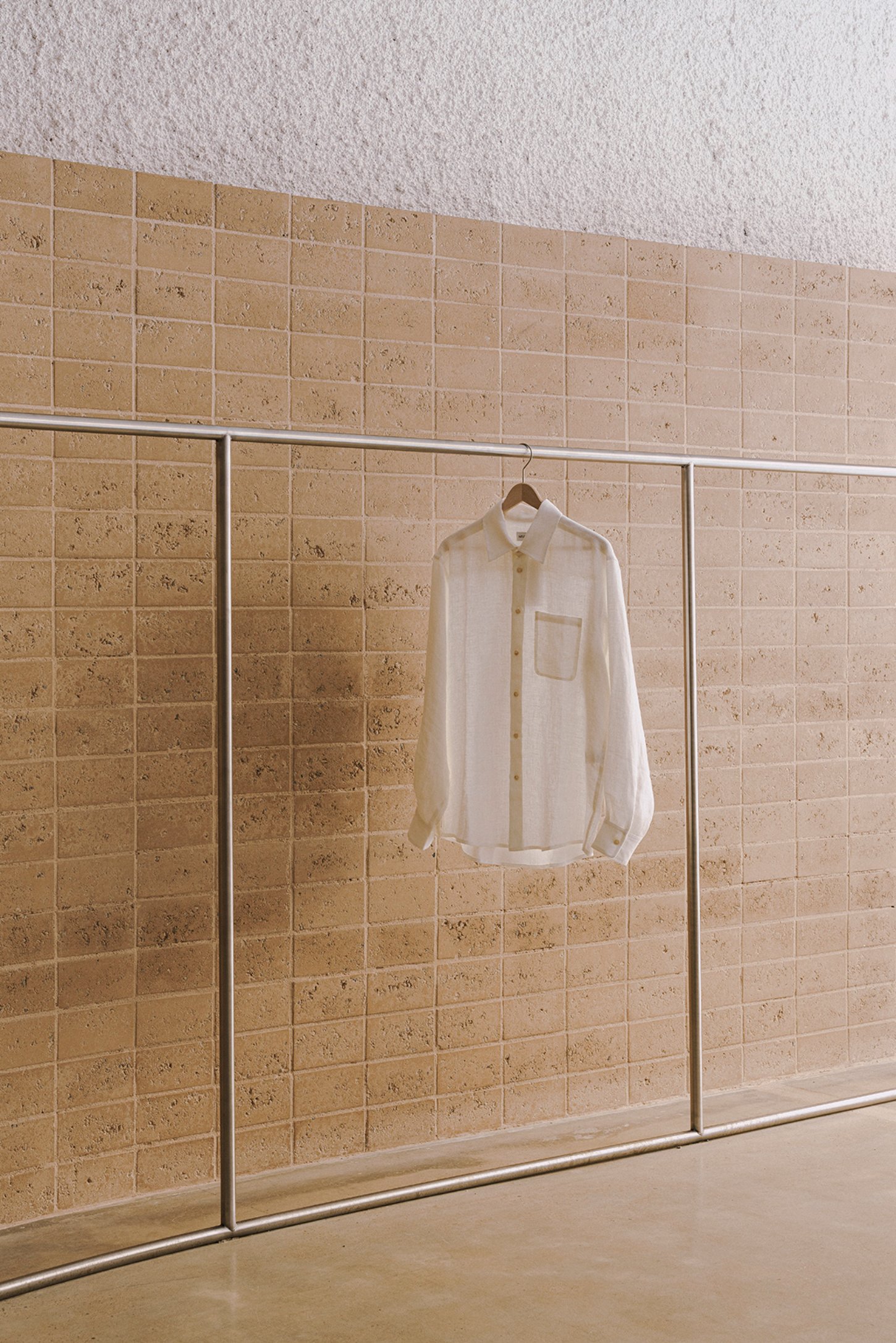
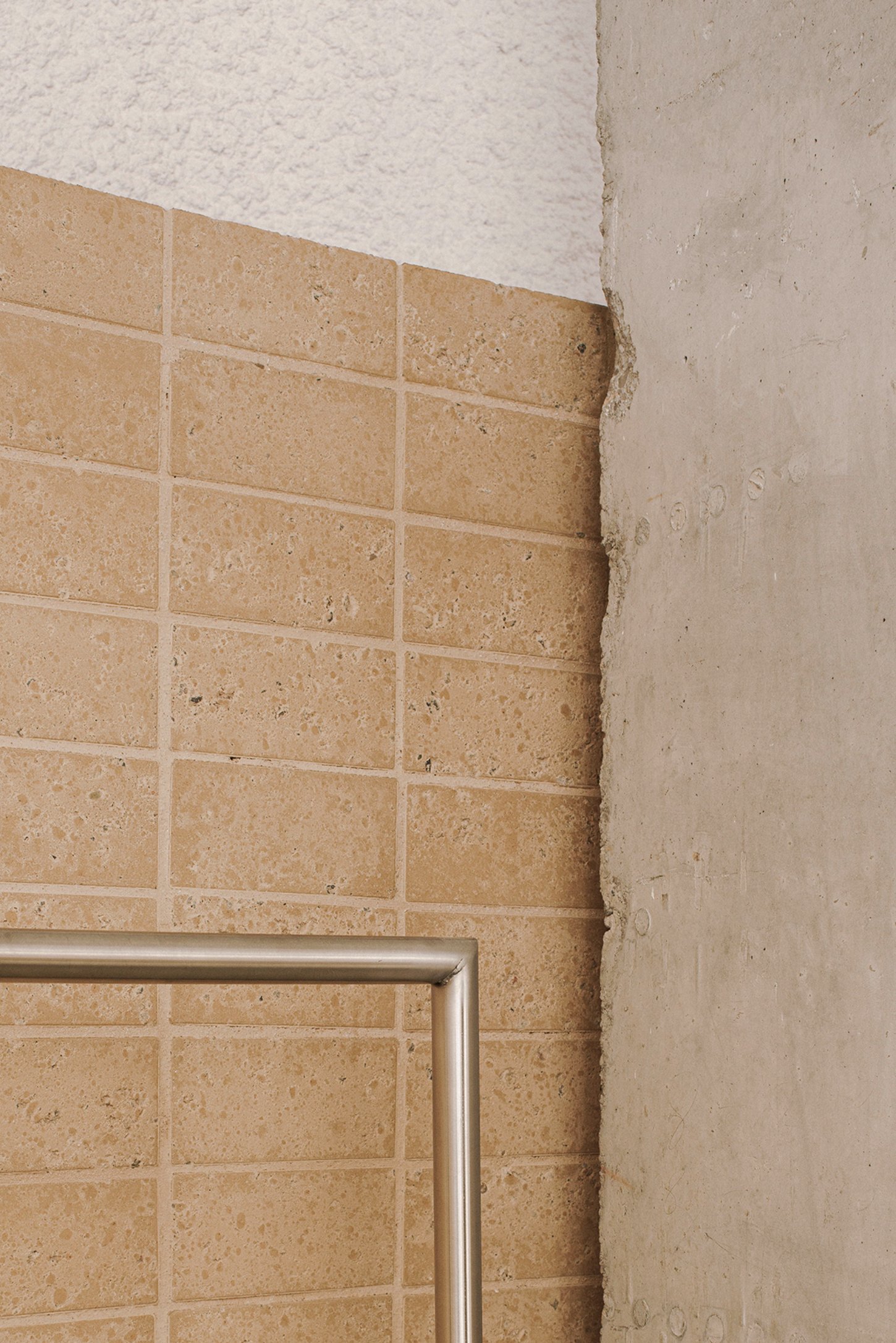
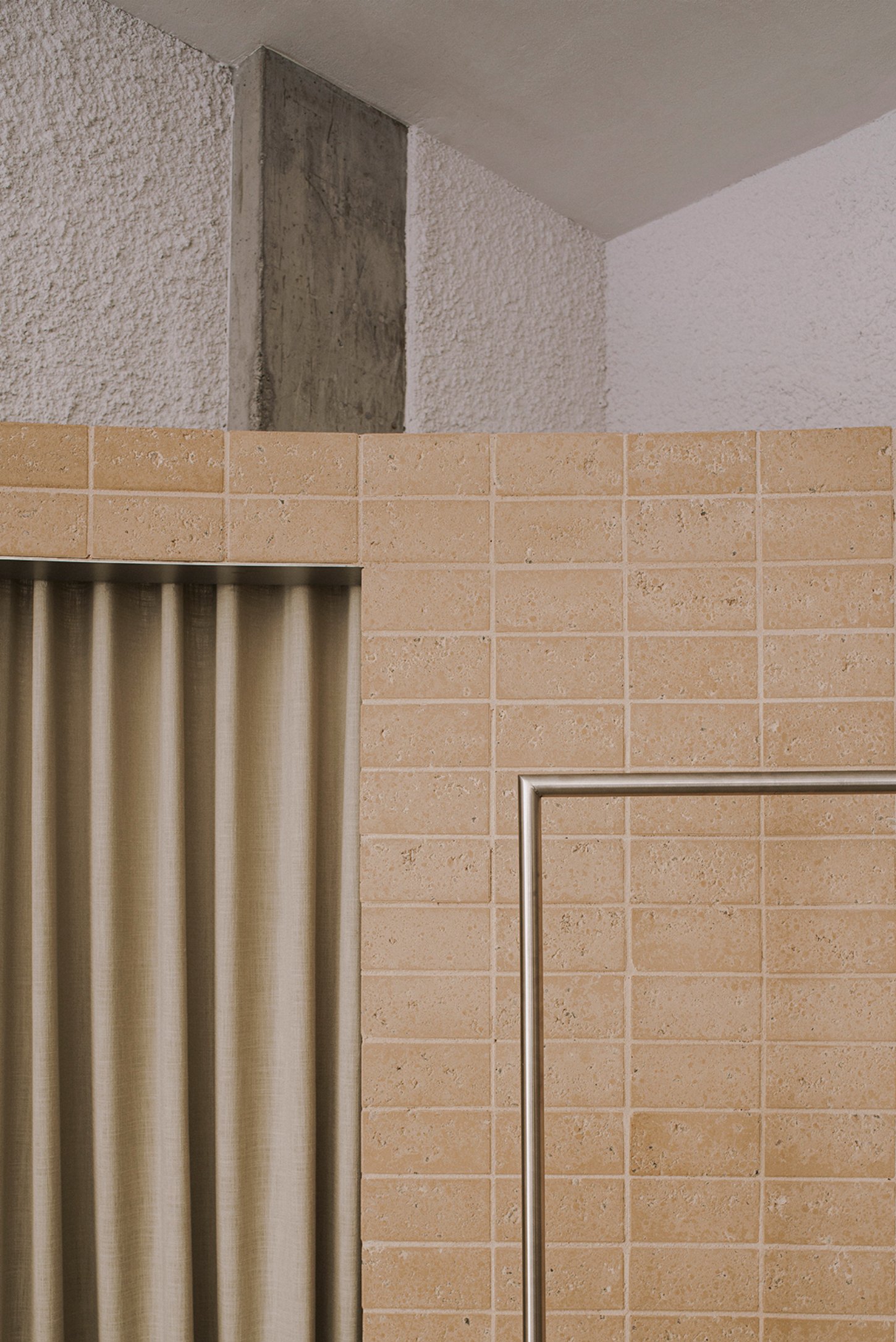
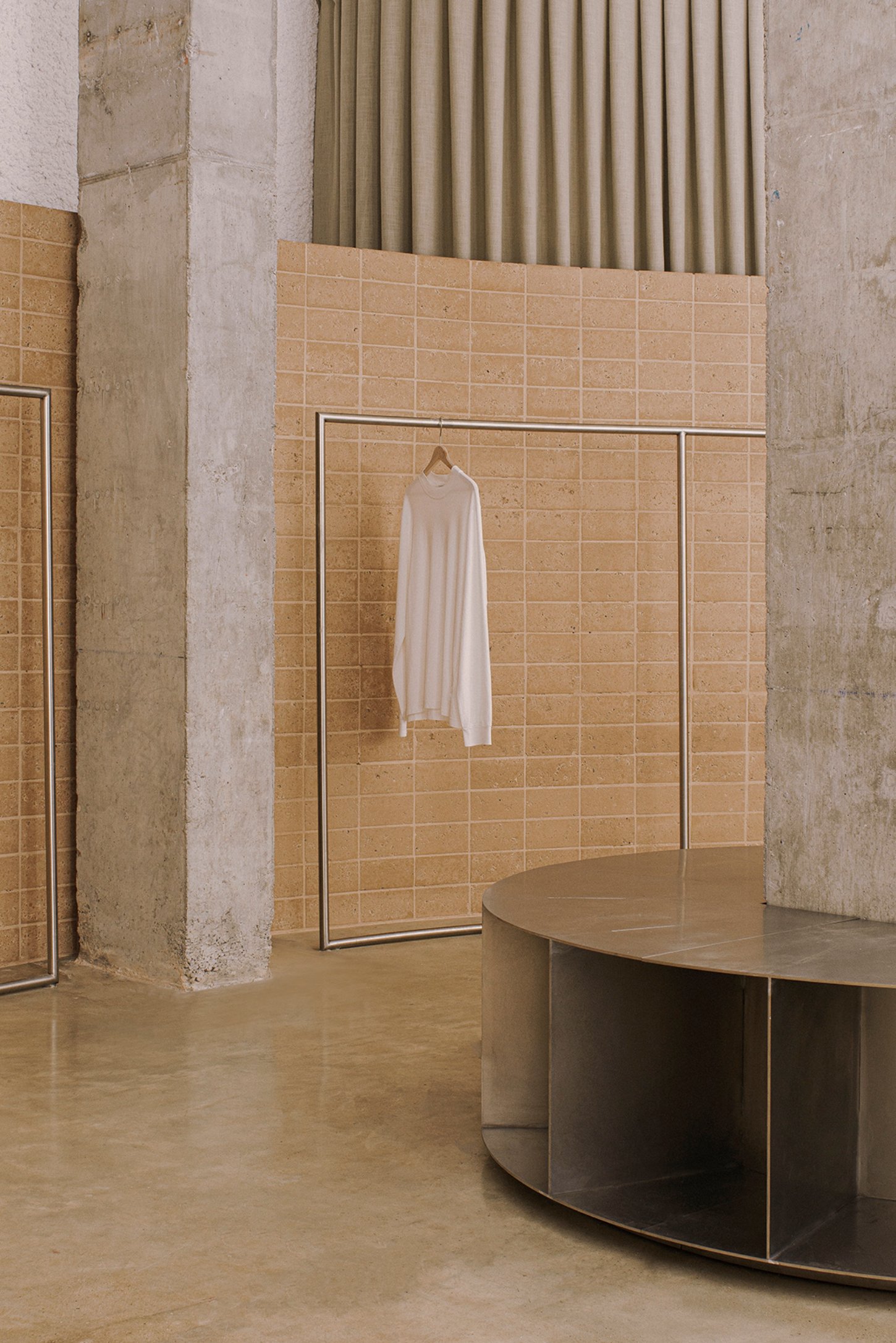
The store’s material palette is deliberately restrained, focusing on a triad of materials that each carry a specific resonance. Fetdeterra, a compacted earth block material, is used for the walls and bench, offering an earthy tone that evokes the landscape of the Balearic Islands. This material choice is not only environmentally conscious, reflecting the brand's commitment to sustainability, but also provides a textured contrast to the sleekness of the steel racks and shelves. These steel elements add a tectonic quality to the space, their refined lines juxtaposing with the heft of the earth blocks.

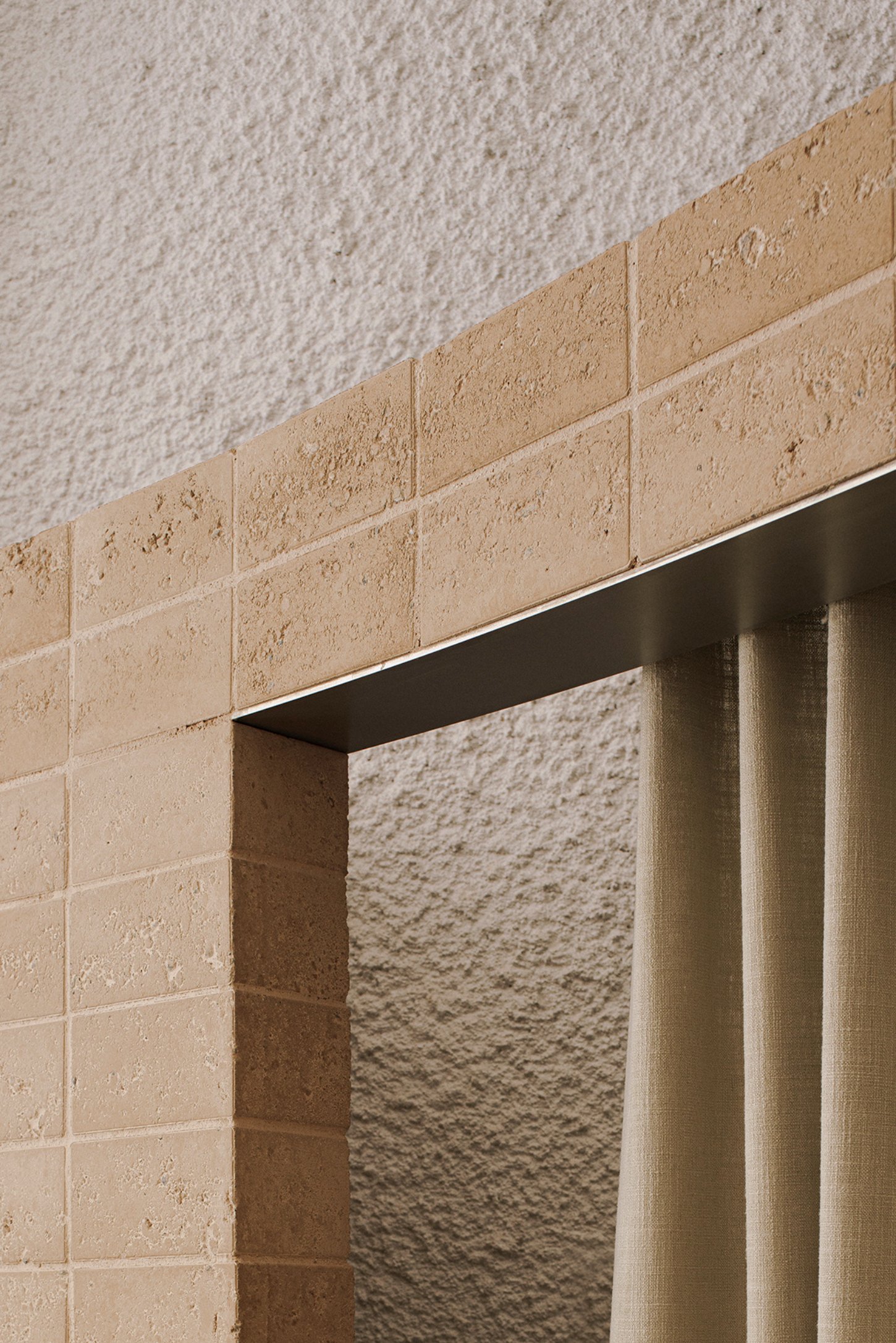
Fabrics, employed as curtains, introduce a final layer of texture and movement. Their fluidity softens the store's overall aesthetic, engaging in a visual dialogue with the more solid, monumental features. The result is a carefully balanced space where each material and form is chosen not just for its functional role, but for the way it contributes to the overall narrative of the space. Here, retail becomes more than just a transaction; it becomes an experience shaped by the thoughtful intersection of design, materiality, and spatial dynamics.

Interested in Showcasing Your Work?

If you would like to feature your works on Thisispaper, please visit our Submission page and sign up to Thisispaper+ to submit your work. Once your submission is approved, your work will be showcased to our global audience of 2 million art, architecture, and design professionals and enthusiasts.
No items found.
We love less
but there is more.
Become a Thisispaper+ member today to unlock full access to our magazine, advanced tools, and support our work.
Join Thisispaper+
No items found.
Zuzanna Gasior
Sep 10, 2024

In Barcelona, Neutrale's latest store designed by estudio DIIR represents a continuation of the brand's ongoing exploration of spatial identity, merging the Mediterranean aesthetic with a thoughtful examination of retail environments.

This space, like its predecessors, is not just a venue for commerce but a site where design principles are meticulously tested and applied. Here, the brand identity and customer experience are not afterthoughts but are woven into the very fabric of the store’s architecture.

One of the store's most striking features is how it utilizes the original qualities of the premises, stripping away unnecessary barriers to create a more fluid and immersive environment. The design introduces two primary sculptural elements that anchor the space. The first, a curved wall, reshapes the geometry of the room, guiding visitors through a radial path that subtly choreographs the shopping experience. This wall isn’t just a backdrop; it sets the stage for a unique interaction between the customer and the product.

Complementing this is a three-step grandstand, positioned as both a welcoming feature and a functional display unit. It invites customers to engage with the products, while also doubling as a counter. The interplay of these elements creates a seamless connection between the street and the store interior, encouraging a sense of openness and accessibility from the moment one steps inside.

The store’s material palette is deliberately restrained, focusing on a triad of materials that each carry a specific resonance. Fetdeterra, a compacted earth block material, is used for the walls and bench, offering an earthy tone that evokes the landscape of the Balearic Islands. This material choice is not only environmentally conscious, reflecting the brand's commitment to sustainability, but also provides a textured contrast to the sleekness of the steel racks and shelves. These steel elements add a tectonic quality to the space, their refined lines juxtaposing with the heft of the earth blocks.

Fabrics, employed as curtains, introduce a final layer of texture and movement. Their fluidity softens the store's overall aesthetic, engaging in a visual dialogue with the more solid, monumental features. The result is a carefully balanced space where each material and form is chosen not just for its functional role, but for the way it contributes to the overall narrative of the space. Here, retail becomes more than just a transaction; it becomes an experience shaped by the thoughtful intersection of design, materiality, and spatial dynamics.
Interested in Showcasing Your Work?

If you would like to feature your works on Thisispaper, please visit our Submission page and subscribe to Thisispaper+. Once your submission is approved, your work will be showcased to our global audience of 2 million art, architecture, and design professionals and enthusiasts.
Thisispaper+
Barcelona Guide
20+ Locations
Web Access
Link to Maps
Step into the heart of Barcelona, where the past and present merge seamlessly in a dance of modern art, design, and architecture. Our guide leads you through a curated selection of the city's most inspiring spaces, each telling its own unique story of creativity and innovation.
Explore
Barcelona Guide

Join Thisispaper+
Become a Thisispaper+ member today to unlock full access to our magazine, submit your project and support our work.
Travel Guides
Immerse yourself in timeless destinations, hidden gems, and creative spaces—curated by humans, not algorithms.
Explore All Guides +
Curated Editions
Dive deeper into carefully curated editions, designed to feed your curiosity and foster exploration.
Off-the-Grid
Jutaku
Sacral Journey
minimum
The New Chair
Explore All Editions +
Submission Module
By submitting and publishing your work, you can expose your work to our global 2M audience.
Learn More+
Become a Thisispaper+ member today to unlock full access to our magazine, submit your project and support our work.