Thisispaper Community
Join today.
Enter your email address to receive the latest news on emerging art, design, lifestyle and tech from Thisispaper, delivered straight to your inbox.
Oops! Something went wrong while submitting the form.
Instant access to new channels
The top stories curated daily
Weekly roundups of what's important
Original features and deep dives
Exclusive community features
Zuzanna Gasior
Apr 21, 2021

'House for Mother' is actually the first house built by Förstberg Ling and as the title suggests, the house is conceived as a dwelling and studio for Björn's mother Maria - librarian and weaving enthusiast.

The house balances spatiality with intimate rooms - formal simplicity with strong materiality. The raw corrugated aluminium facade creates a variable play with light and shade during the day, a rich materiality contrasting with its simple expression. The fuzzy reflections in the unpainted metal make the house change color throughout the day, changing expression depending on the weather, from blue to grey to white or even pink, when the sun is setting. 

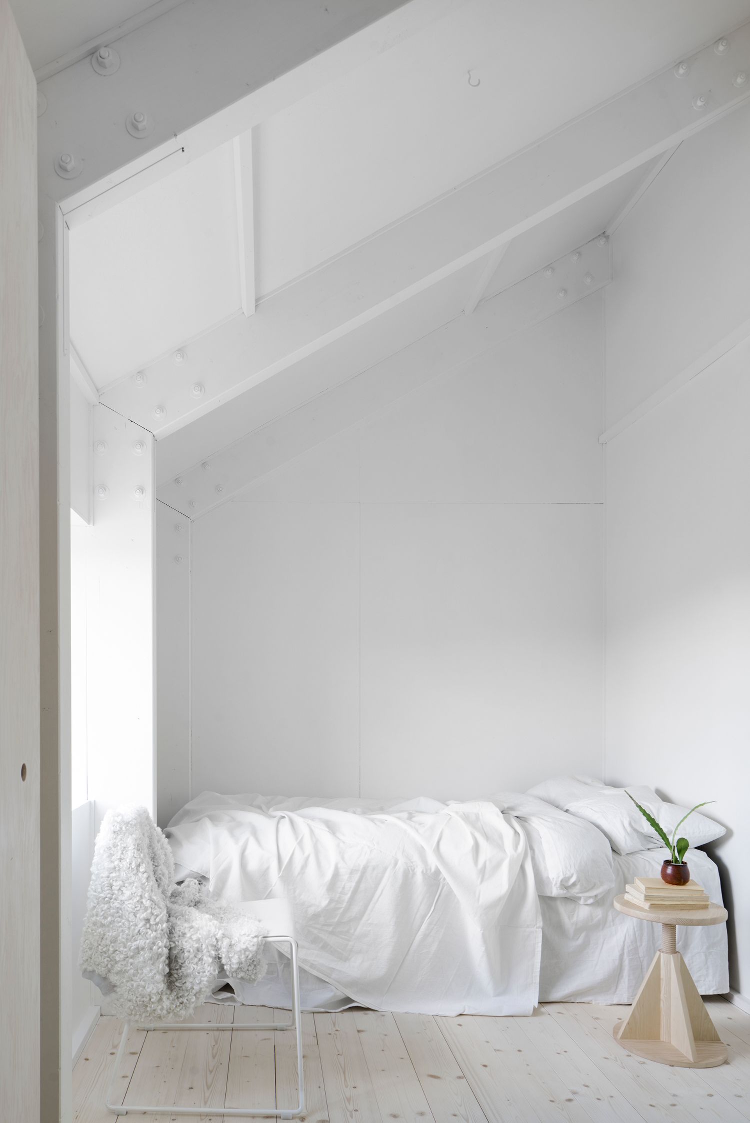
The wooden beams and trusses along with the walls lined with plywood give warmth to the interior while the concrete floor is a durable surface for everyday use, elevated to a low bench along the perimeter of the building.

The house is made up of two parallel volumes of the same width, but of different height and inclination of the gabled roof. The first volume contains the kitchen, dining room and living room, with the bathroom and laundry room housed in a smaller cabin within the structure. The second volume, partly in two levels, provides the bedrooms and a small studio. The sharp division between the living room painted white, and the dining room in natural pine plywood, creates a distinction between the spaces without any walls. 

The division of the house into two volumes, slightly shifted from each other, emphasizes the narrowness of the plot while creating natural outdoor spaces in the front and back of the house. While first standing in the open, the urban context has slowly grown around the house and now little more than the gables are exposed to the neighborhood.

Interested in Showcasing Your Work?

If you would like to feature your works on Thisispaper, please visit our Submission page and sign up to Thisispaper+ to submit your work. Once your submission is approved, your work will be showcased to our global audience of 2 million art, architecture, and design professionals and enthusiasts.
No items found.
We love less
but there is more.
Become a Thisispaper+ member today to unlock full access to our magazine, advanced tools, and support our work.
Join Thisispaper+
No items found.
Zuzanna Gasior
Apr 21, 2021

'House for Mother' is actually the first house built by Förstberg Ling and as the title suggests, the house is conceived as a dwelling and studio for Björn's mother Maria - librarian and weaving enthusiast.

The house balances spatiality with intimate rooms - formal simplicity with strong materiality. The raw corrugated aluminium facade creates a variable play with light and shade during the day, a rich materiality contrasting with its simple expression. The fuzzy reflections in the unpainted metal make the house change color throughout the day, changing expression depending on the weather, from blue to grey to white or even pink, when the sun is setting. 

The wooden beams and trusses along with the walls lined with plywood give warmth to the interior while the concrete floor is a durable surface for everyday use, elevated to a low bench along the perimeter of the building.

The house is made up of two parallel volumes of the same width, but of different height and inclination of the gabled roof. The first volume contains the kitchen, dining room and living room, with the bathroom and laundry room housed in a smaller cabin within the structure. The second volume, partly in two levels, provides the bedrooms and a small studio. The sharp division between the living room painted white, and the dining room in natural pine plywood, creates a distinction between the spaces without any walls. 

The division of the house into two volumes, slightly shifted from each other, emphasizes the narrowness of the plot while creating natural outdoor spaces in the front and back of the house. While first standing in the open, the urban context has slowly grown around the house and now little more than the gables are exposed to the neighborhood.

Interested in Showcasing Your Work?

If you would like to feature your works on Thisispaper, please visit our Submission page and subscribe to Thisispaper+. Once your submission is approved, your work will be showcased to our global audience of 2 million art, architecture, and design professionals and enthusiasts.
Thisispaper+
DwellWell
100+ Projects
Web Access
Link to Maps
Wellbeing as an outcome of ongoing relations happening in space and time. Things, environments, and experiences that are designed to enhance life and enable us to thrive.
Explore
DwellWell

Join Thisispaper+
Become a Thisispaper+ member today to unlock full access to our magazine, submit your project and support our work.
Travel Guides
Immerse yourself in timeless destinations, hidden gems, and creative spaces—curated by humans, not algorithms.
Explore All Guides +
Curated Editions
Dive deeper into carefully curated editions, designed to feed your curiosity and foster exploration.
Off-the-Grid
Jutaku
Sacral Journey
minimum
The New Chair
Explore All Editions +
Submission Module
By submitting and publishing your work, you can expose your work to our global 2M audience.
Learn More+
Become a Thisispaper+ member today to unlock full access to our magazine, submit your project and support our work.