Thisispaper Community
Join today.
Enter your email address to receive the latest news on emerging art, design, lifestyle and tech from Thisispaper, delivered straight to your inbox.
Oops! Something went wrong while submitting the form.
Instant access to new channels
The top stories curated daily
Weekly roundups of what's important
Original features and deep dives
Exclusive community features
Zuzanna Gasior
Jun 17, 2021

The f m b architekten created a new building for the Greiner Company that responds to the context and simultaneously transports the values of the brand's identity.

The Greiner Company, a family based business founded 1922 in the small town Pleidelsheim near Ludwigsburg, Germany, is known for its high quality chairs and seats and is selling products all over the world in the fields of beauty, healthcare and automotive – at its own brand or as supplier. The old headquarter with its small client-center and showroom couldn’t hold up with that progress any more.

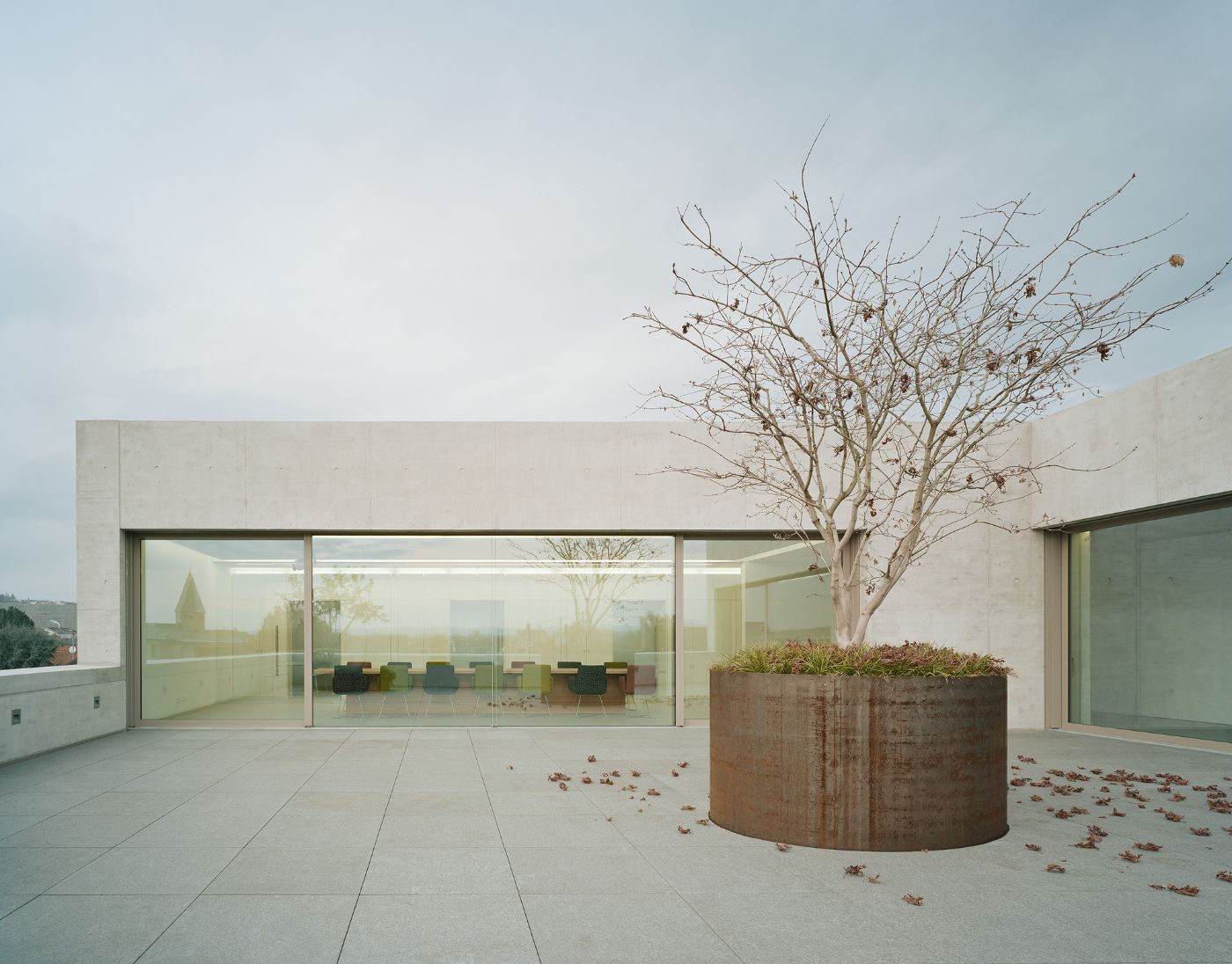
Architects decided jointly with the client to create a pure, reduced Shape that is inspired by the timeless qualities of classical modernism. The façade of the building is worked in exposed concrete, giving the structure a modest but individual impact to that heterogenic place.

The cut out roof-terrace reduces the shape at the main-roads intersection so that the volume of the structure reacts sensibly to the height of the surrounding buildings. At the intersection the building opens its exhibition-floor over the corner through big showcase-windows to the public - not primarily to catch new clients, but stimulating the public space.

Organized on four levels, the flexible and multifunctional exhibition-room and customer-center is reached on entry-level and can also be used for special events when needed. However, the headquarters representative “heart” is reached over the low entrance-room: A triple storied, open space reception-hall made out of exposed concrete walls with poured in lamps - hosting a sculptural spiral staircase. It connects the upper floors with offices, conference-room, accounting-area and the roof-terrace.

In Addition to the spiral staircase, the whole building is connected to an elevator and a necessary evacuation staircase, which provides a short internal connection for the staff and a shortcut to the nearby production-hall.

Interested in Showcasing Your Work?

If you would like to feature your works on Thisispaper, please visit our Submission page and sign up to Thisispaper+ to submit your work. Once your submission is approved, your work will be showcased to our global audience of 2 million art, architecture, and design professionals and enthusiasts.
No items found.
We love less
but there is more.
Become a Thisispaper+ member today to unlock full access to our magazine, advanced tools, and support our work.
Join Thisispaper+
No items found.
Zuzanna Gasior
Jun 17, 2021

The f m b architekten created a new building for the Greiner Company that responds to the context and simultaneously transports the values of the brand's identity.

The Greiner Company, a family based business founded 1922 in the small town Pleidelsheim near Ludwigsburg, Germany, is known for its high quality chairs and seats and is selling products all over the world in the fields of beauty, healthcare and automotive – at its own brand or as supplier. The old headquarter with its small client-center and showroom couldn’t hold up with that progress any more.

Architects decided jointly with the client to create a pure, reduced Shape that is inspired by the timeless qualities of classical modernism. The façade of the building is worked in exposed concrete, giving the structure a modest but individual impact to that heterogenic place.

The cut out roof-terrace reduces the shape at the main-roads intersection so that the volume of the structure reacts sensibly to the height of the surrounding buildings. At the intersection the building opens its exhibition-floor over the corner through big showcase-windows to the public - not primarily to catch new clients, but stimulating the public space.

Organized on four levels, the flexible and multifunctional exhibition-room and customer-center is reached on entry-level and can also be used for special events when needed. However, the headquarters representative “heart” is reached over the low entrance-room: A triple storied, open space reception-hall made out of exposed concrete walls with poured in lamps - hosting a sculptural spiral staircase. It connects the upper floors with offices, conference-room, accounting-area and the roof-terrace.

In Addition to the spiral staircase, the whole building is connected to an elevator and a necessary evacuation staircase, which provides a short internal connection for the staff and a shortcut to the nearby production-hall.

Interested in Showcasing Your Work?

If you would like to feature your works on Thisispaper, please visit our Submission page and subscribe to Thisispaper+. Once your submission is approved, your work will be showcased to our global audience of 2 million art, architecture, and design professionals and enthusiasts.
Thisispaper+
Concrete Stories
Web Access
Link to Maps

Join Thisispaper+
Become a Thisispaper+ member today to unlock full access to our magazine, submit your project and support our work.
Travel Guides
Immerse yourself in timeless destinations, hidden gems, and creative spaces—curated by humans, not algorithms.
Explore All Guides +
Curated Editions
Dive deeper into carefully curated editions, designed to feed your curiosity and foster exploration.
Off-the-Grid
Jutaku
Sacral Journey
minimum
The New Chair
Explore All Editions +
Submission Module
By submitting and publishing your work, you can expose your work to our global 2M audience.
Learn More+
Become a Thisispaper+ member today to unlock full access to our magazine, submit your project and support our work.