Thisispaper Community
Join today.
Enter your email address to receive the latest news on emerging art, design, lifestyle and tech from Thisispaper, delivered straight to your inbox.
Oops! Something went wrong while submitting the form.
Instant access to new channels
The top stories curated daily
Weekly roundups of what's important
Original features and deep dives
Exclusive community features
Zuzanna Gasior
Apr 14, 2023

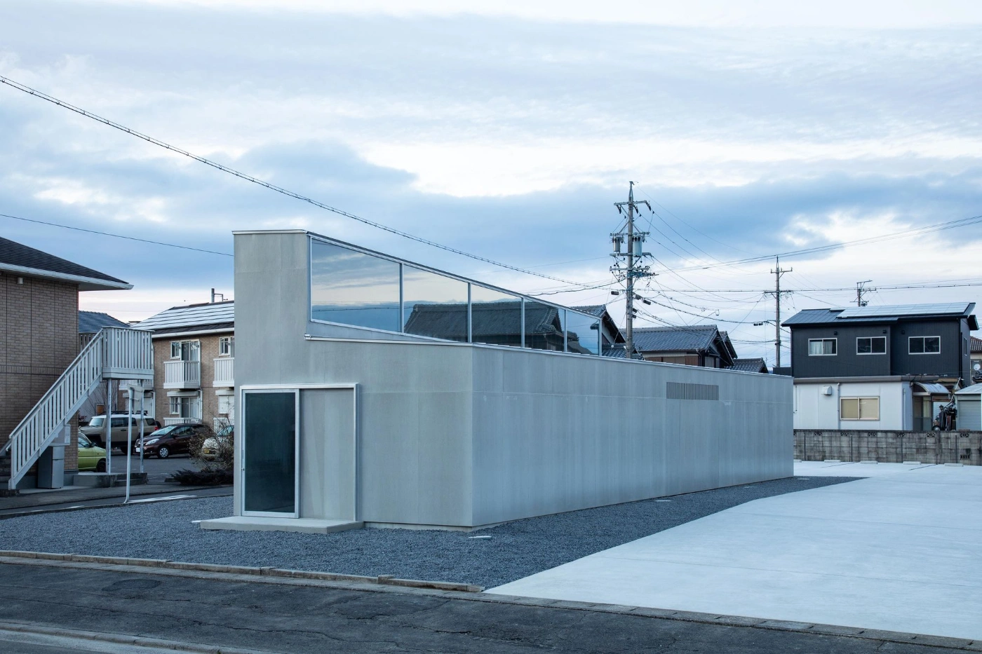
Located in Iga, a once-historic city that has now transformed into an industrial area with massive factories dominating its southern side, Gallery/Salon H by Niimori Jamison is a refreshing addition to the urban fabric.

Developed in the 1970s for local factory workers, the residential area where the project is located lacked gathering spaces for the community. Moreover, a nearby high school's craft department had no place to showcase student works. These pressing issues informed the brief for the project, which initially called for a small hair salon.

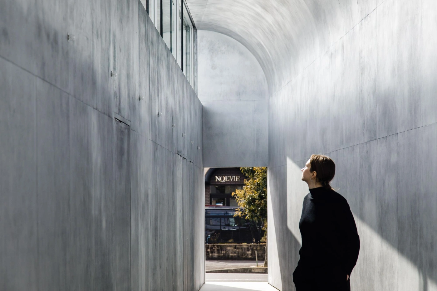
However, upon closer investigation, the design team discovered that rapid developments had driven up costs and made it difficult for people to find places to connect with one another. To address this, the project was expanded to perform a public function, providing a large tunnel-like room mainly used as a public gallery space. The site, situated on a corner lot, was rotated out of rectilinear alignment to encourage pedestrians to use it as a walkway and resting place.

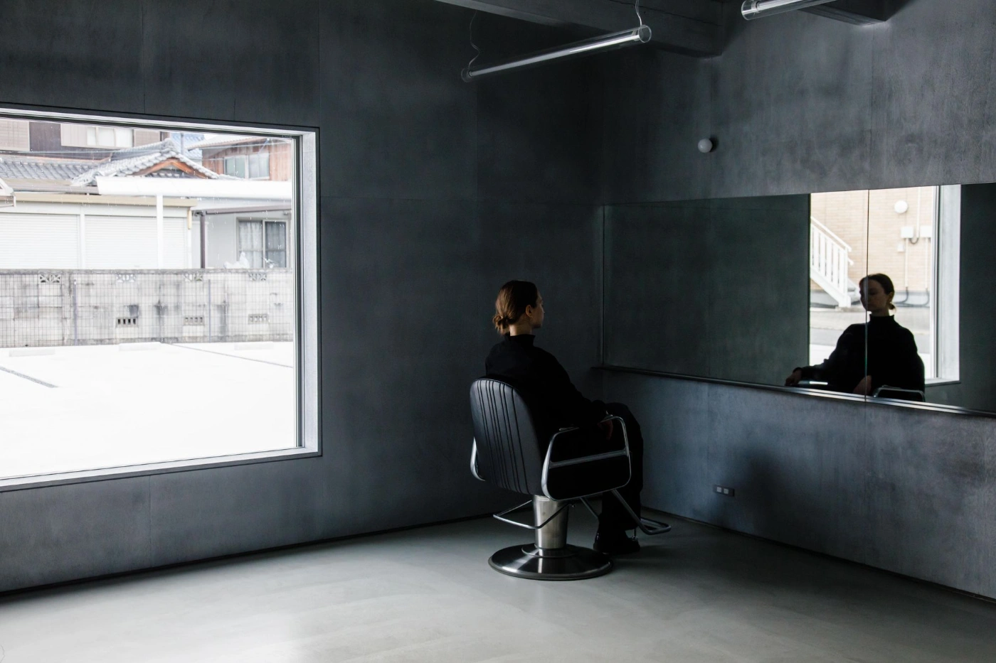
One of the standout features of Gallery/Salon H is its design. The gallery space widens towards the back of the site, which creates a variety of different exhibits while casting an uneven, filtered light from the curved ceiling above. The salon space is also carefully crafted to provide a different sense of depth throughout the space, achieved by using mirrors that are off-parallel.

The materiality of the building is another aspect worth mentioning. The same cementitious lining used outside is also utilized indoors, but with a hand-polished seal that adds material depth to the indistinct quality of the interior. The subtle shifts in conventional geometries and natural light and reflection offer moments to ponder the places we inhabit.

Interested in Showcasing Your Work?

If you would like to feature your works on Thisispaper, please visit our Submission page and sign up to Thisispaper+ to submit your work. Once your submission is approved, your work will be showcased to our global audience of 2 million art, architecture, and design professionals and enthusiasts.
No items found.
We love less
but there is more.
Become a Thisispaper+ member today to unlock full access to our magazine, advanced tools, and support our work.
Join Thisispaper+
No items found.
Zuzanna Gasior
Apr 14, 2023

Located in Iga, a once-historic city that has now transformed into an industrial area with massive factories dominating its southern side, Gallery/Salon H by Niimori Jamison is a refreshing addition to the urban fabric.

Developed in the 1970s for local factory workers, the residential area where the project is located lacked gathering spaces for the community. Moreover, a nearby high school's craft department had no place to showcase student works. These pressing issues informed the brief for the project, which initially called for a small hair salon.

However, upon closer investigation, the design team discovered that rapid developments had driven up costs and made it difficult for people to find places to connect with one another. To address this, the project was expanded to perform a public function, providing a large tunnel-like room mainly used as a public gallery space. The site, situated on a corner lot, was rotated out of rectilinear alignment to encourage pedestrians to use it as a walkway and resting place.

One of the standout features of Gallery/Salon H is its design. The gallery space widens towards the back of the site, which creates a variety of different exhibits while casting an uneven, filtered light from the curved ceiling above. The salon space is also carefully crafted to provide a different sense of depth throughout the space, achieved by using mirrors that are off-parallel.

The materiality of the building is another aspect worth mentioning. The same cementitious lining used outside is also utilized indoors, but with a hand-polished seal that adds material depth to the indistinct quality of the interior. The subtle shifts in conventional geometries and natural light and reflection offer moments to ponder the places we inhabit.

Interested in Showcasing Your Work?

If you would like to feature your works on Thisispaper, please visit our Submission page and subscribe to Thisispaper+. Once your submission is approved, your work will be showcased to our global audience of 2 million art, architecture, and design professionals and enthusiasts.
Thisispaper+
Japan Guide
40+ Locations
Web Access
Link to Maps
In a country where simplicity is an art form, our guide explores Japan's modern masterpieces in design, architecture, and wellness. From tranquil spaces to cutting-edge creativity, discover the places that define Japan’s unique blend of the old and the new.
Explore
Japan Guide

Join Thisispaper+
Become a Thisispaper+ member today to unlock full access to our magazine, submit your project and support our work.
Travel Guides
Immerse yourself in timeless destinations, hidden gems, and creative spaces—curated by humans, not algorithms.
Explore All Guides +
Curated Editions
Dive deeper into carefully curated editions, designed to feed your curiosity and foster exploration.
Off-the-Grid
Jutaku
Sacral Journey
minimum
The New Chair
Explore All Editions +
Submission Module
By submitting and publishing your work, you can expose your work to our global 2M audience.
Learn More+
Become a Thisispaper+ member today to unlock full access to our magazine, submit your project and support our work.