Thisispaper Community
Join today.
Enter your email address to receive the latest news on emerging art, design, lifestyle and tech from Thisispaper, delivered straight to your inbox.
Oops! Something went wrong while submitting the form.
Instant access to new channels
The top stories curated daily
Weekly roundups of what's important
Original features and deep dives
Exclusive community features
Zuzanna Gasior
Apr 21, 2023

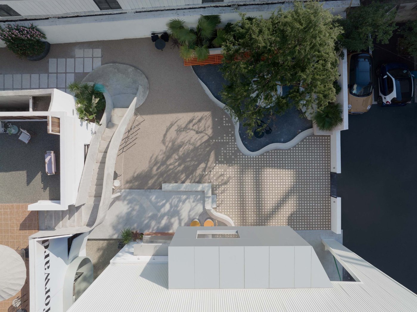
Amidst the hustle and bustle of the city, the Flop Building by Archipoetry Studio stands tall, a beacon of renewal and innovation.

Once a steel factory with decaying facades, the building has now been given a fresh lease of life by an enterprising architectural firm.

Led by a team of visionaries, the firm set out to preserve the building's structural framework while breathing new life into it. The original composite steel wall and roof, which had fallen into disrepair, were removed, and the building was strengthened to ensure its longevity. Remarkably, the building's volume and height were maintained, preserving its unique character.

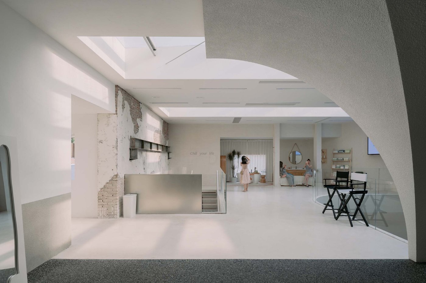
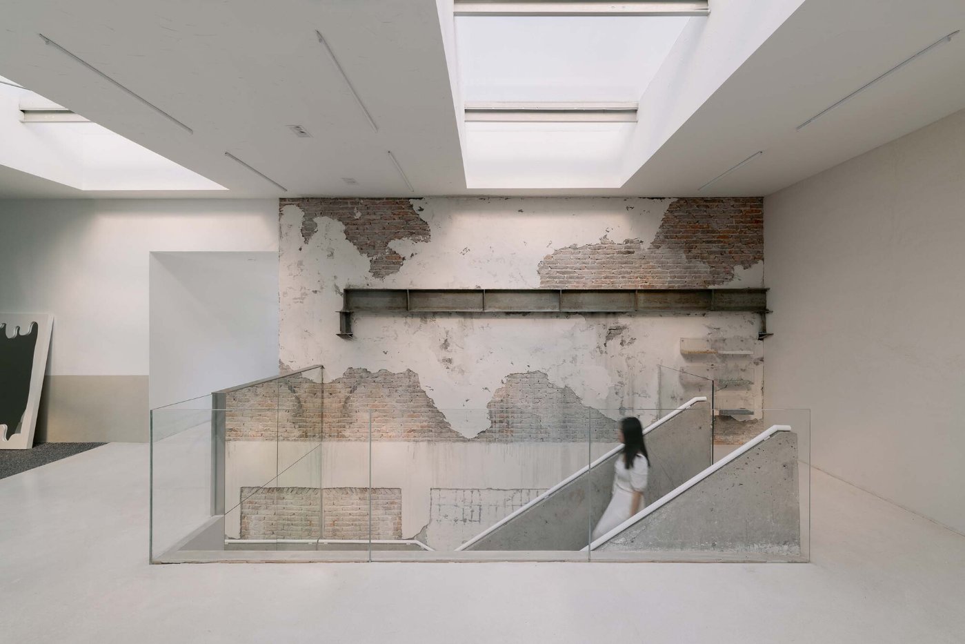
The team went above and beyond, adding two mezzanines to the existing double-height factory building, allowing for diverse photo-shoots and enhancing the building's functionality. The first floor of the building now offers vast open spaces, providing easy access for human circulation, entrances, and exits. On the second floor, a small device has been added to divide the space as per the functional requirements of the photography space.

The roof, fitted with solar panels, allows for ample indoor lighting, while the walls are made of aluminum alloy metal, reflecting the original architecture of the building. The materials chosen for the façade correspond to the building's original style, while the glass walls are frameless, adding to the building's minimalist aesthetic.

One of the most striking features of the revamped building is the column and beam structure, surrounded by chairs, forming a resting space that faces inward. This arrangement forms an eye-catching connection with the second floor, allowing for a unique perspective of the space.

During the construction phase, the damp walls fell naturally, creating a unique peeling effect. Rather than discarding this feature, the team chose to keep it intact, revealing the building's original materials beneath.

The transformation of the Flop Building is a story of renewal and preservation, showcasing how modern design can breathe new life into historic structures while maintaining their original character. The building now stands as a testament to the power of vision, innovation, and the importance of preservation in the face of urban development.

Interested in Showcasing Your Work?

If you would like to feature your works on Thisispaper, please visit our Submission page and sign up to Thisispaper+ to submit your work. Once your submission is approved, your work will be showcased to our global audience of 2 million art, architecture, and design professionals and enthusiasts.
No items found.
We love less
but there is more.
Become a Thisispaper+ member today to unlock full access to our magazine, advanced tools, and support our work.
Join Thisispaper+
No items found.
Zuzanna Gasior
Apr 21, 2023

Amidst the hustle and bustle of the city, the Flop Building by Archipoetry Studio stands tall, a beacon of renewal and innovation.

Once a steel factory with decaying facades, the building has now been given a fresh lease of life by an enterprising architectural firm.

Led by a team of visionaries, the firm set out to preserve the building's structural framework while breathing new life into it. The original composite steel wall and roof, which had fallen into disrepair, were removed, and the building was strengthened to ensure its longevity. Remarkably, the building's volume and height were maintained, preserving its unique character.

The team went above and beyond, adding two mezzanines to the existing double-height factory building, allowing for diverse photo-shoots and enhancing the building's functionality. The first floor of the building now offers vast open spaces, providing easy access for human circulation, entrances, and exits. On the second floor, a small device has been added to divide the space as per the functional requirements of the photography space.

The roof, fitted with solar panels, allows for ample indoor lighting, while the walls are made of aluminum alloy metal, reflecting the original architecture of the building. The materials chosen for the façade correspond to the building's original style, while the glass walls are frameless, adding to the building's minimalist aesthetic.

One of the most striking features of the revamped building is the column and beam structure, surrounded by chairs, forming a resting space that faces inward. This arrangement forms an eye-catching connection with the second floor, allowing for a unique perspective of the space.

During the construction phase, the damp walls fell naturally, creating a unique peeling effect. Rather than discarding this feature, the team chose to keep it intact, revealing the building's original materials beneath.

The transformation of the Flop Building is a story of renewal and preservation, showcasing how modern design can breathe new life into historic structures while maintaining their original character. The building now stands as a testament to the power of vision, innovation, and the importance of preservation in the face of urban development.

Interested in Showcasing Your Work?

If you would like to feature your works on Thisispaper, please visit our Submission page and subscribe to Thisispaper+. Once your submission is approved, your work will be showcased to our global audience of 2 million art, architecture, and design professionals and enthusiasts.
No items found.

Join Thisispaper+
Become a Thisispaper+ member today to unlock full access to our magazine, submit your project and support our work.
Travel Guides
Immerse yourself in timeless destinations, hidden gems, and creative spaces—curated by humans, not algorithms.
Explore All Guides +
Curated Editions
Dive deeper into carefully curated editions, designed to feed your curiosity and foster exploration.
Off-the-Grid
Jutaku
Sacral Journey
minimum
The New Chair
Explore All Editions +
Submission Module
By submitting and publishing your work, you can expose your work to our global 2M audience.
Learn More+
Become a Thisispaper+ member today to unlock full access to our magazine, submit your project and support our work.