Thisispaper Community
Join today.
Enter your email address to receive the latest news on emerging art, design, lifestyle and tech from Thisispaper, delivered straight to your inbox.
Oops! Something went wrong while submitting the form.
Instant access to new channels
The top stories curated daily
Weekly roundups of what's important
Original features and deep dives
Exclusive community features
Zuzanna Gasior
Dec 27, 2022

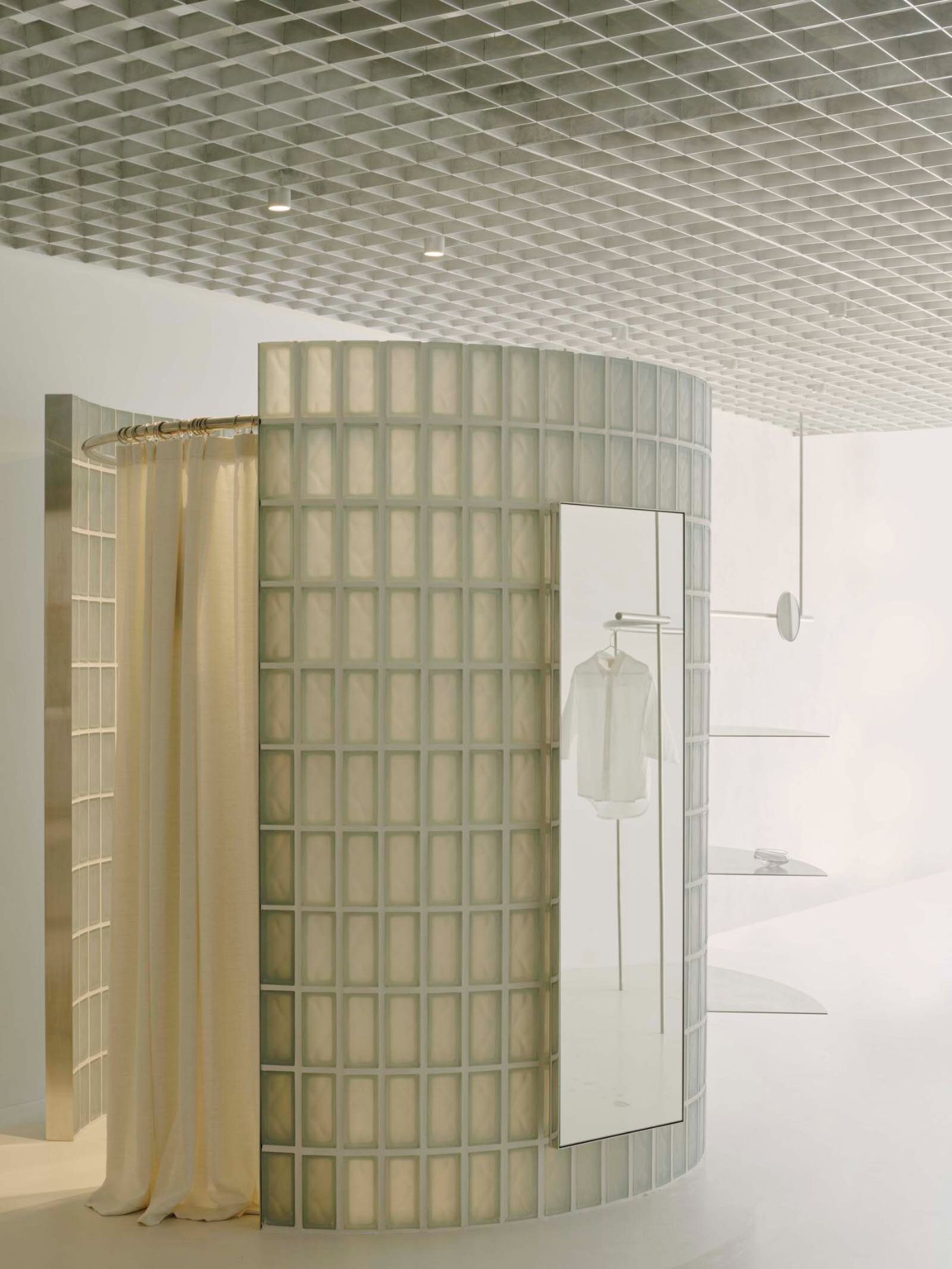
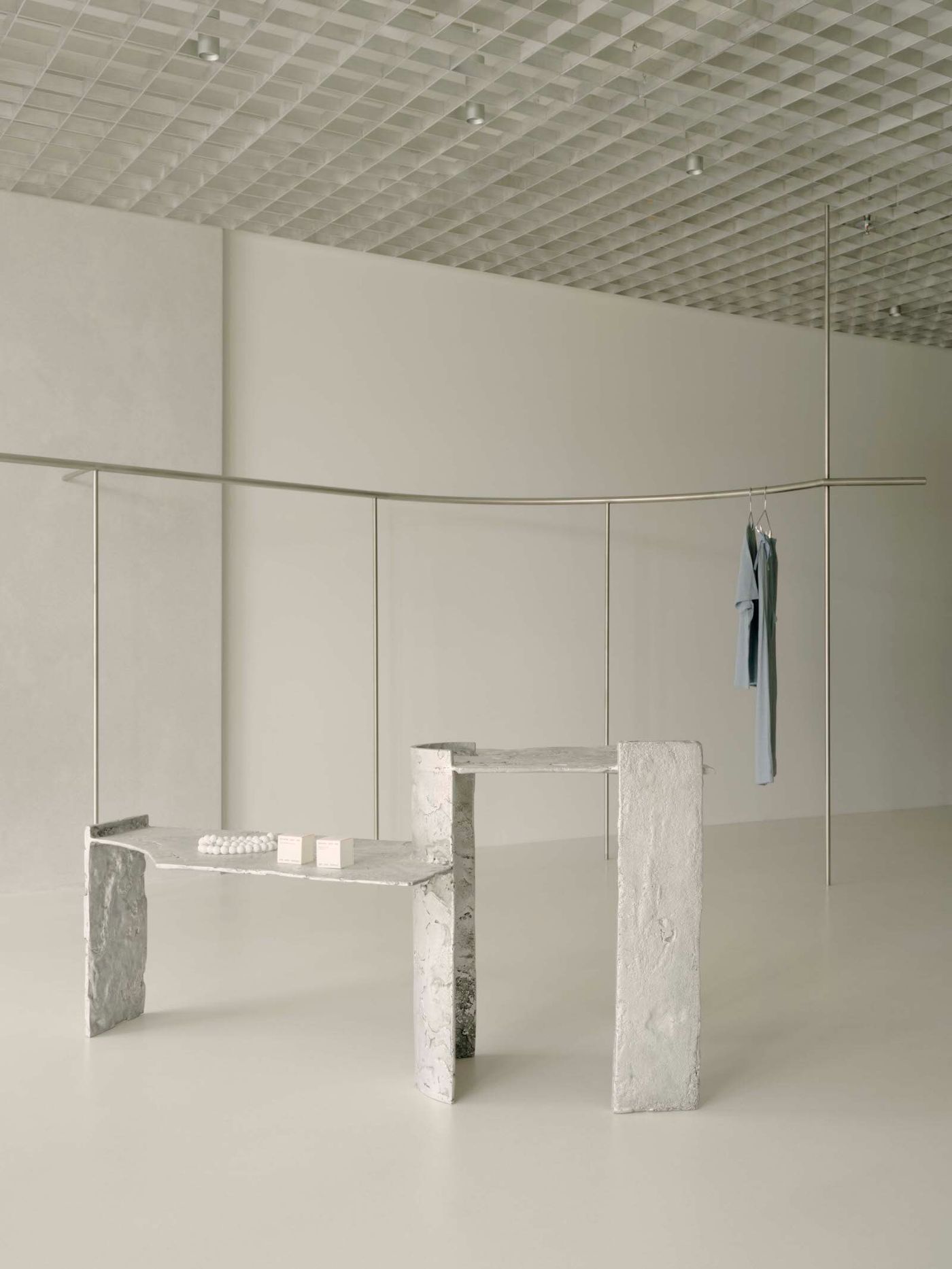
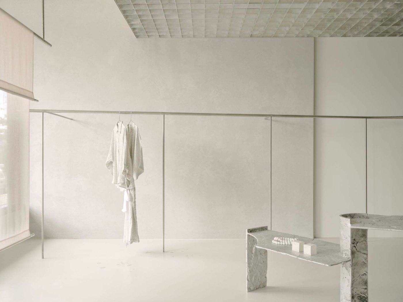
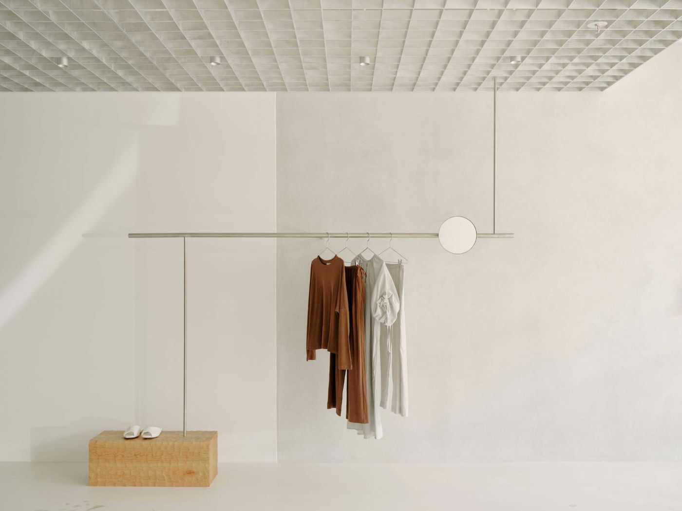
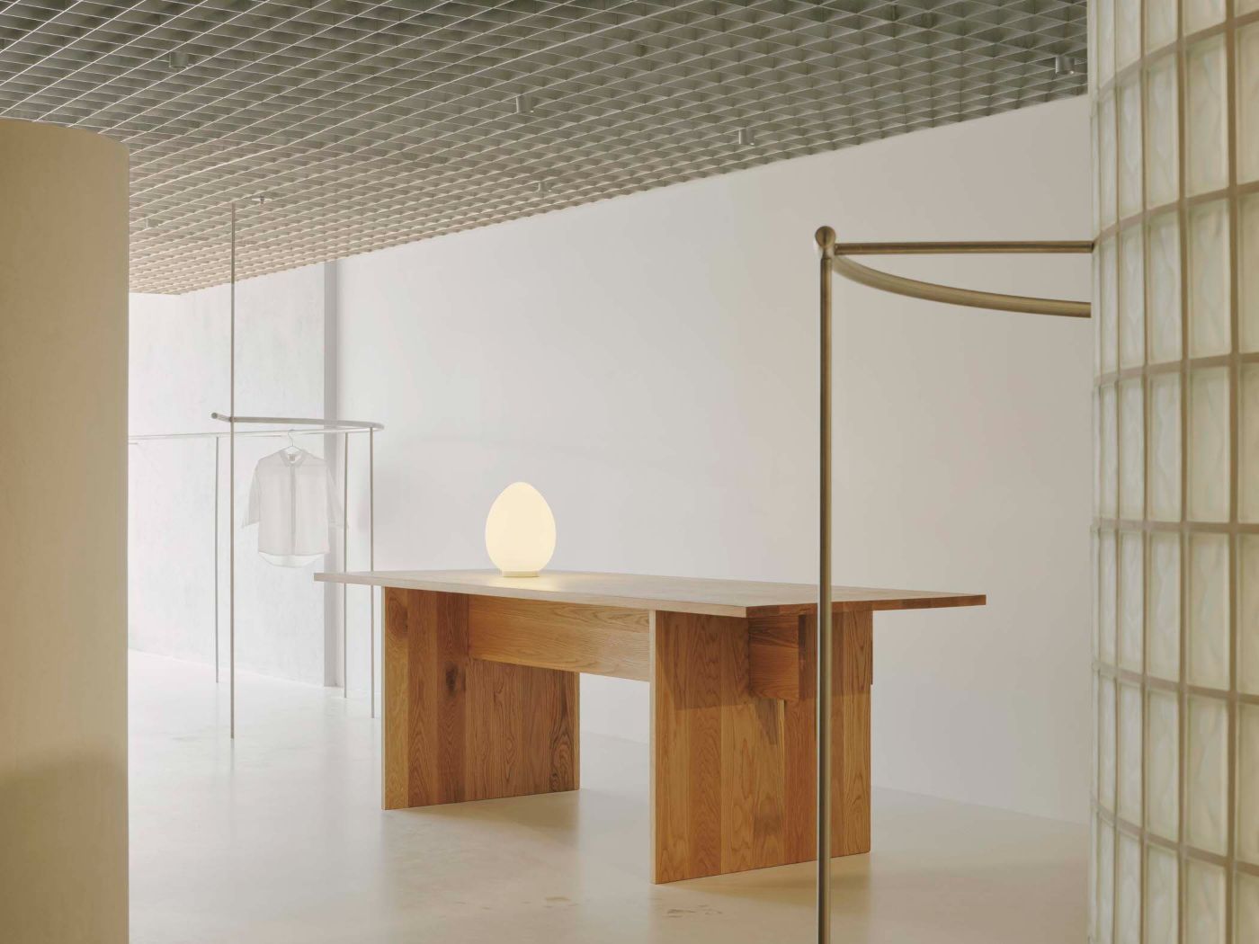
Pattern Studio has designed the first flagship store for apparel and lifestyle brand Deiji Studios, located in Byron Bay, Australia.

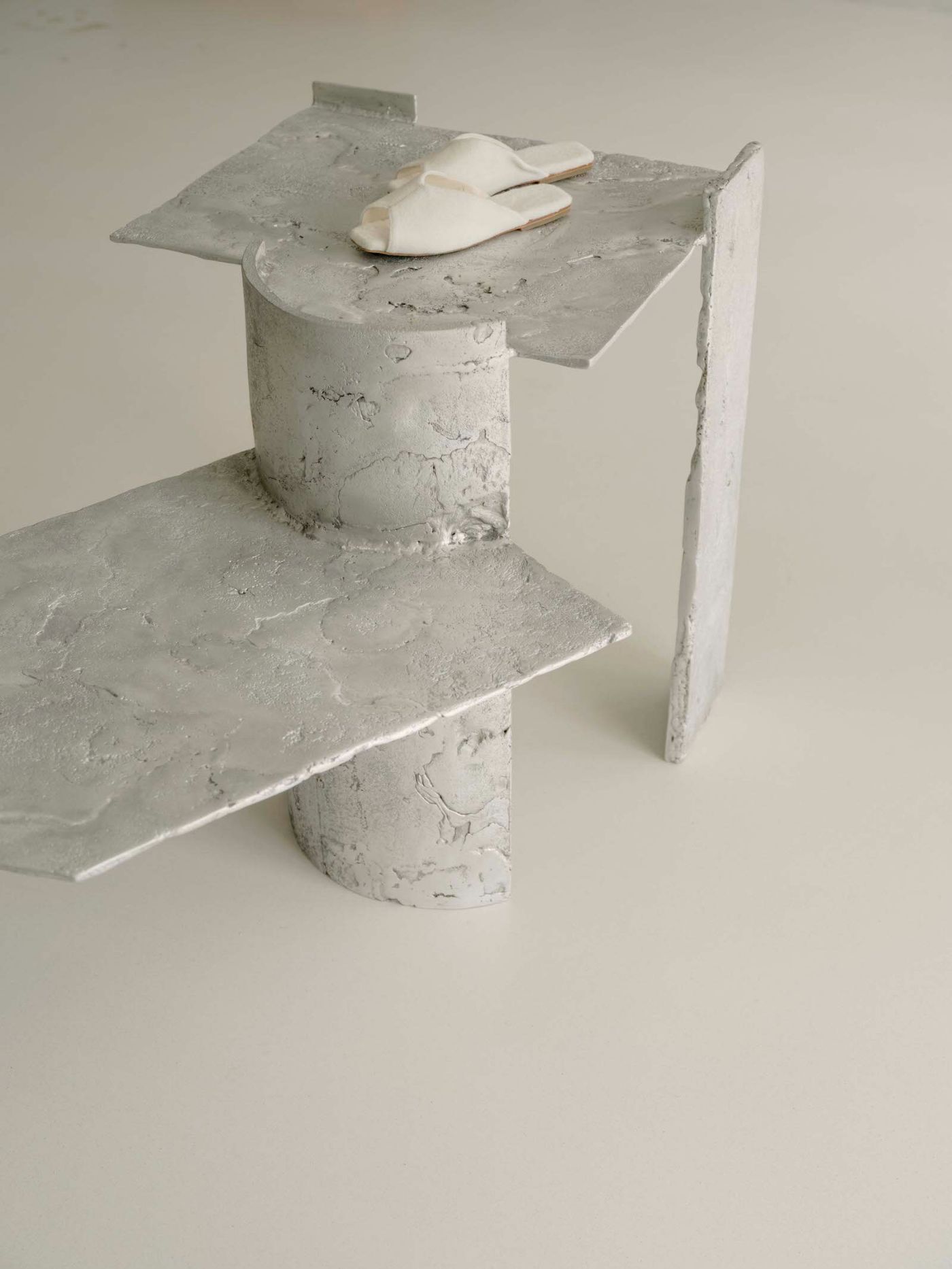
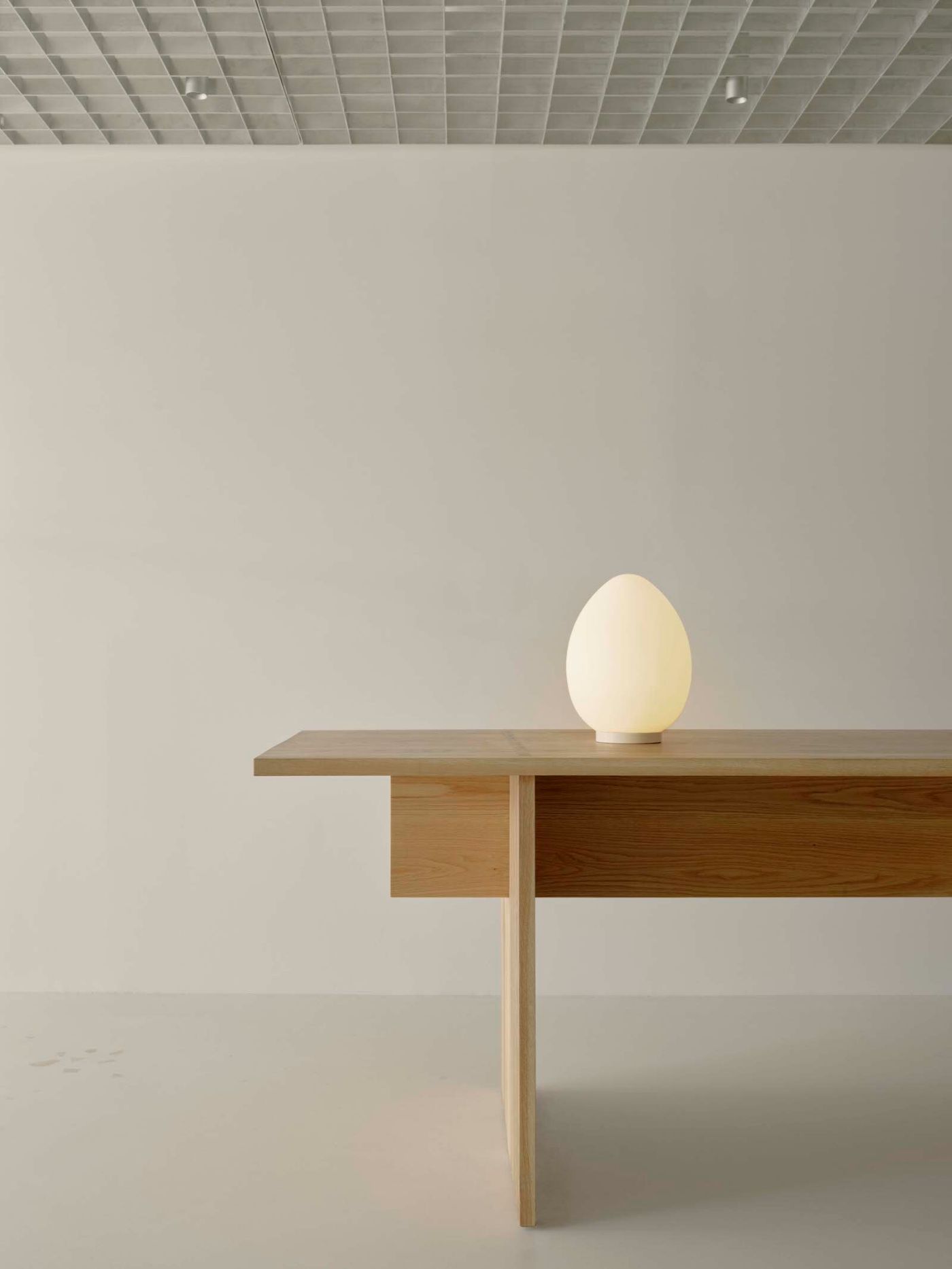
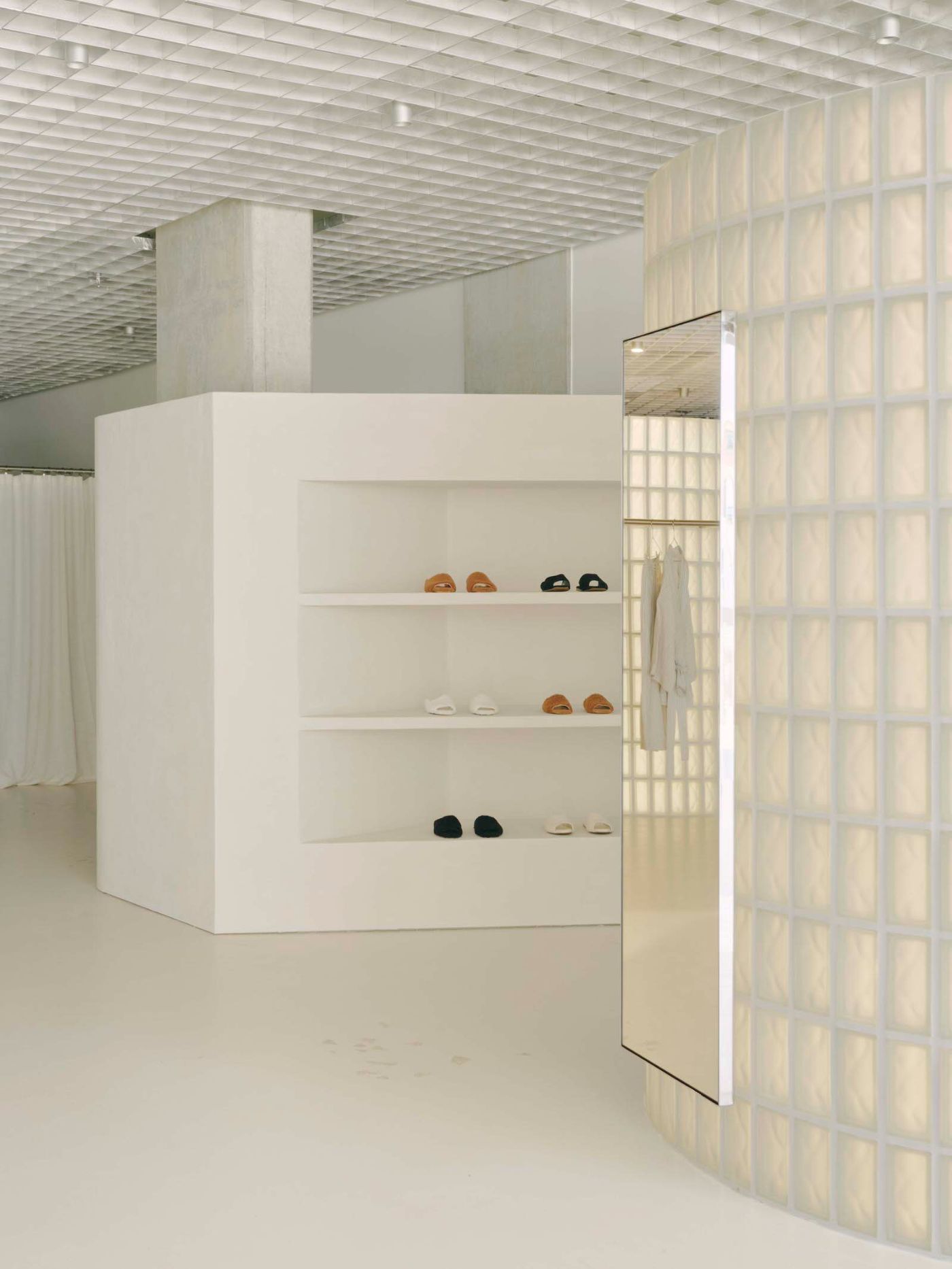
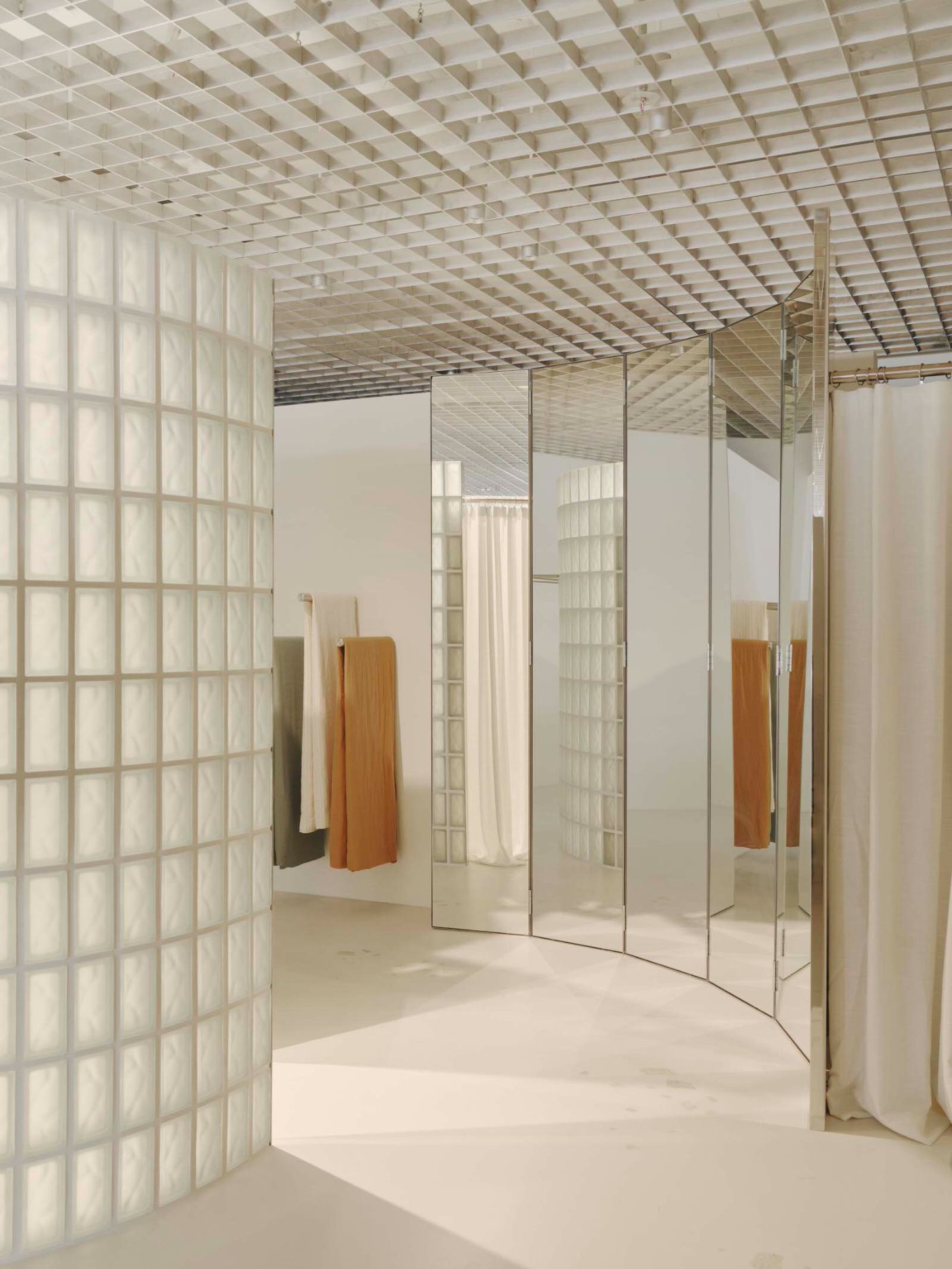
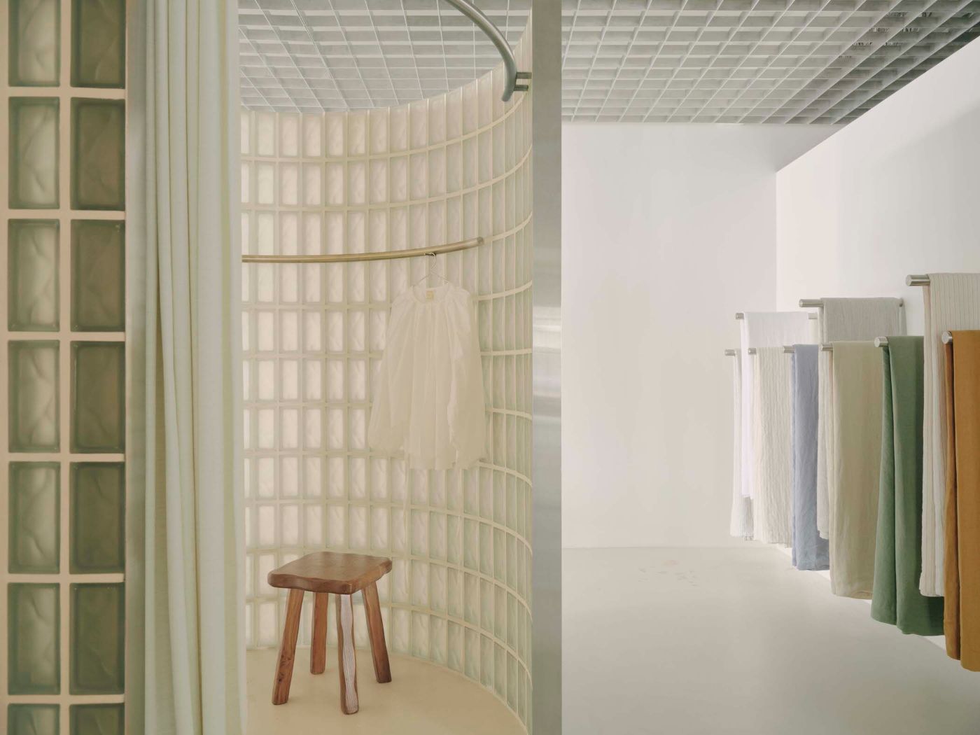
The overall design embodies the brand's effortless and serene style. Designers and clients debated which of the brand's qualities would translate spatially well. Materially, the palette of the store uses neutral and natural finishes. Ultimately, the result is an interior that feels calm and serene - never monotonous.

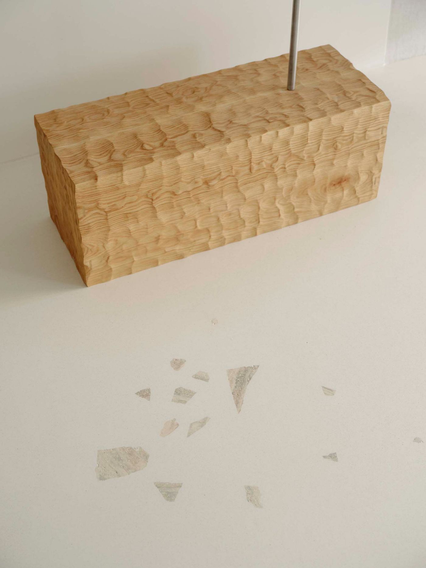
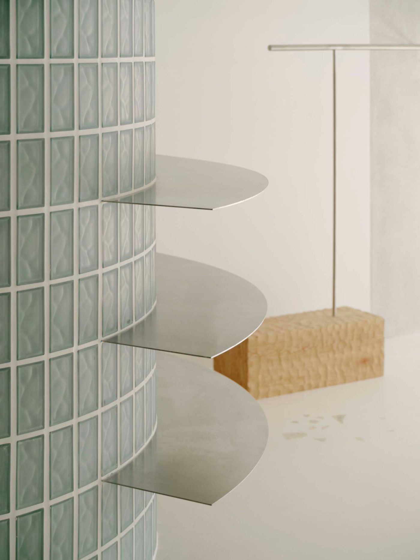
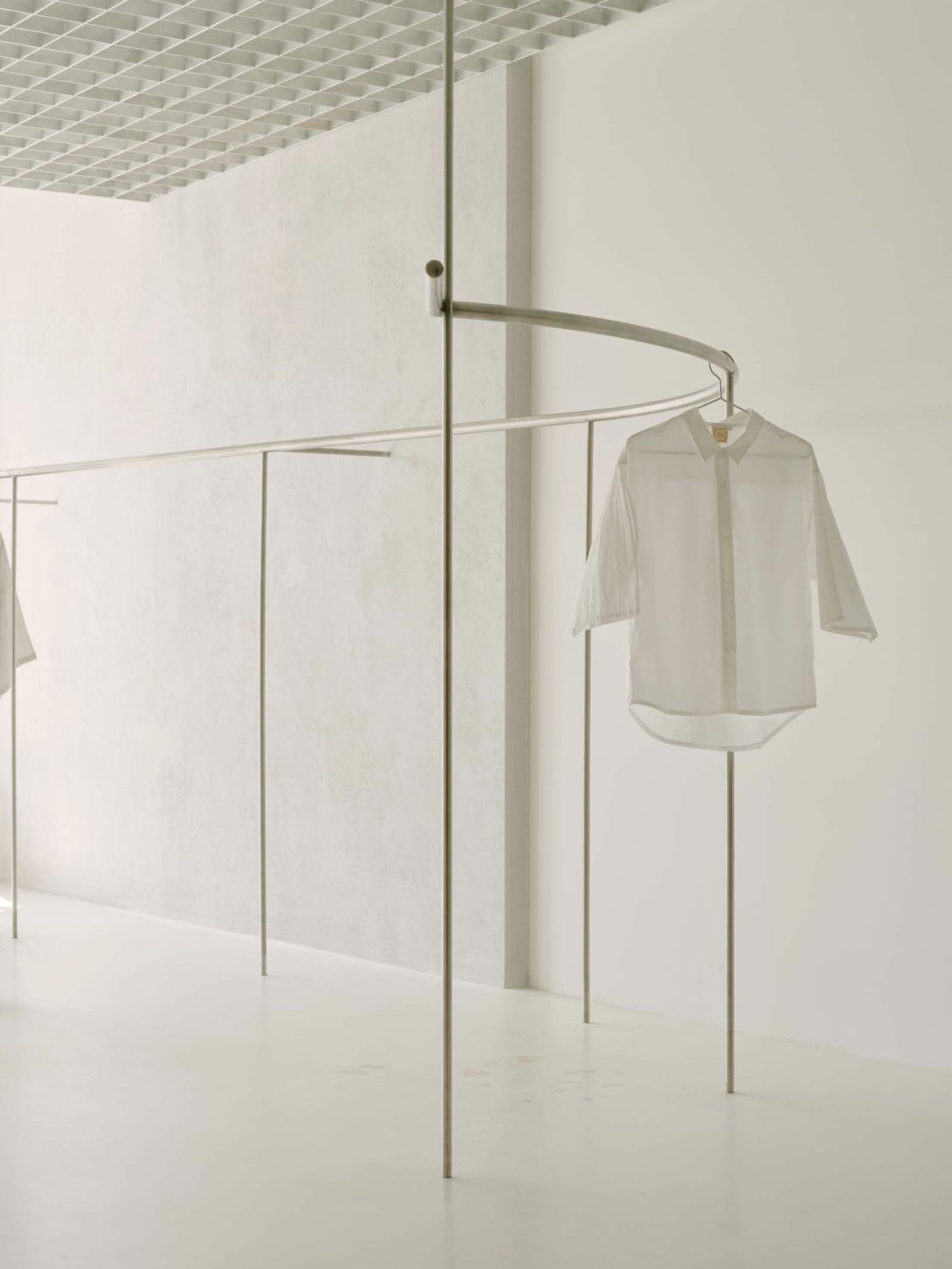
There are smatterings of natural stone scattered across an off-white concrete floor. Soft white paint is used on the walls to create a minimalist look. The rhythmic geometry of the raw aluminium grid ceiling offers a contrast to the more lyrical curved elements found on the shop floor. The curved glass chambers glow ethereally, offering a luxuriously tranquil experience for those changing. Scale and mass are carefully balanced by the sense of lightness their translucency creates.

Interested in Showcasing Your Work?

If you would like to feature your works on Thisispaper, please visit our Submission page and sign up to Thisispaper+ to submit your work. Once your submission is approved, your work will be showcased to our global audience of 2 million art, architecture, and design professionals and enthusiasts.
No items found.
We love less
but there is more.
Become a Thisispaper+ member today to unlock full access to our magazine, advanced tools, and support our work.
Join Thisispaper+
No items found.
Zuzanna Gasior
Dec 27, 2022

Pattern Studio has designed the first flagship store for apparel and lifestyle brand Deiji Studios, located in Byron Bay, Australia.

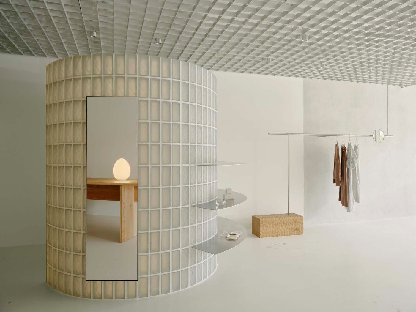
The overall design embodies the brand's effortless and serene style. Designers and clients debated which of the brand's qualities would translate spatially well. Materially, the palette of the store uses neutral and natural finishes. Ultimately, the result is an interior that feels calm and serene - never monotonous.

There are smatterings of natural stone scattered across an off-white concrete floor. Soft white paint is used on the walls to create a minimalist look. The rhythmic geometry of the raw aluminium grid ceiling offers a contrast to the more lyrical curved elements found on the shop floor. The curved glass chambers glow ethereally, offering a luxuriously tranquil experience for those changing. Scale and mass are carefully balanced by the sense of lightness their translucency creates.
Interested in Showcasing Your Work?

If you would like to feature your works on Thisispaper, please visit our Submission page and subscribe to Thisispaper+. Once your submission is approved, your work will be showcased to our global audience of 2 million art, architecture, and design professionals and enthusiasts.
No items found.

Join Thisispaper+
Become a Thisispaper+ member today to unlock full access to our magazine, submit your project and support our work.
Travel Guides
Immerse yourself in timeless destinations, hidden gems, and creative spaces—curated by humans, not algorithms.
Explore All Guides +
Curated Editions
Dive deeper into carefully curated editions, designed to feed your curiosity and foster exploration.
Off-the-Grid
Jutaku
Sacral Journey
minimum
The New Chair
Explore All Editions +
Submission Module
By submitting and publishing your work, you can expose your work to our global 2M audience.
Learn More+
Become a Thisispaper+ member today to unlock full access to our magazine, submit your project and support our work.