Thisispaper Community
Join today.
Enter your email address to receive the latest news on emerging art, design, lifestyle and tech from Thisispaper, delivered straight to your inbox.
Oops! Something went wrong while submitting the form.
Instant access to new channels
The top stories curated daily
Weekly roundups of what's important
Original features and deep dives
Exclusive community features
Zuzanna Gasior
Jan 17, 2023

In a socially significant heritage site in Abbotsford, DesignOffice created a showroom and private residence for the new owners of The Carringbush Hotel.

Having lived and worked in the area for nearly three decades, the clients wished for the site to retain its civic generosity, and for the pub to remain a key tenant. The original Collingwood Football Team Club Room on the ground floor was reimagined as a salon that could flex to showcase the client’s fashion collections, or host international guests and clients when required. The joinery, which makes the room work functionally, was conceived as a flexible piece of furniture, inserted into the heritage fabric of the room, while concealing a kitchenette, storage, fold-down bed and hidden entrance to the ensuite.

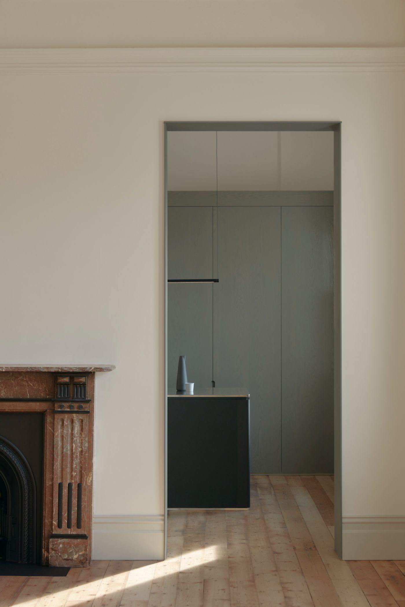
From the street entrance, the central stair defines the axis of the arrival sequence and the contemporary gloss steel balustrade is designed to read as a single sculptural element within the space. Inside, heritage components are defined by a restrained palette, with restored pine floors, natural white walls and ceilings, bordered by soft grey skirting and window frames. This is contrasted by thin steel portal frames in grey-green, articulating the considered rhythm of new openings in the existing central masonry wall.

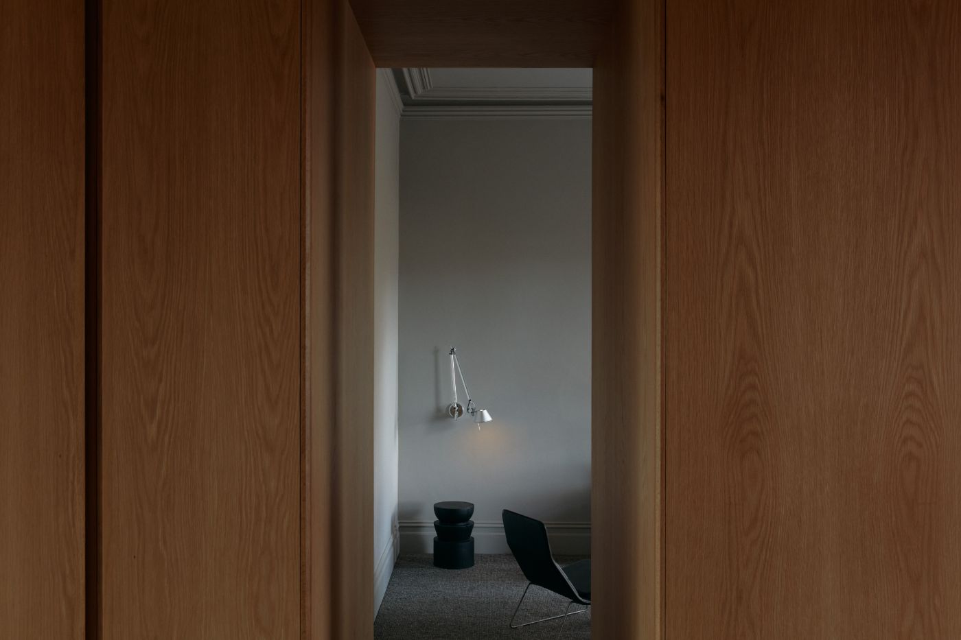
Materials distinct from the original fabric are also present in the dressing room and bathroom, a pair of timber chambers. Oak veneer lined walls and ceilings paired with Bedonia stone floors, serve to mentally and visually remove these more private areas, enhancing the separation between work and home.

Rich with unexpected detail, the design finds opportunities to delight. Strategically placed windows, particularly a generous bathroom window framing the train tracks and the old painted Vickers Gin sign beyond, offer curated views which place its residents squarely within the locale they love.

Interested in Showcasing Your Work?

If you would like to feature your works on Thisispaper, please visit our Submission page and sign up to Thisispaper+ to submit your work. Once your submission is approved, your work will be showcased to our global audience of 2 million art, architecture, and design professionals and enthusiasts.
No items found.
We love less
but there is more.
Become a Thisispaper+ member today to unlock full access to our magazine, advanced tools, and support our work.
Join Thisispaper+
No items found.
Zuzanna Gasior
Jan 17, 2023

In a socially significant heritage site in Abbotsford, DesignOffice created a showroom and private residence for the new owners of The Carringbush Hotel.

Having lived and worked in the area for nearly three decades, the clients wished for the site to retain its civic generosity, and for the pub to remain a key tenant. The original Collingwood Football Team Club Room on the ground floor was reimagined as a salon that could flex to showcase the client’s fashion collections, or host international guests and clients when required. The joinery, which makes the room work functionally, was conceived as a flexible piece of furniture, inserted into the heritage fabric of the room, while concealing a kitchenette, storage, fold-down bed and hidden entrance to the ensuite.

From the street entrance, the central stair defines the axis of the arrival sequence and the contemporary gloss steel balustrade is designed to read as a single sculptural element within the space. Inside, heritage components are defined by a restrained palette, with restored pine floors, natural white walls and ceilings, bordered by soft grey skirting and window frames. This is contrasted by thin steel portal frames in grey-green, articulating the considered rhythm of new openings in the existing central masonry wall.

Materials distinct from the original fabric are also present in the dressing room and bathroom, a pair of timber chambers. Oak veneer lined walls and ceilings paired with Bedonia stone floors, serve to mentally and visually remove these more private areas, enhancing the separation between work and home.

Rich with unexpected detail, the design finds opportunities to delight. Strategically placed windows, particularly a generous bathroom window framing the train tracks and the old painted Vickers Gin sign beyond, offer curated views which place its residents squarely within the locale they love.

Interested in Showcasing Your Work?

If you would like to feature your works on Thisispaper, please visit our Submission page and subscribe to Thisispaper+. Once your submission is approved, your work will be showcased to our global audience of 2 million art, architecture, and design professionals and enthusiasts.
No items found.

Join Thisispaper+
Become a Thisispaper+ member today to unlock full access to our magazine, submit your project and support our work.
Travel Guides
Immerse yourself in timeless destinations, hidden gems, and creative spaces—curated by humans, not algorithms.
Explore All Guides +
Curated Editions
Dive deeper into carefully curated editions, designed to feed your curiosity and foster exploration.
Off-the-Grid
Jutaku
Sacral Journey
minimum
The New Chair
Explore All Editions +
Submission Module
By submitting and publishing your work, you can expose your work to our global 2M audience.
Learn More+
Become a Thisispaper+ member today to unlock full access to our magazine, submit your project and support our work.