Thisispaper Community
Join today.
Enter your email address to receive the latest news on emerging art, design, lifestyle and tech from Thisispaper, delivered straight to your inbox.
Oops! Something went wrong while submitting the form.
Instant access to new channels
The top stories curated daily
Weekly roundups of what's important
Original features and deep dives
Exclusive community features
Hitoshi Arato
Jan 23, 2023

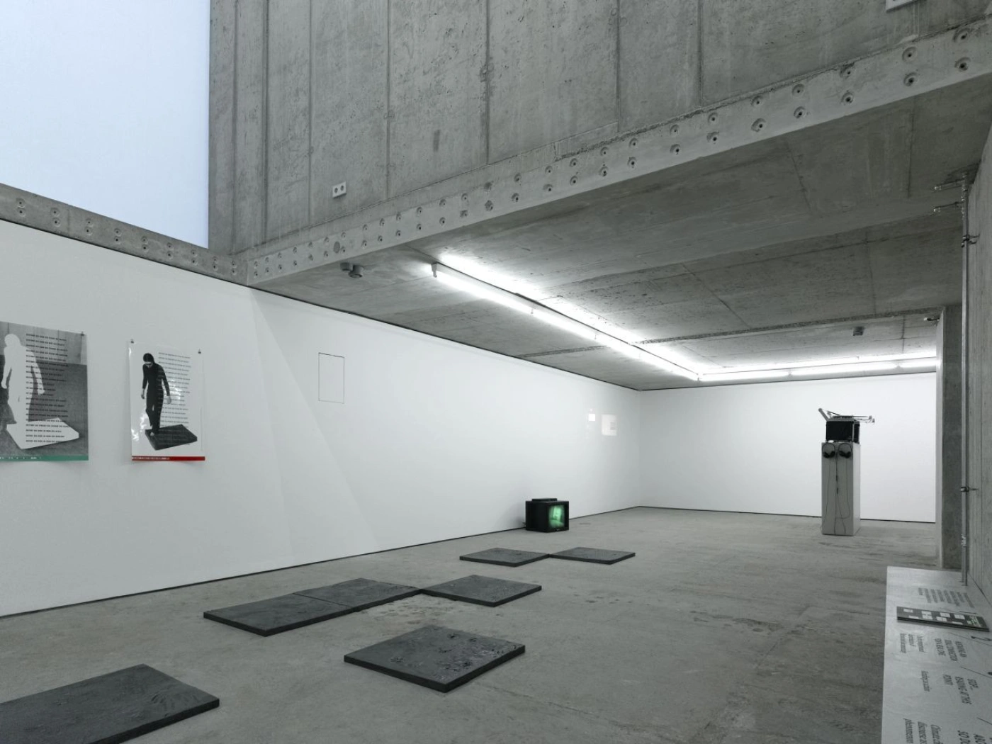
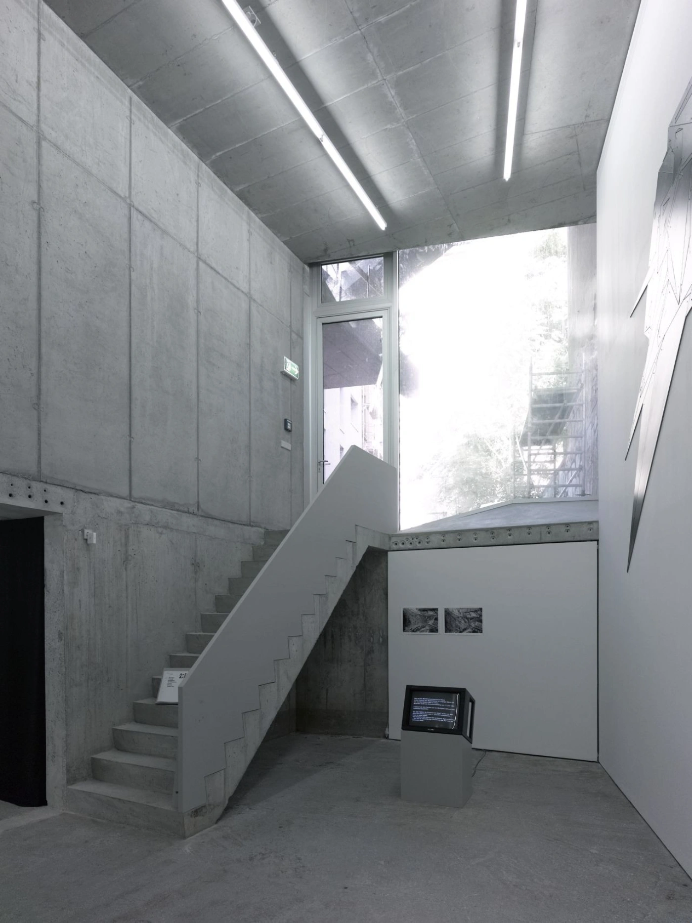
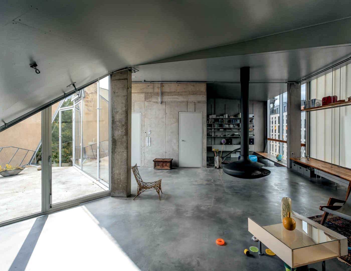
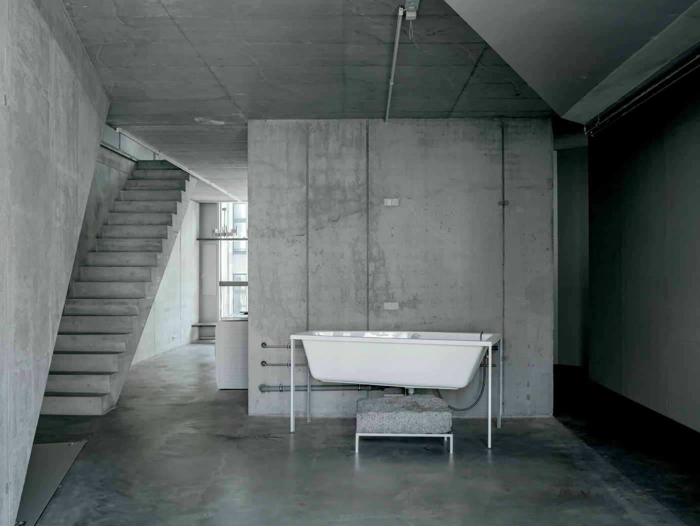
The gallery and ateliers at Brunnenstrasse 9 designed by by Brandlhuber & Emde & Burlon in Berlin are a prime example of adaptive reuse in architecture.

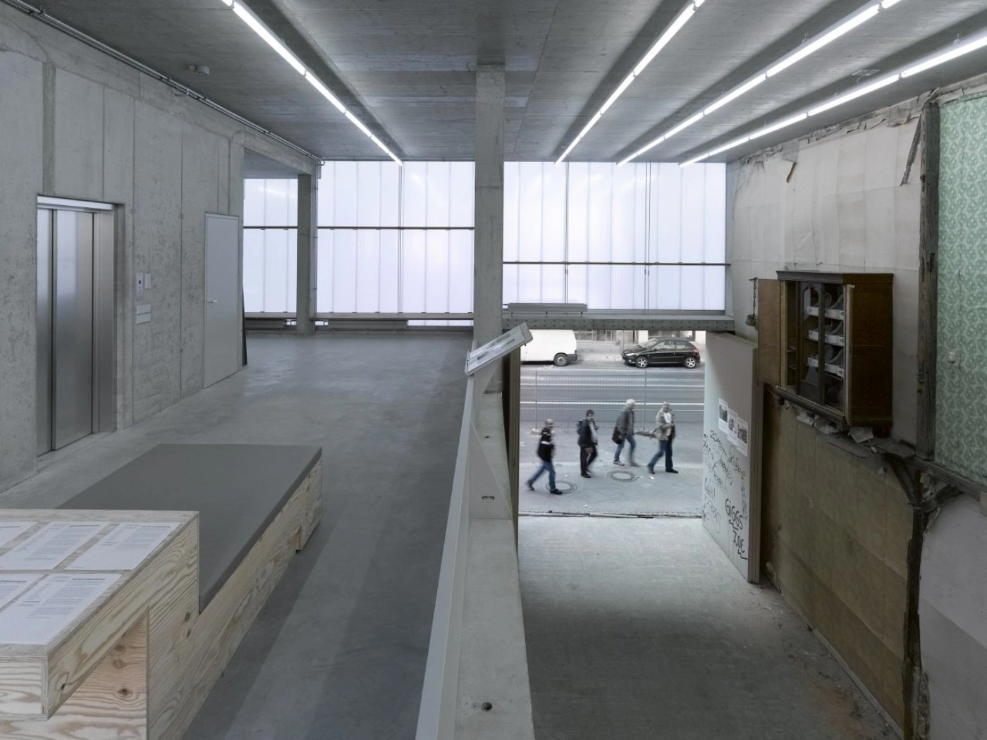
Built on the foundations of a ruin, the project took advantage of an opportunity to buy the land for a discounted price and make use of the remaining structure. Rather than removing the original building, the architects, Brandlhuber & Emde & Burlon, included it in the design and developed it further to create a unique and functional space.

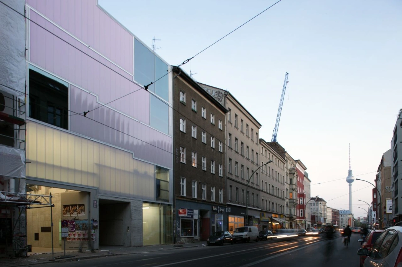
The design of the building was heavily influenced by the City Planning Department's agenda of "critical reconstruction," which references the city's historical context. The basic volume of the building is defined by the eave heights of the two adjacent buildings, with the attic floor shaped accordingly to compromise with the neighbors behind the rear courtyard. The continuation of the adjacent building heights into Brunnenstrasse 9 results in a 30cm difference between the two floor levels, which naturally divides the floor plate on every storey for different uses.

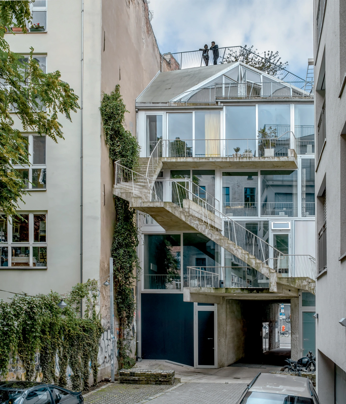
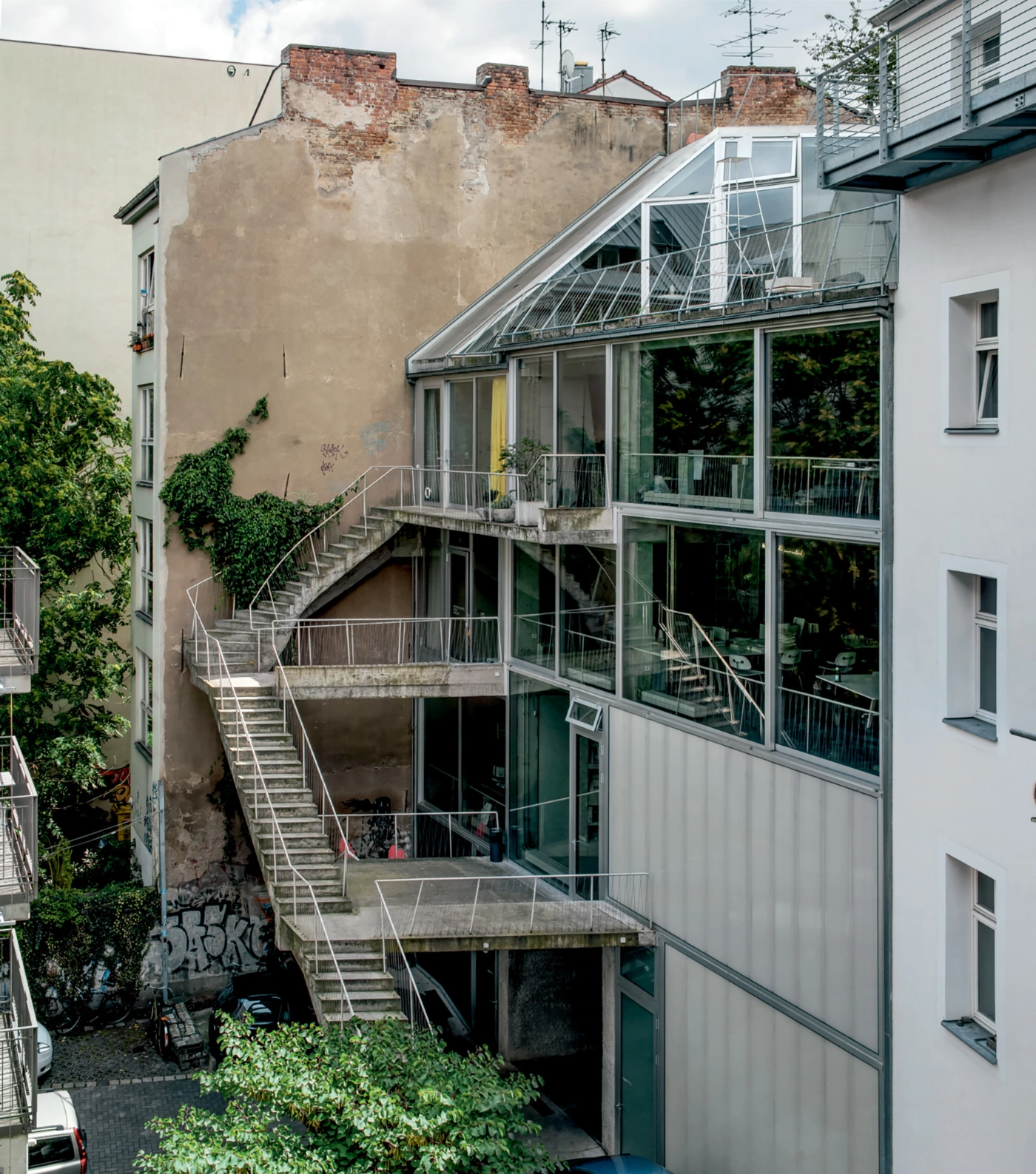
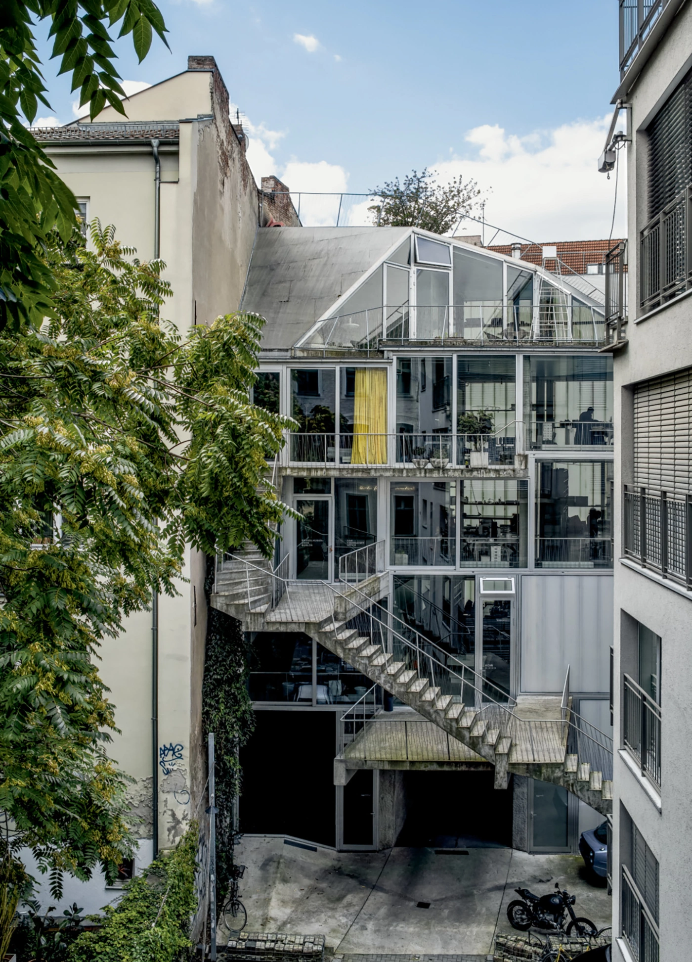
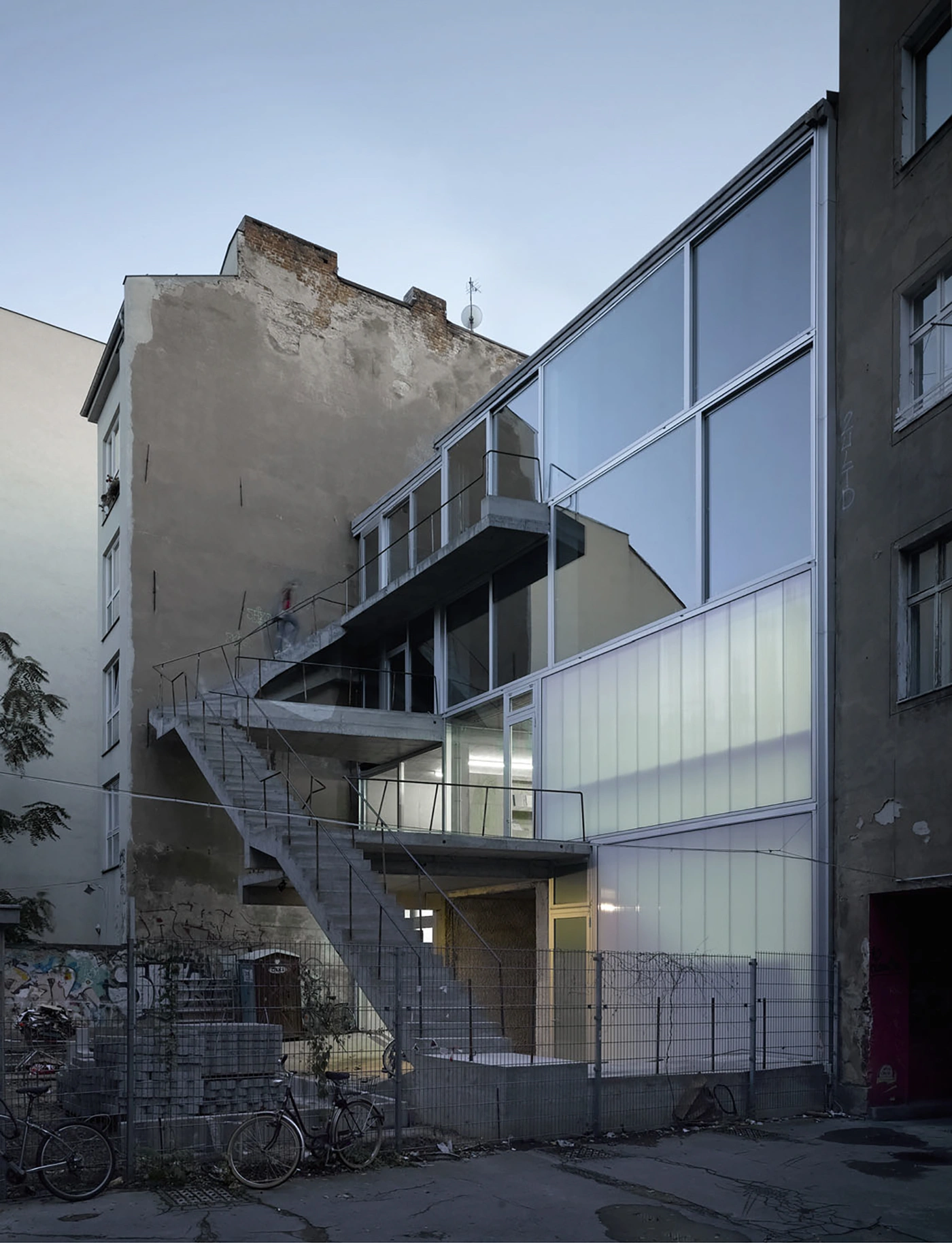
The concrete core, reduced to a minimum, houses the bathrooms and the elevator. It directly connects the different units to the street level via an entrance located in the public passageway. Apart from this central core, there is no other physical connection between the single units. The only way to circulate between them is either through elevator access or the external staircase attached to the rear facade. This exterior circulation layer is offset five meters from the back facade in accordance with the building code and fire regulations, eliminating the need for an interior stair and maximizing spatial efficiency.

The facade of the building is also a nod to the context and regulations of the site. The street side, facing the heavily trafficked Brunnenstrasse, is given a closed quality, while the rear wall facing onto the courtyard is completely glazed. All the facade elements rest on a robust metal sub-structure, providing for future changes to the facade and following the same logic of flexibility and adaptability employed on the inside. The Brunnenstrasse 9 project is a successful example of how architects can use the constraints and opportunities of a site to create a unique and functional space.

Interested in Showcasing Your Work?

If you would like to feature your works on Thisispaper, please visit our Submission page and sign up to Thisispaper+ to submit your work. Once your submission is approved, your work will be showcased to our global audience of 2 million art, architecture, and design professionals and enthusiasts.
No items found.
We love less
but there is more.
Become a Thisispaper+ member today to unlock full access to our magazine, advanced tools, and support our work.
Join Thisispaper+
No items found.
Hitoshi Arato
Jan 23, 2023

The gallery and ateliers at Brunnenstrasse 9 designed by by Brandlhuber & Emde & Burlon in Berlin are a prime example of adaptive reuse in architecture.

Built on the foundations of a ruin, the project took advantage of an opportunity to buy the land for a discounted price and make use of the remaining structure. Rather than removing the original building, the architects, Brandlhuber & Emde & Burlon, included it in the design and developed it further to create a unique and functional space.

The design of the building was heavily influenced by the City Planning Department's agenda of "critical reconstruction," which references the city's historical context. The basic volume of the building is defined by the eave heights of the two adjacent buildings, with the attic floor shaped accordingly to compromise with the neighbors behind the rear courtyard. The continuation of the adjacent building heights into Brunnenstrasse 9 results in a 30cm difference between the two floor levels, which naturally divides the floor plate on every storey for different uses.

The concrete core, reduced to a minimum, houses the bathrooms and the elevator. It directly connects the different units to the street level via an entrance located in the public passageway. Apart from this central core, there is no other physical connection between the single units. The only way to circulate between them is either through elevator access or the external staircase attached to the rear facade. This exterior circulation layer is offset five meters from the back facade in accordance with the building code and fire regulations, eliminating the need for an interior stair and maximizing spatial efficiency.

The facade of the building is also a nod to the context and regulations of the site. The street side, facing the heavily trafficked Brunnenstrasse, is given a closed quality, while the rear wall facing onto the courtyard is completely glazed. All the facade elements rest on a robust metal sub-structure, providing for future changes to the facade and following the same logic of flexibility and adaptability employed on the inside. The Brunnenstrasse 9 project is a successful example of how architects can use the constraints and opportunities of a site to create a unique and functional space.

Interested in Showcasing Your Work?

If you would like to feature your works on Thisispaper, please visit our Submission page and subscribe to Thisispaper+. Once your submission is approved, your work will be showcased to our global audience of 2 million art, architecture, and design professionals and enthusiasts.
Thisispaper+
Berlin Guide
40+ Locations
Web Access
Link to Maps
With countless emerging creative studios, artists and architects, this city guide presents a curated and timeless selection of the best places in Berlin in terms of "art, design, architecture and lifestyle".
Explore
Berlin Guide

Join Thisispaper+
Become a Thisispaper+ member today to unlock full access to our magazine, submit your project and support our work.
Travel Guides
Immerse yourself in timeless destinations, hidden gems, and creative spaces—curated by humans, not algorithms.
Explore All Guides +
Curated Editions
Dive deeper into carefully curated editions, designed to feed your curiosity and foster exploration.
Off-the-Grid
Jutaku
Sacral Journey
minimum
The New Chair
Explore All Editions +
Submission Module
By submitting and publishing your work, you can expose your work to our global 2M audience.
Learn More+
Become a Thisispaper+ member today to unlock full access to our magazine, submit your project and support our work.